Orthopedic Care
Black Tie Orthopedic
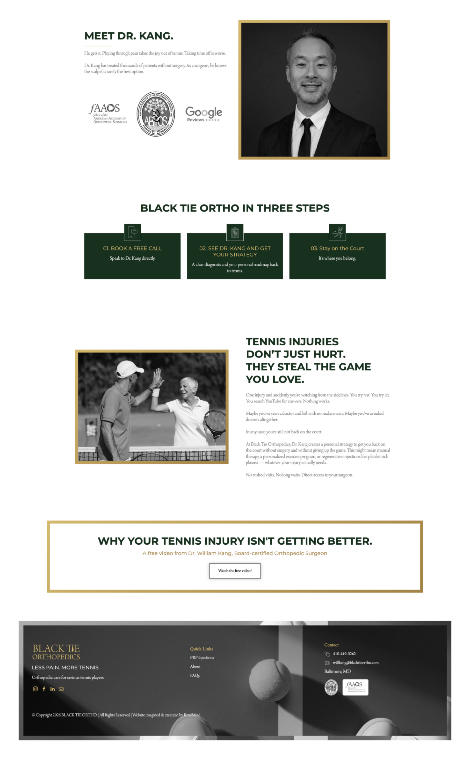
Black Tie Orthopedic began with a clear vision: create a new kind of orthopedic practice for active adults who expect more from their care.
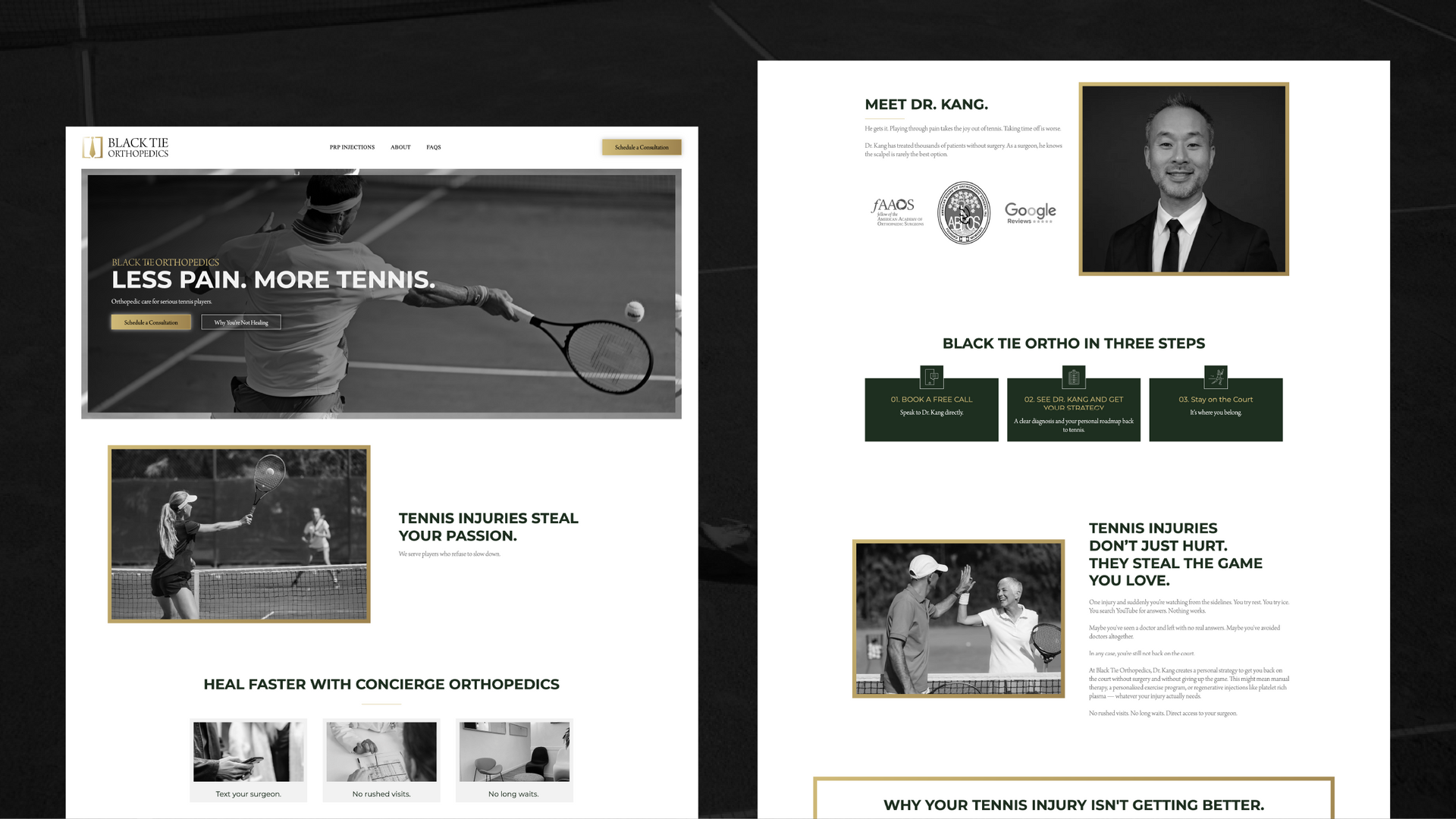
With a new business to launch and no existing website, Black Tie needed a digital presence that could establish credibility from the start while capturing the premium, modern experience at the heart of the practice.
Built & Hosted using

Organic, Sleek, Bright
Website Design
Our Approach
Suited for a Different Kind of Practice
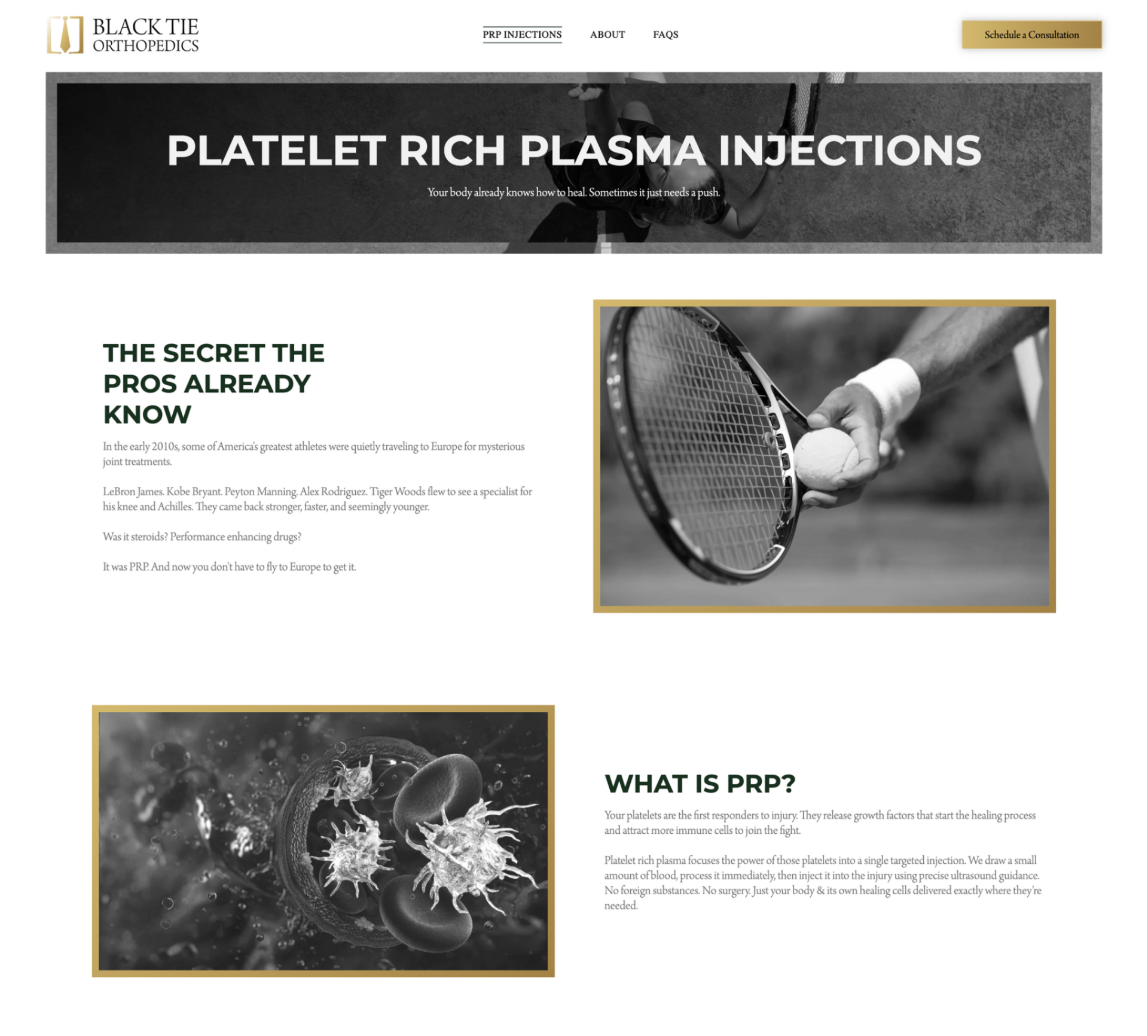
Black Tie Orthopedic was built around a more personalized vision for orthopedic care, one that paired specialized expertise with the level of service patients might expect from a premium experience. The brand and website needed to make that distinction clear while still feeling credible and approachable to active adults.
Working closely with the client, RivalMind translated that vision into a sophisticated identity and digital experience that felt polished without becoming clinical or impersonal. Every element was shaped to reinforce the practice’s focus on specialized care, personal attention, and a distinctly different patient experience.
The Results
Serving Up a Strong First Impression
From day one, the practice had a digital presence that reflected the caliber of care behind it. The finished experience gave patients a clear sense of what made this approach to orthopedics different while creating a strong foundation for growth.
For a seasoned physician stepping outside the traditional practice model, it was a confident first step toward building something distinctly his own.
An Identity Tailored to Fit
Starting with a blank slate, the logo needed to give Black Tie a distinct and memorable presence from the start. RivalMind designed a logo with a sharp, sophisticated character that feels intentional and unmistakably connected to the brand.
Clean and versatile, it gives Black Tie a recognizable identity that can grow alongside the practice.

The Right Type for the Occasion
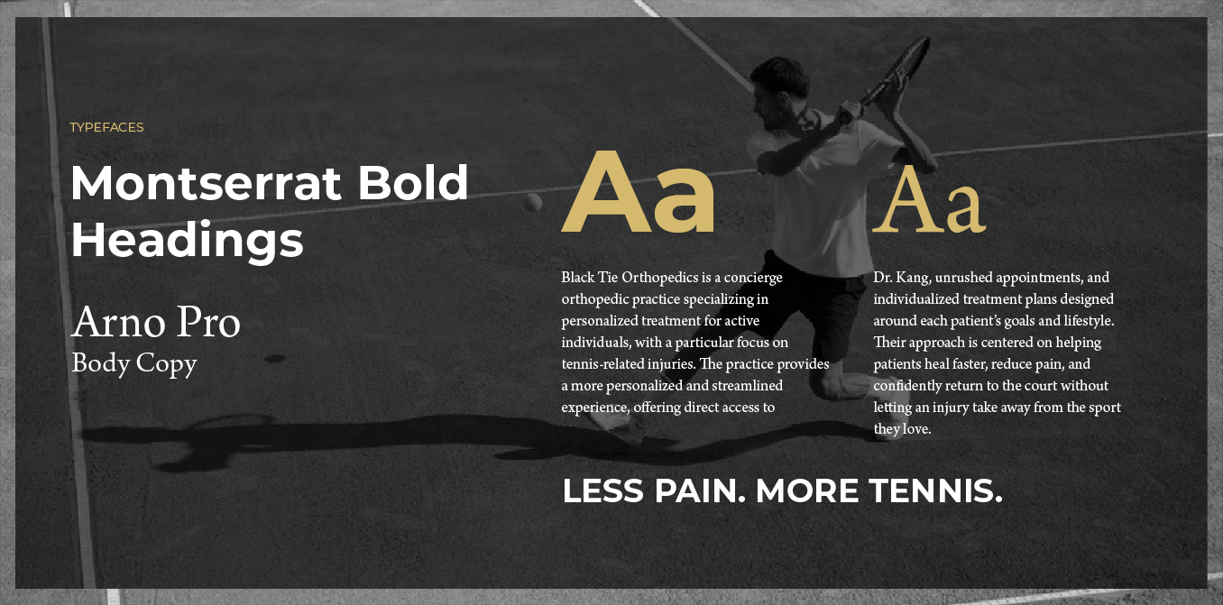
Gravesend brings a sharp, contemporary presence to headlines, while Arno Pro introduces a more classic sensibility throughout the site. Together, the two typefaces create a balance between modern energy and timeless character.
The pairing also establishes a clear visual hierarchy, making the site easy to navigate while giving the content plenty of personality.
Black Tie, with a Touch of Gold
Black and white were a natural starting point, giving the brand a bold visual connection to its name. Gold accents bring warmth and distinction to key moments throughout the site, while deep green softens the palette with a subtle, unexpected contrast.
The added depth keeps the aesthetic from feeling too stark while preserving the strong, classic look that defines Black Tie.


Staff Spotlight
Designed by Alexis Camp
Alexis Camp showcases her talent by crafting a diverse array of elements, ranging from captivating graphics to dynamic website designs. Rooted in her unwavering passion for design, Alexis's approach embodies a commitment to exploration, constantly seeking to push the boundaries of creativity. With an appetite for innovation, she pursues fresh perspectives and original concepts, ensuring that every project she undertakes resonates with creativity and excellence.
Specialties: Duda Web Development, Illustration, Logos/Branding


There’s More in Our Court
Every brand brings a different challenge to the table and a new opportunity to think strategically. See how RivalMind turns those opportunities into digital experiences designed to connect, engage, and move businesses forward.


Contact Us
It's time to grow your business.
TruCare Concierge Web Design Portfolio Contact Form
We will get back to you as soon as possible.
Please try again later.
By checking the box above, you consent to receive informational SMS and appointment/meeting reminders from RivalMind at the phone number provided. Msg & data rates may apply. Msg frequency varies. Unsubscribe at any time by replying STOP. Reply HELP for help. Consent is not a condition of purchase. Privacy Policy & Terms.