Health and Wellness
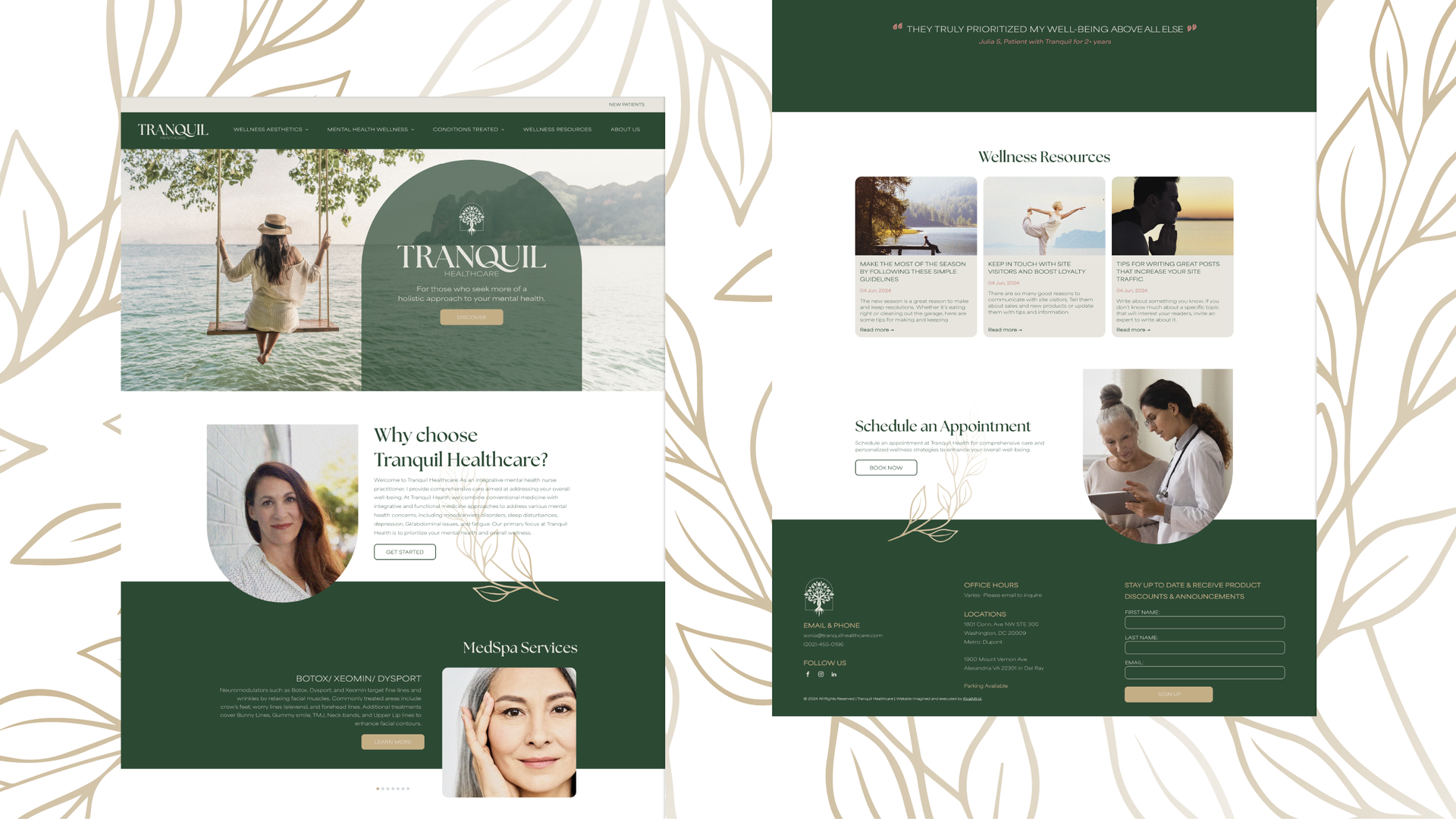
Tranquil Healthcare
Offering a diverse range of med spa services to enhance both mental and physical health, Tranquil Health Care is focused on total wellness. Their unique approach is very personalized and combines mental health care with functional and integrative medicine.
The owner came to us for an updated website that would represent their dedication to fostering a caring, supportive space where clients can explore various therapies and treatments aimed at improving their overall health.
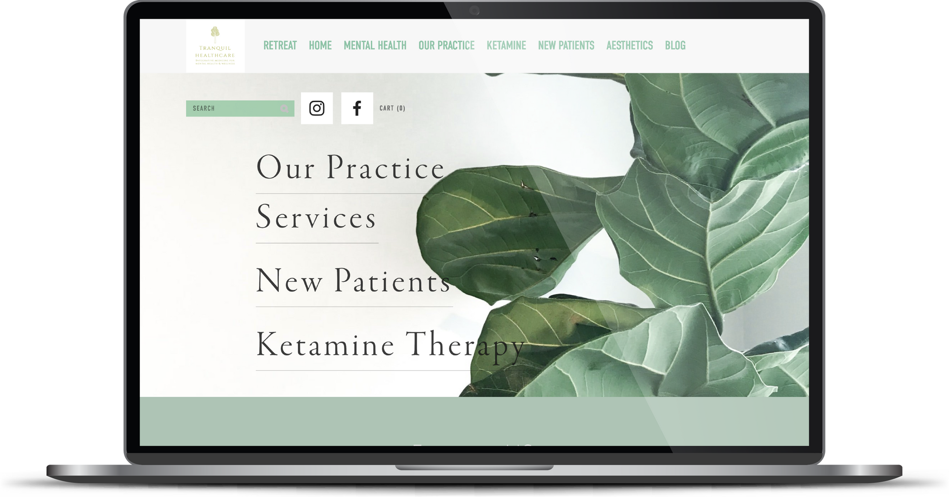
There was also a need to provide users with an easier way to navigate and explore options, highlighting the many clients receive customized and comprehensive care. And finally, like most businesses, the overarching goal was to increase profitability by making meaningful connections with customers looking for services.
Built & Hosted using

Elegant, Fresh, and Approachable
Logo Design / Website Design
Our Approach
Our Approach
Calm, captivating
and relatable
This client was presented with two strong concepts, both clarifying the brand through a more modern lens. One was bold and contemporary. The other was serene and professional. The owner was drawn to the more tranquil concept and our creative team was ready to run with it.
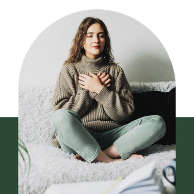
The addition of delicate fonts, striking colors, and overlapping sections further refined the brand identity. Images were carefully selected to reflect the diverse range of clientele, with a particular focus on middle-aged
to older women. By incorporating visuals that showcase a variety of backgrounds and lifestyles, the imagery not only appeals to the target demographic, but also underscores the inclusivity and broad appeal of the brand.
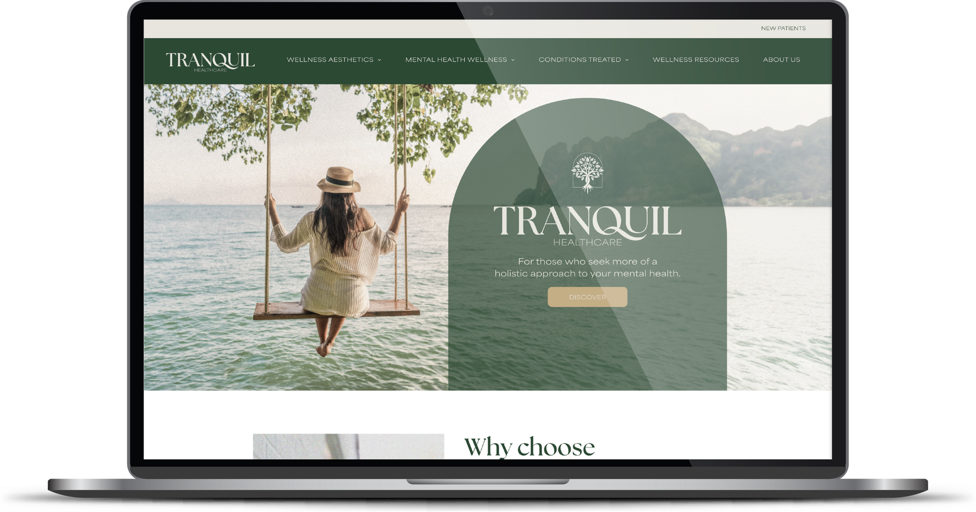
Polished and aesthetically pleasing, the website has an inviting atmosphere that is both welcoming and professional. The re-organized navigation now provides the user with the ability to navigate to different services and see options in a clear and compelling design.


The Results
In our creative way, we gave this client the customized and comprehensive care she values!
The new website includes the elegance she envisioned, while seamlessly blending a sense of calm with dynamic visual appeal. Website visitors now feel welcome and find an intuitive path to explore services in a serene environment that perfectly encapsulates what Tranquil Health Care offers.
Before & After
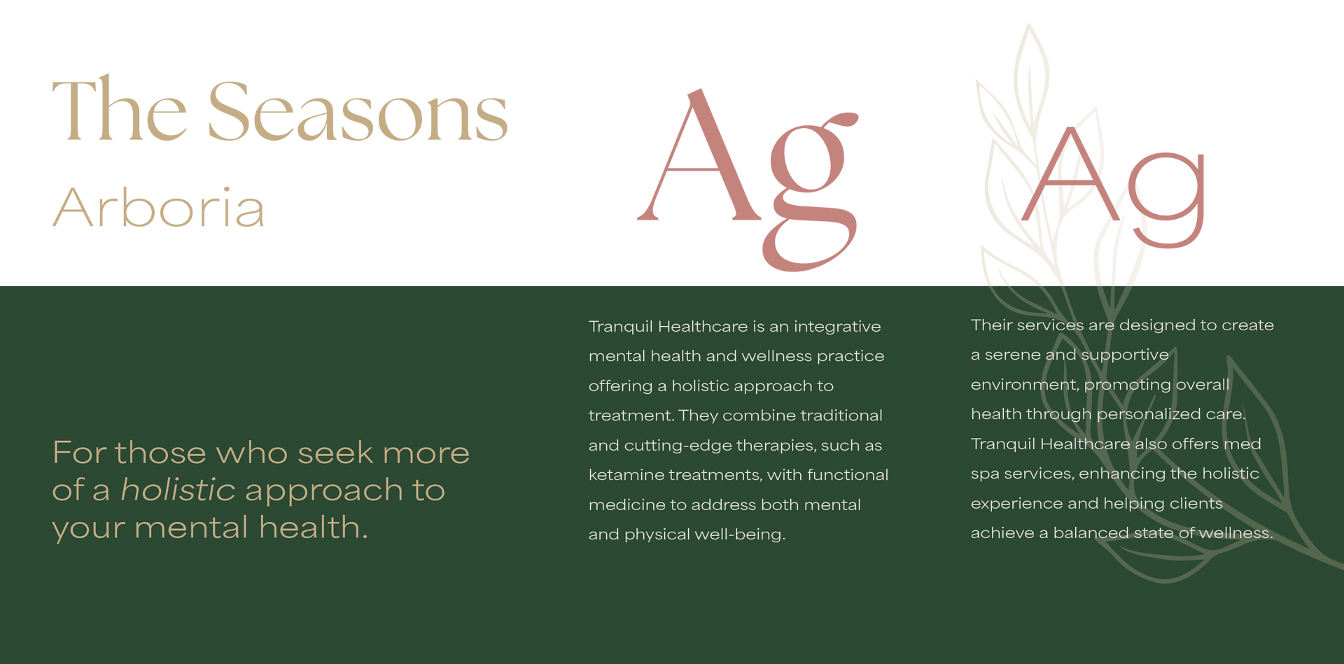
Harmonious, elegant fonts.
The Seasons font was an ideal choice for the main headers, as its elegant, organic serifs perfectly align with the brand's refined aesthetic. The typeface exudes a sense of timeless sophistication, which complements the overall branding. Paired with Area Extended, the design achieves a harmonious balance, as the rounded forms of Area Extended resonate with the brand’s elements, adding a touch of modernity while maintaining cohesiveness.
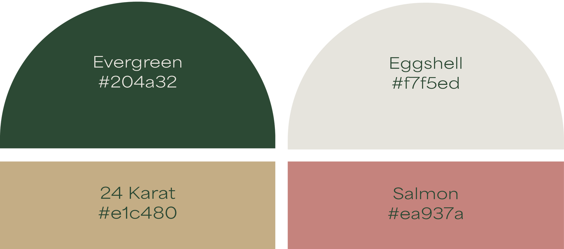
Soft, serene, sophisticated colors.
A new and fresh website should never be shocking. With this in mind, evergreen and eggshell were used to echo elements from the previous site, offering a sense of continuity and familiarity to returning visitors. 24 karat was introduced to highlight the gold leaves, providing a bold contrast against the evergreen shade. Salmon was chosen to infuse a touch of brightness into smaller design elements, helping to balance the overall palette. The combined color scheme is tranquil, approachable, and comfortably sophisticated.
Staff Spotlight
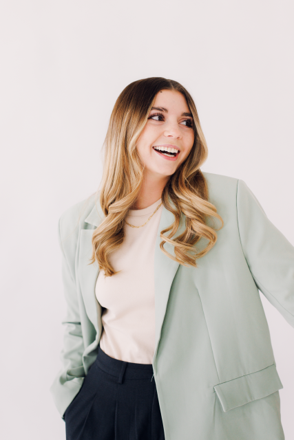
Alexis Camp showcases her talent by crafting a diverse array of elements, ranging from captivating graphics to dynamic website designs. Rooted in her unwavering passion for design, Alexis's approach embodies a commitment to exploration, constantly seeking to push the boundaries of creativity. With an appetite for innovation, she pursues fresh perspectives and original concepts, ensuring that every project she undertakes resonates with creativity and excellence.
Specialties: Duda Web Development, Illustration, Logos/Branding
More Case Studies
We love to share our clients’ successes! A quick review shows our extensive experience across diverse industries and our talent for aligning with a multitude of styles and branding guides. The one commonality you’ll see? Our ability to bridge the gap between marketing and business growth through innovative and custom design. This is why companies come to us.

Contact Us
It's time to grow your business.
Tranquil Healthcare Web Design Portfolio Contact Form
We will get back to you as soon as possible.
Please try again later.