Nonprofit Pregnancy Resource Center
Women's Resource Clinic
Women’s Resource Clinic came to RivalMind with a clear heart for service but without the visual identity or digital foundation to fully support their mission. As a nonprofit, medically licensed pregnancy resource center serving women and families in Chico, California, their work depends on trust, approachability, and clarity. They needed a brand and website that reflected the care they provide while guiding visitors toward confident next steps.
Built & Hosted using

Clear, Reliable, Contemporary
SEO / Website Development
Our Approach
Striking yet approachable aesthetic
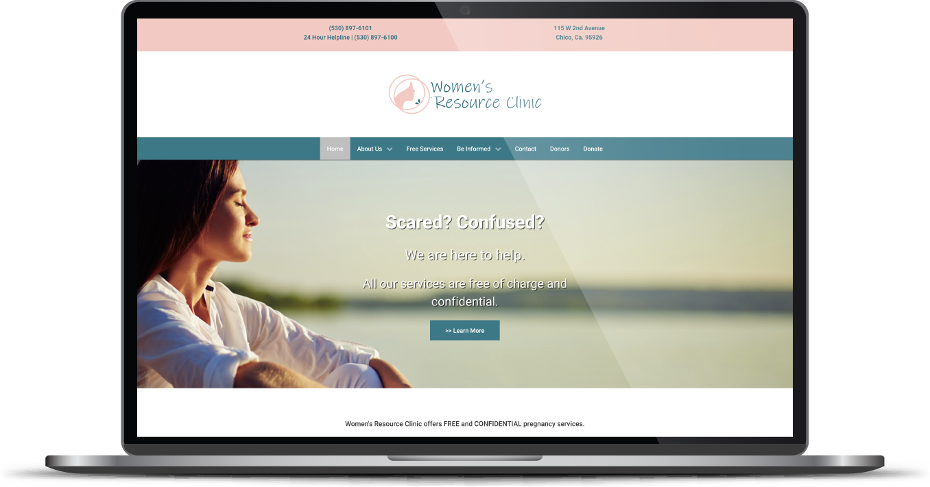
The Women's Resource Clinic challenge was not a lack of impact, but a lack of structure to communicate it. Without an updated logo or fully functioning website, potential clients and donors struggled to immediately understand who they were and how they could help.
RivalMind stepped in and we began by clarifying the brand from the inside out, defining a visual and messaging foundation rooted in compassion, dignity, and community. From there, we designed a new logo, developed a cohesive brand aesthetic, and built a fully strategized website that balanced education, support, and conversion. Every decision was made with their primary audience in mind, particularly young women ages 15 to 25 seeking clear, respectful information about their options.


The Results
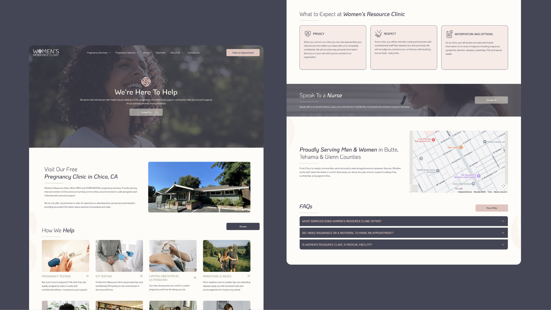
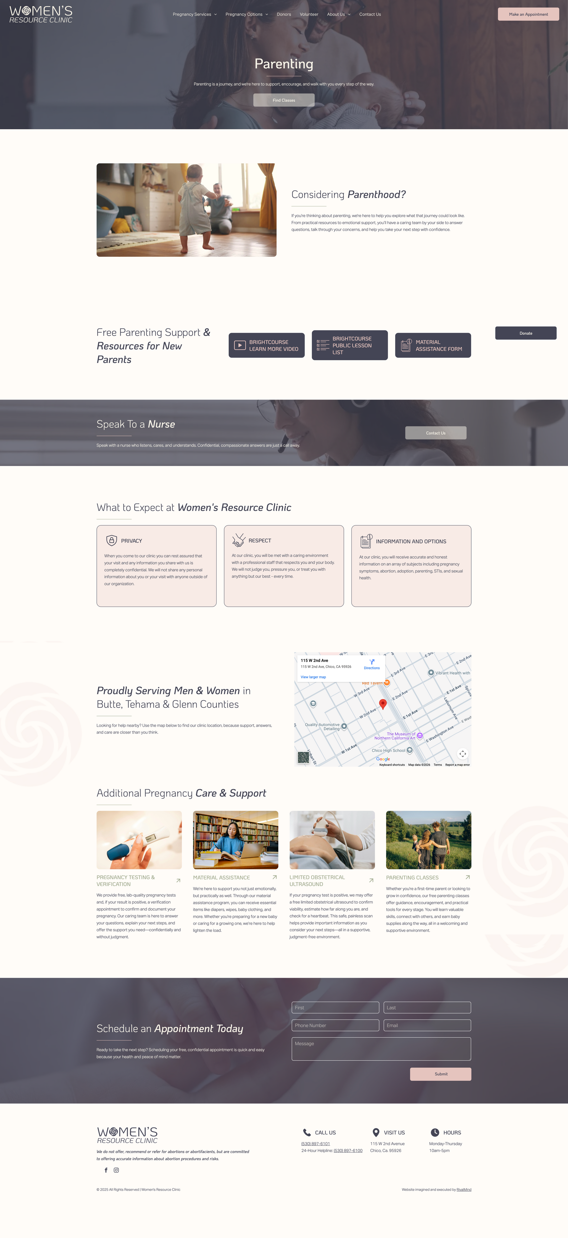
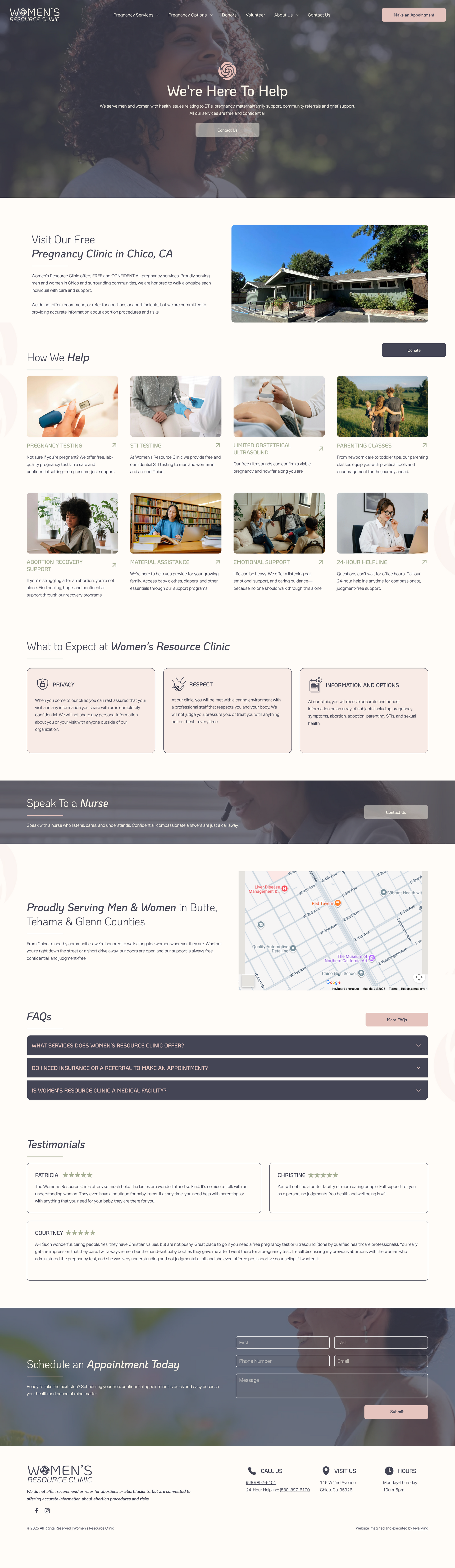
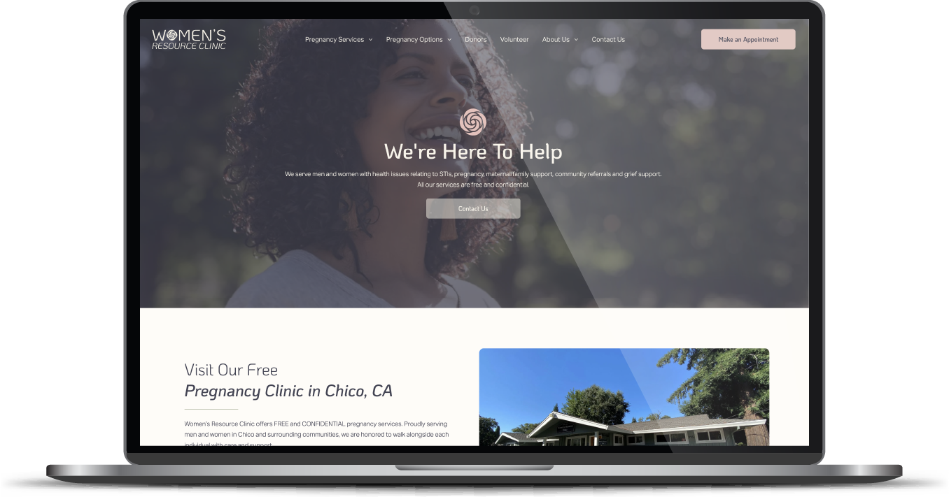
The finished website delivered a soft, welcoming, and delicate experience that mirrors the in-clinic environment. Navigation was simplified and thoughtfully structured, including the integration of the donor portal alongside client-facing content to create unity across audiences. The new design improved user engagement, strengthened credibility, and gave the organization a digital presence they felt proud to extend into their physical space.
Most importantly, Women’s Resource Clinic now has a brand and website that support their long-term goal of increasing conversions while continuing to serve their community with care.
Before & After
Logo concept
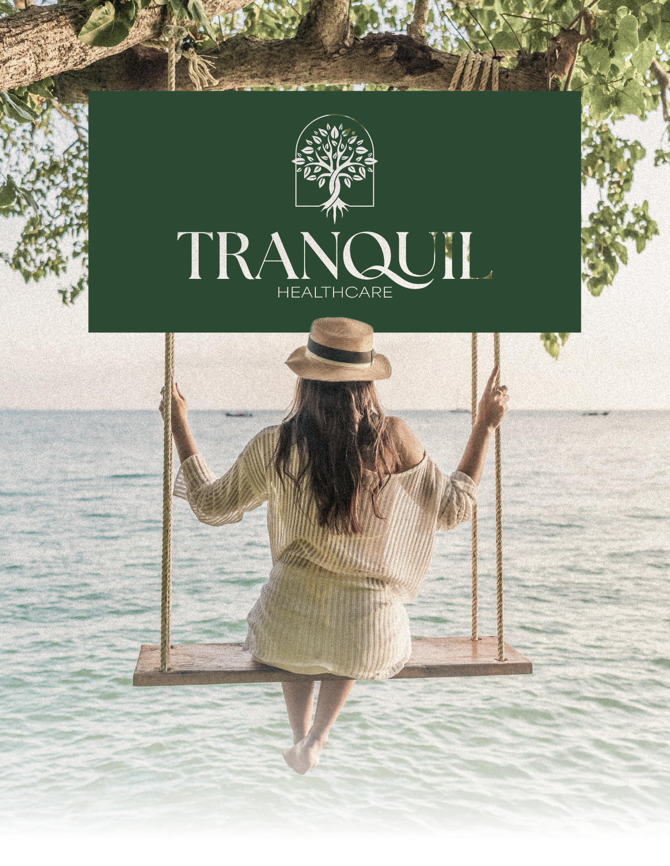
The logo was created from the ground up and became the cornerstone of the brand. A rose motif was selected to honor Chico’s identity as the City of Roses while symbolizing the heart of Women’s Resource Clinic’s mission. Each petal represents the layers of care, education, and resources offered to individuals navigating deeply personal decisions. The result is a mark that feels gentle, meaningful, and grounded in place.
Organic and friendly font.
Typography played a key role in balancing warmth with clarity. Koho was chosen as the primary typeface for its organic qualities and subtle petal-like forms that echo the rose motif. Aktiv Grotesk was paired alongside it for its clean, neutral structure, ensuring accessibility and readability across all devices while supporting a wide audience.
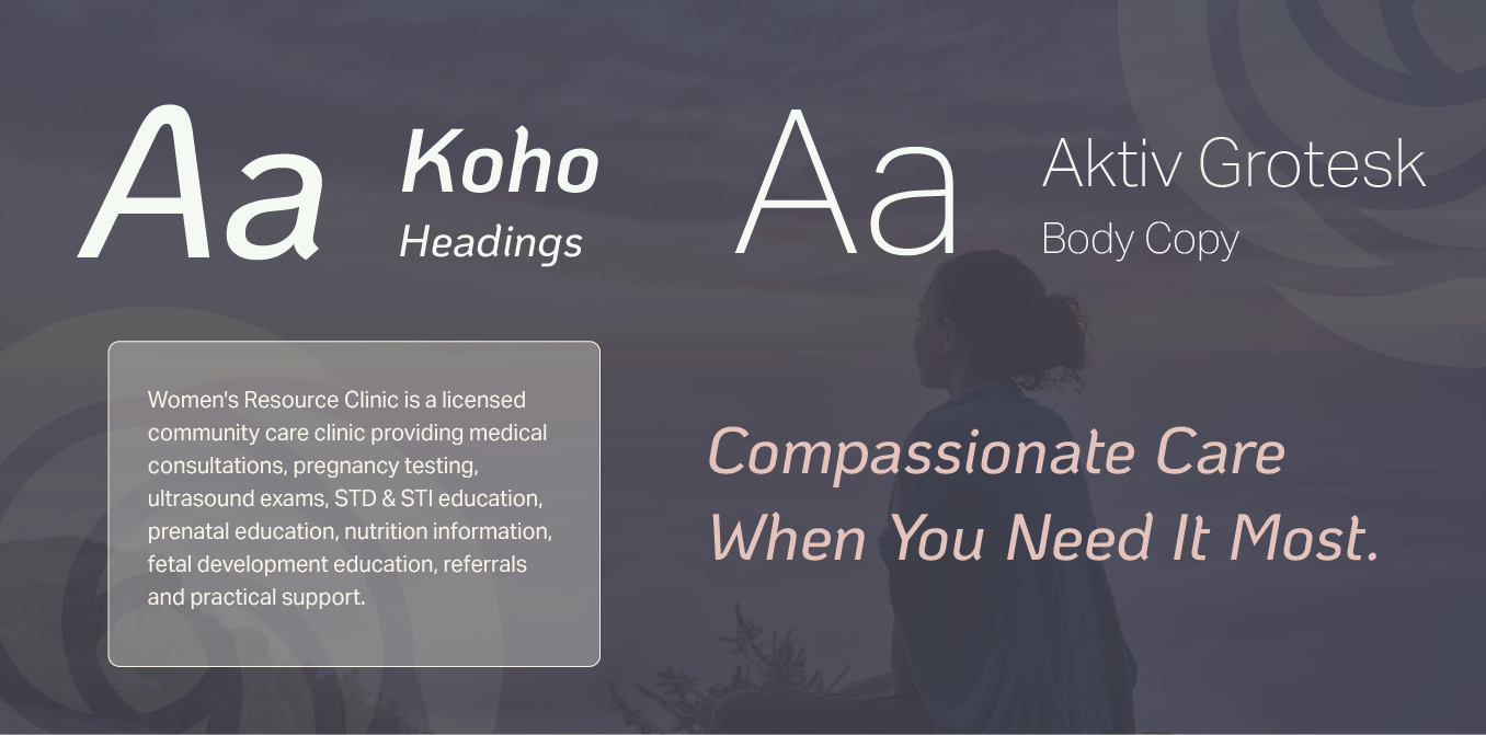
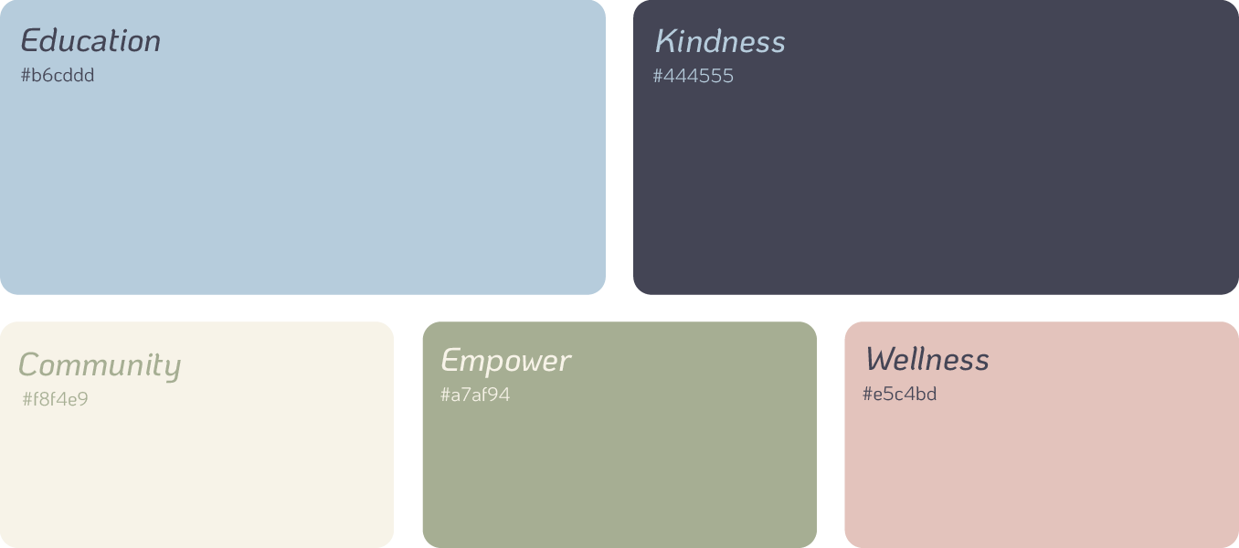
Tranquil colors with a modern touch.
The color palette was inspired by the client’s desire for calm and approachability. Soft pastel tones of pink, blue, and green create a sense of compassion and ease, while richer violet and warm cream add depth, trust, and professionalism. Together, these colors reinforce a safe, welcoming environment for clients and supporters alike.

Staff Spotlight
Alexis Camp showcases her talent by crafting a diverse array of elements, ranging from captivating graphics to dynamic website designs. Rooted in her unwavering passion for design, Alexis's approach embodies a commitment to exploration, constantly seeking to push the boundaries of creativity. With an appetite for innovation, she pursues fresh perspectives and original concepts, ensuring that every project she undertakes resonates with creativity and excellence.
Specialties: Duda Web Development, Illustration, Logos/Branding

More Case Studies
Every organization has a story worth telling. If you would like to see how RivalMind helps nonprofits, healthcare providers, and service-driven brands clarify their message and grow with purpose, explore our other case studies or schedule a conversation with our team.
Contact Us
It's time to grow your business.
Women's Resource Clinic Web Design Portfolio Contact Form
We will get back to you as soon as possible.
Please try again later.