Concierge Medicine
TrueCare Concierge
A Healthier Brand Presence Starts Here. Designed to Attract Patients, Built to Earn Their Trust.
TruCare Concierge entered the market with a clear vision but no digital footprint. As a new concierge medicine practice, Dr. Gabrielle Navon did not just need a website. She needed a presence that felt as personal as her care model and as refined as the experience she delivers.
Because in concierge medicine, first impressions are not made in the exam room. They happen online.
Built & Hosted using

Organic, Sleek, Bright
Website Design
Our Approach
From Vision to Patient Experience
Starting from scratch can be a challenge or an advantage. In this case, it was both.
Without an existing brand or website, TrueCare Concierge had a rare opportunity to build everything with intention. The goal was not just to look polished, but to create an experience that immediately felt different.
Today’s patients are not just searching for care. They are searching for a better experience. One where they feel heard, respected, and prioritized. Many have grown used to rushed visits and impersonal interactions, and they are ready for something more thoughtful and connected.
RivalMind helped bring that vision to life.
We defined a brand that reflects a high-touch, relationship-driven approach to care. We designed a website that guides visitors naturally from interest to
action. We also built a strong SEO foundation so the right audience can find TrueCare Concierge at the right time.
With no established brand system in place, our team created everything from the ground up. This included the logo, visual identity, and overall voice. Every element was designed to communicate trust, professionalism, and personalization.
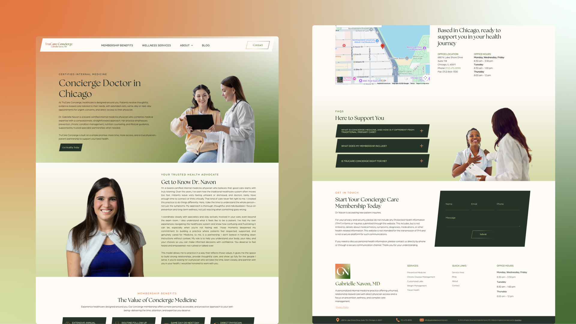
Visually, the site leans into an organic, sleek, and bright aesthetic. Soft gradients guide the eye while subtle angles introduce movement and contrast. Imagery feels natural and inclusive, reinforcing a sense of comfort and approachability.
Throughout the experience, clear calls to action help visitors take the next step with confidence. The result is a seamless journey that feels as intentional as the care itself.
A Practice That Stands Apart
The final product is more than a website. It is a strong, confident first impression that reflects the quality of care behind it.
TrueCare Concierge now has a digital presence that attracts patients seeking a more personalized healthcare experience, builds trust early in the decision-making process, and positions the practice as both premium and approachable.
Without a strategic foundation, new practices can struggle to gain visibility or communicate their value. With the right digital presence in place, TrueCare Concierge is prepared to grow, connect with patients, and build lasting relationships from the very first interaction.


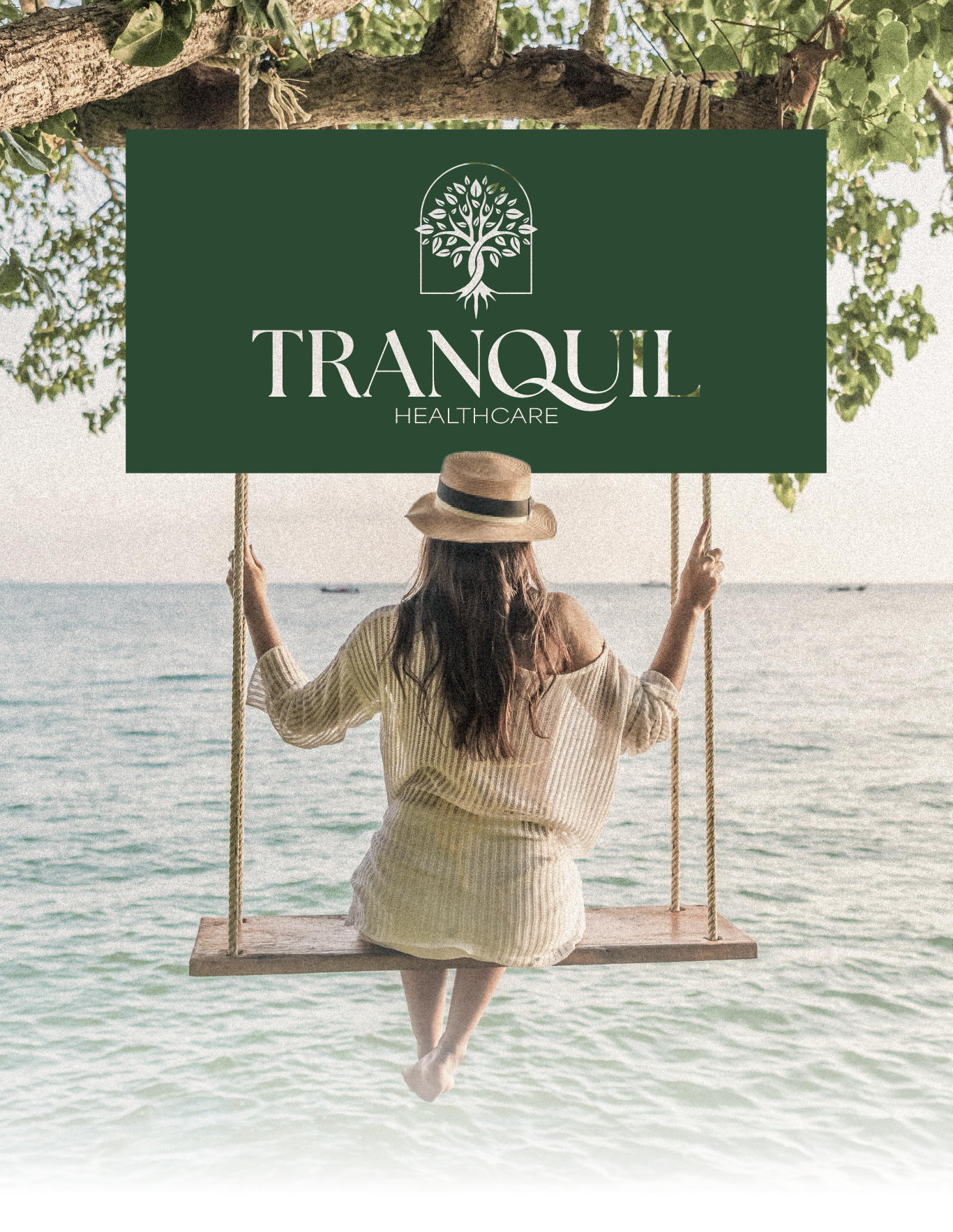
A Mark of Modern Care
A strong brand starts with a mark that feels both intentional and memorable. For TrueCare Concierge, the logo needed to reflect professionalism while still feeling personal and approachable. It had to signal trust at a glance while aligning with the warmth of the overall brand experience.
RivalMind designed a logo that balances simplicity with sophistication. The mark works seamlessly across digital applications, from the website to future marketing materials, ensuring consistency as the brand grows.
Its clean, modern structure reinforces credibility, while its softer visual tone connects back to the human-centered nature of the practice. The result is a logo that feels right at home in both a medical and lifestyle context, supporting a brand that is as much about relationships as it is about care.

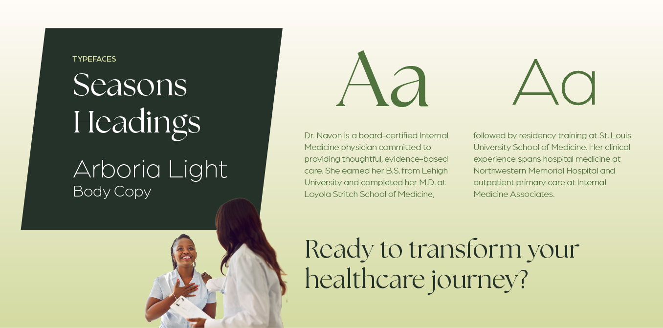
Setting the Tone, Line by Line
The Seasons font was selected for its soft, elegant character, bringing a sense of warmth and refinement to headlines. It reflects the thoughtful and personalized nature of the care experience.
Arboria was chosen as a complementary typeface for its clarity and strength. It ensures content is easy to navigate while maintaining a clean and modern feel.
Together, these typefaces create a balanced system that feels both refined and accessible.
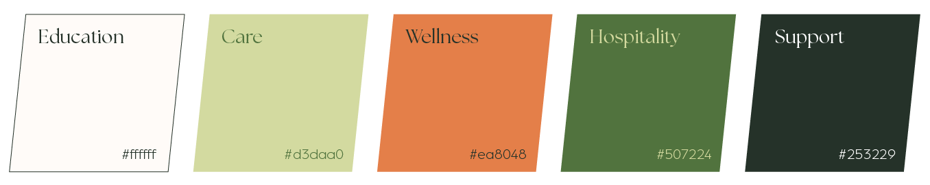
Designed to Feel Different
The color palette was designed to move away from the cold, clinical feel often associated with healthcare.
Soft greens establish a sense of wellness, vitality, and balance. These tones create a calming foundation that aligns with a more holistic and patient-centered approach.
Accents of orange introduce warmth and energy, reinforcing a sense of human connection and approachability. This combination helps communicate that the experience is not only professional, but also personal.
The result is a visual identity that feels inviting, distinctive, and aligned with the brand’s focus on meaningful care.

Staff Spotlight
Designed by Alexis Camp
Alexis Camp showcases her talent by crafting a diverse array of elements, ranging from captivating graphics to dynamic website designs. Rooted in her unwavering passion for design, Alexis's approach embodies a commitment to exploration, constantly seeking to push the boundaries of creativity. With an appetite for innovation, she pursues fresh perspectives and original concepts, ensuring that every project she undertakes resonates with creativity and excellence.
Specialties: Duda Web Development, Illustration, Logos/Branding


More Stories, More Results
Every brand has a story to tell, and the right strategy brings it into focus.
Explore more
RivalMind case studies to see how we help organizations build clarity, strengthen their digital presence, and turn thoughtful design into measurable growth.

Contact Us
It's time to grow your business.
TruCare Concierge Web Design Portfolio Contact Form
We will get back to you as soon as possible.
Please try again later.