Transportation & Logistics
K2 Transportation
K2 Transportation came to RivalMind to establish a brand and digital presence that reflects their expertise in temperature-controlled trucking while presenting the company as approachable and dependable. As a logistics partner focused on connecting reliable carriers with businesses that require precise temperature management, trust and clarity are central to their reputation.
Without a defined brand system in place, the project began with an exploration of visual directions that could capture both professionalism and approachability. Our team identified an opportunity to build a friendly, recognizable identity supported by thoughtful design choices that communicate reliability, industry knowledge, and operational confidence across every page of the site.
Built & Hosted using
Approachable, Rounded, Experienced
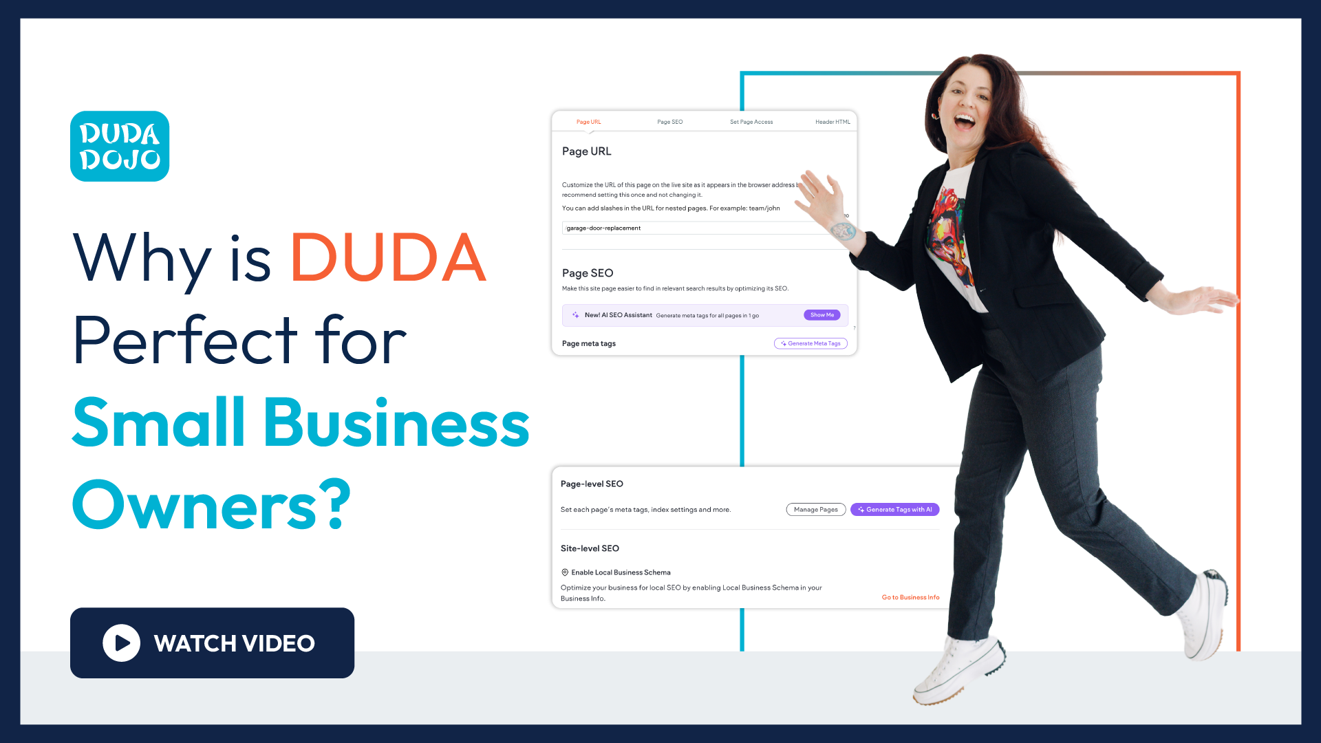
Website Design / SEO
Our Approach
Mapping the route
To establish the right direction, our design team developed six distinct creative concepts. Each explored different color palettes, typography pairings, imagery styles, and logo approaches. This process allowed the client to evaluate multiple brand personalities before selecting a concept that felt both approachable and professional.
The chosen direction features softer visual elements and rounded forms that mirror the reliability and consistency K2 brings to transportation partnerships.
Because the company specializes in temperature-controlled freight, we designed the visual identity to subtly reference temperature management through the logo and supporting graphics.
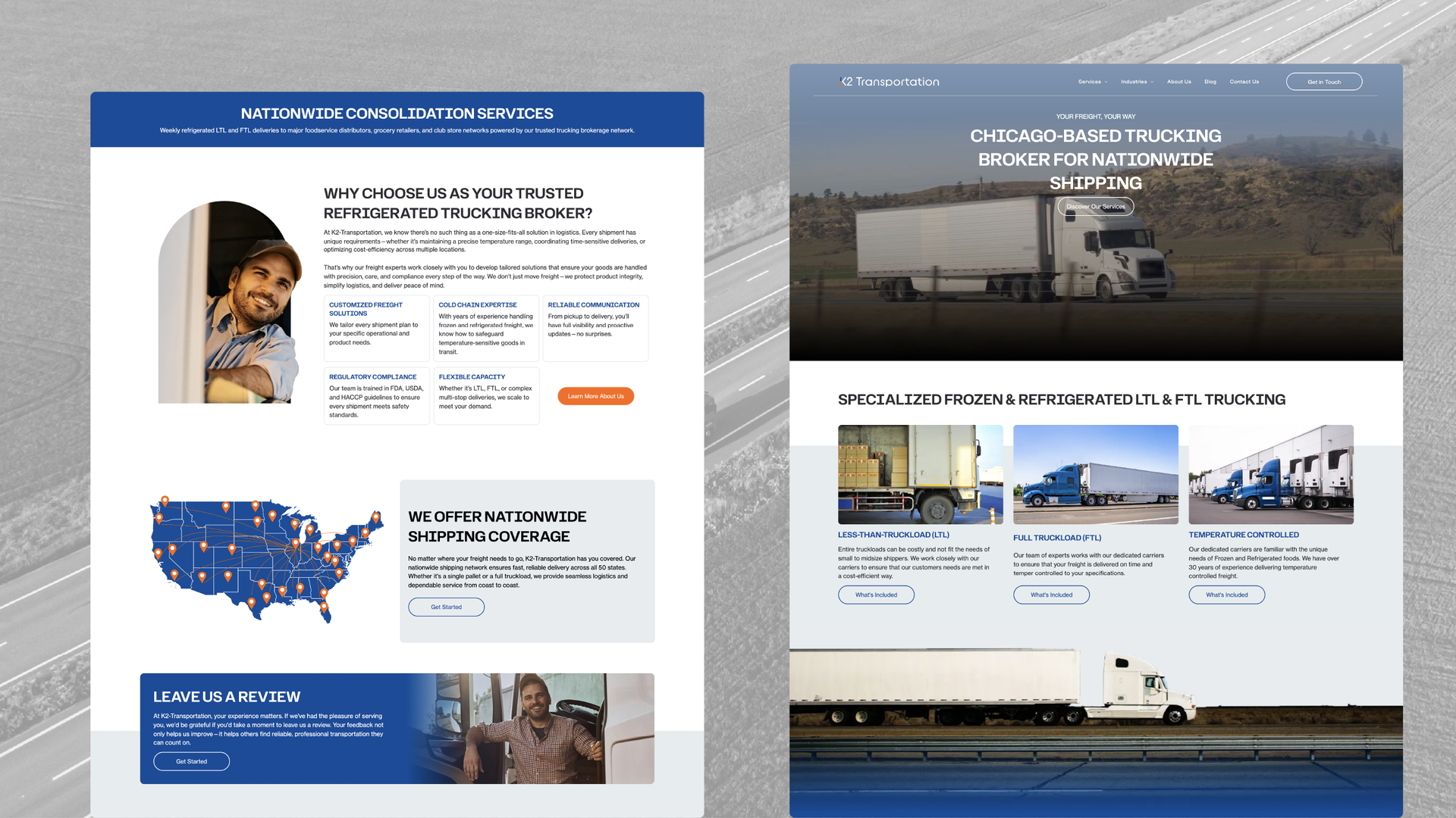
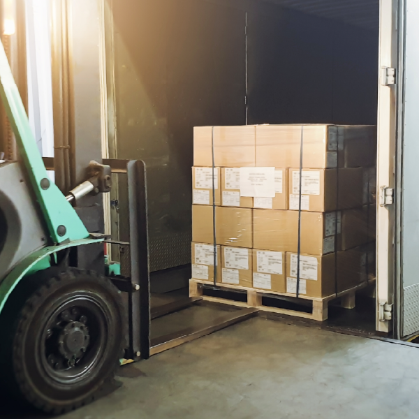
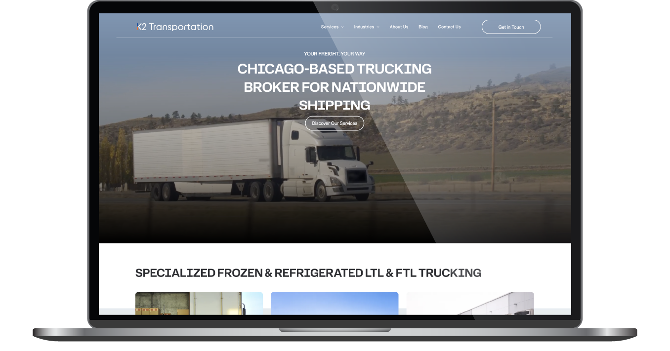
Throughout the site, people-focused imagery reinforces the company’s role as a trusted connector between shippers and carriers. Images of trucks and logistics operations highlight the scale and capability of their network, while thoughtful layouts keep the experience easy to navigate for prospective partners.


Results
The new K2 Transportation website provides a clear and cohesive foundation for the company’s growing brand. The visual identity communicates trust, reliability, and expertise while remaining approachable for potential partners exploring the company’s services.
Clean layouts, people-focused imagery, and a thoughtful typography system support readability and clarity throughout the site. The new logo and color palette introduce a recognizable brand system that can extend beyond the website into marketing materials and future growth initiatives.
The finished platform positions K2 Transportation as an experienced logistics partner with a friendly, professional presence. It reflects their commitment to dependable service and strengthens the way they present their temperature-controlled transportation expertise to new customers and carriers alike.


Before & After
Where the Brand Meets the Road
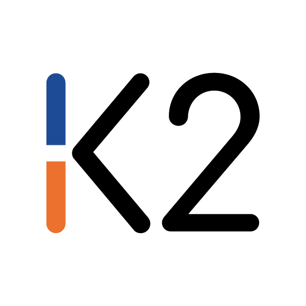
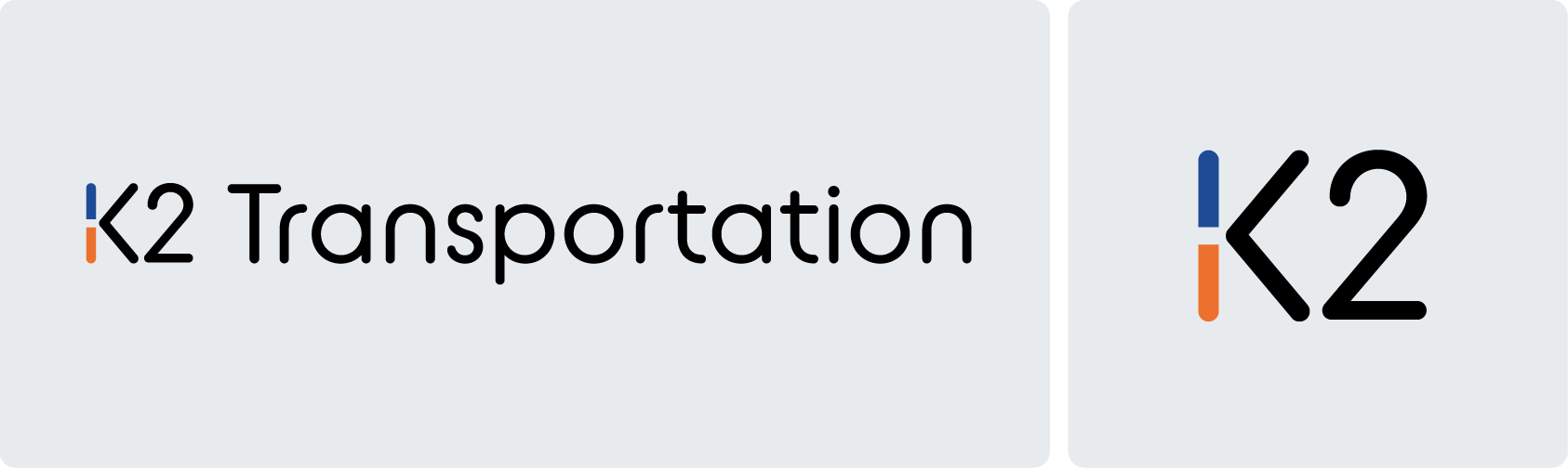
Because K2 Transportation did not have an existing logo, our team developed several concepts that visually captured their specialization in temperature-controlled trucking. This allowed the K2 Transportation team to try on different identities before selecting their new BLANK.
The selected design features smooth, rounded shapes that echo the site’s overall visual language. Its form subtly references the appearance of a hot-and-cold thermometer, reinforcing the company’s expertise in managing temperature-sensitive freight. The final mark balances simplicity with meaning, giving the brand a distinctive and memorable identity.
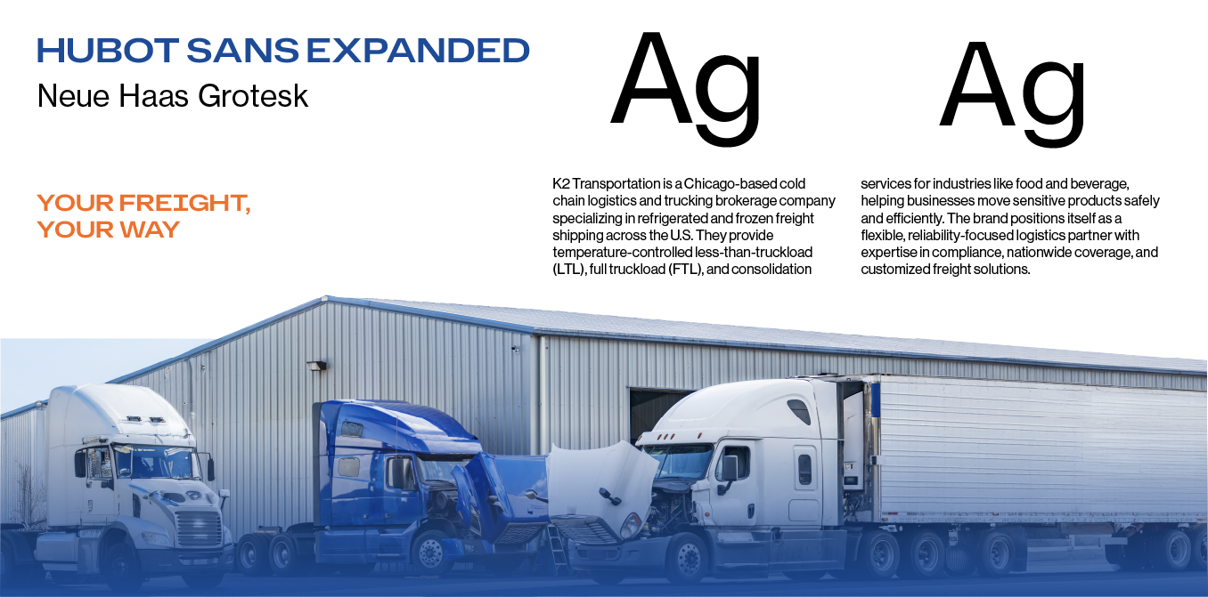
Heading in the (write) direction
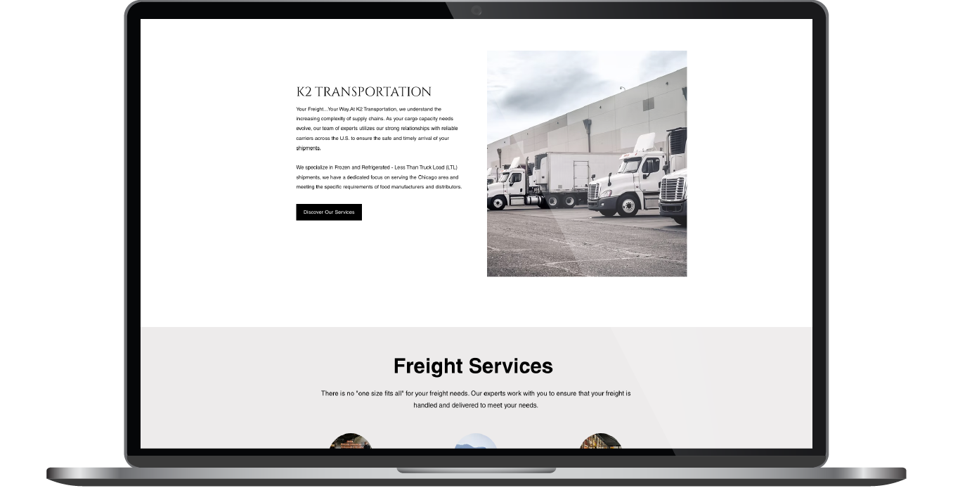
Typography plays a key role in reinforcing the brand’s approachable tone. Headlines use the Urbane Rounded typeface, whose soft edges align with the rounded visual language established in the logo and graphic elements.
For body copy, we selected Neue Haas Grotesk. This classic Grotesk typeface is known for its clarity and balance, making it an ideal choice for longer content and information-heavy sections. Its clean structure supports readability across devices while maintaining a professional appearance that suits the transportation and logistics industry.
Together, these typefaces create a visual rhythm that feels friendly, organized, and easy to follow.
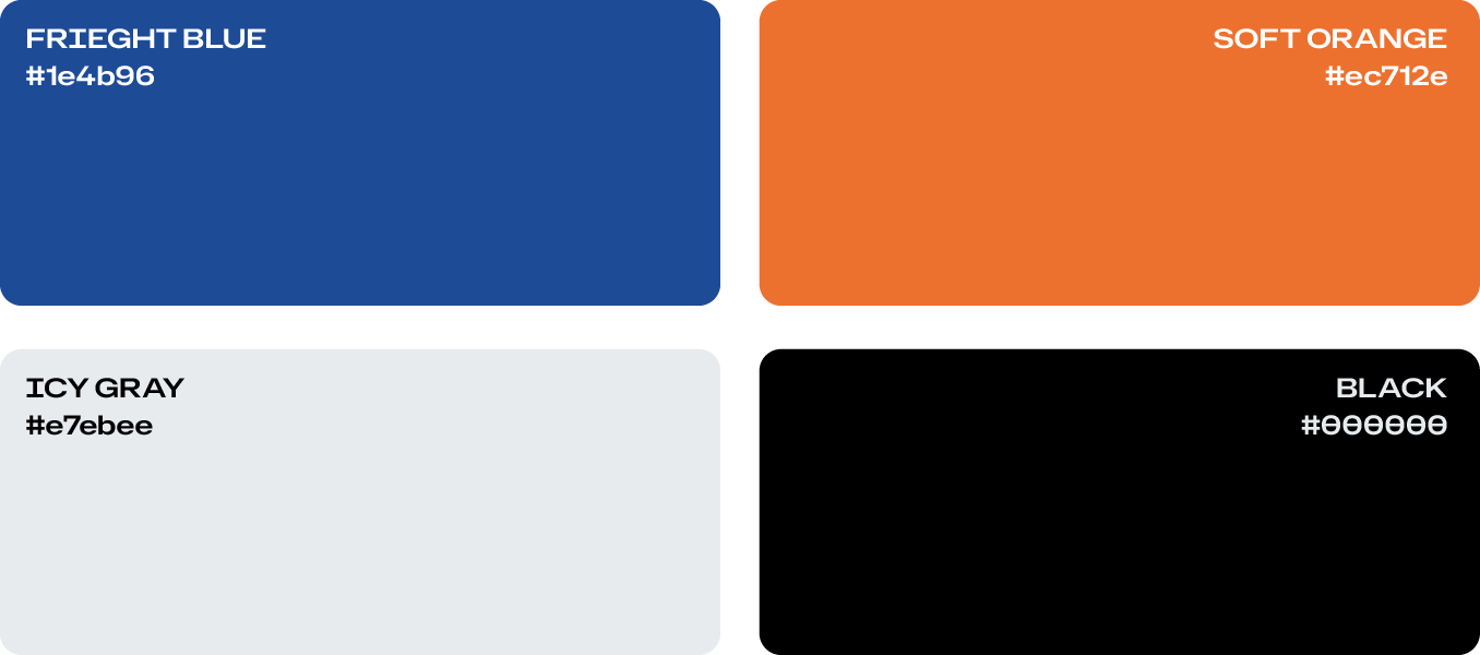
Color in motion
The color palette was designed to communicate reliability while maintaining a welcoming tone. Bright blue serves as the primary anchor, reinforcing trust, stability, and professionalism within the logistics space.
Soft orange introduces warmth and energy without overwhelming the layout. The tones were intentionally kept slightly muted rather than highly saturated, allowing the design to remain approachable and comfortable to navigate.
Neutral shades support the palette and provide balance throughout the site. Together, these colors create a cohesive system that highlights important content while maintaining a calm, confident presence across the interface.

Staff Spotlight
Designed by Krystyanna Joseph
Krystyanna Joseph is the driving force behind groundbreaking website designs at RivalMind. Her approach is defined by a relentless pursuit of innovation, fueled by a deep commitment to research, boundless creativity, and an unwavering dedication to pushing the boundaries of her skills and perspectives. With every project, she sets the bar higher, ensuring that RivalMind remains at the forefront of cutting-edge design and client satisfaction.
Specialties: Duda Web Development, Animation/Motion Design
More Case Studies

Contact Us
It's time to grow your business.
K2 Transportation Web Design Portfolio Contact Form
We will get back to you as soon as possible.
Please try again later.