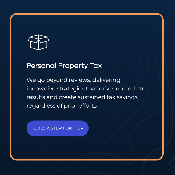
Tax & Accounting Services
Baden Tax Management
Baden Tax came to us with a clear ask: take their strong existing brand and evolve it into something more timeless.
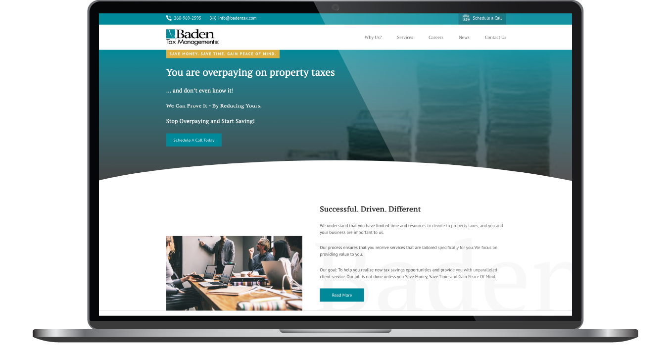
Their previous website wasn’t pulling its weight. It lacked the clarity, structure, and professionalism that clients expect from a high-level tax advisory firm. And in a field where precision matters and presentation speaks volumes, Baden needed a website that reflected the care they bring to every financial decision.
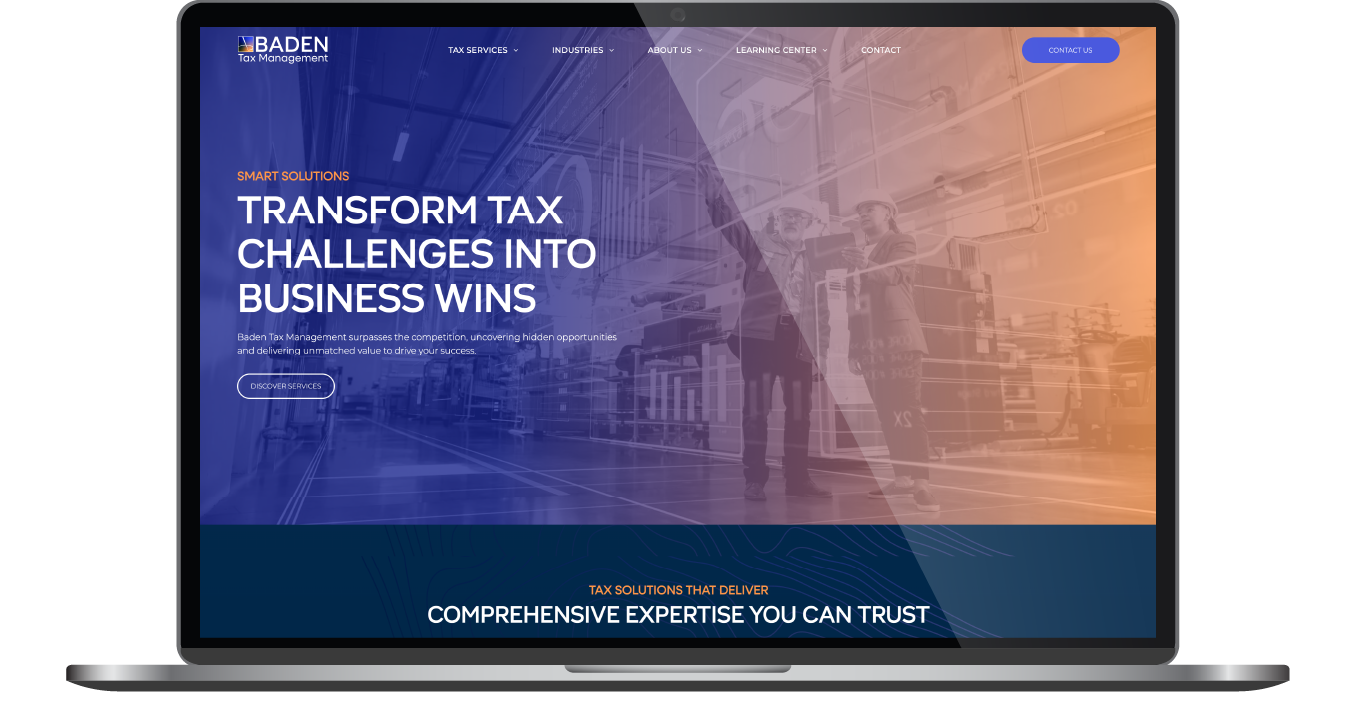
They weren’t looking for reinvention. They needed refinement. The result is a sleek, modern website that carries authority, supports search visibility, and puts their expertise front and center.
Built & Hosted using

Clear, Reliable, Contemporary
Logo Design / Website Design / SEO
Our Approach
Highlighting genuine integrity and effectiveness
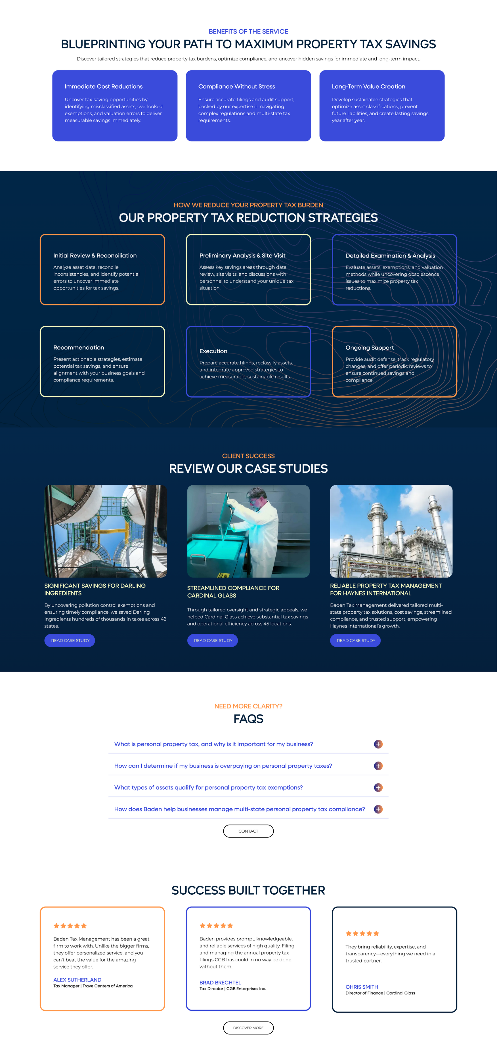
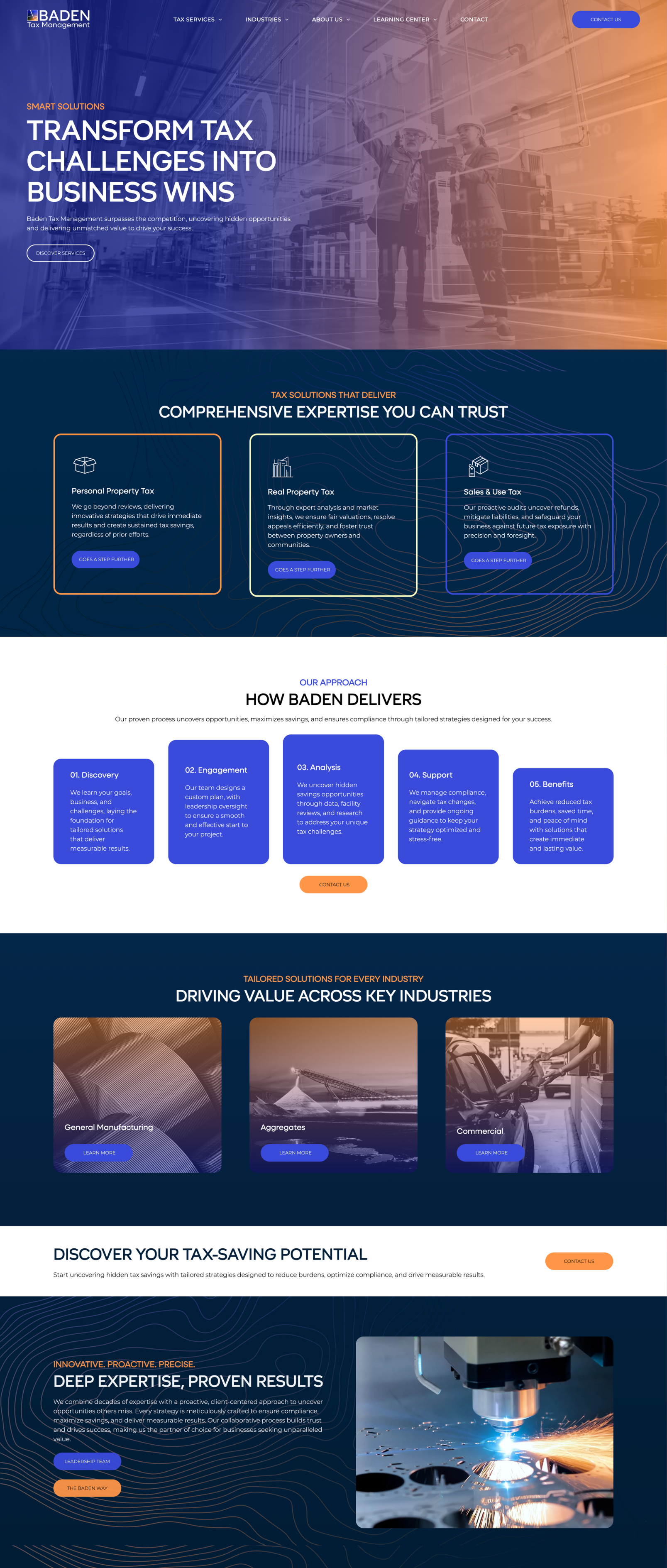
Our team approached this project the same way Baden approaches a balance sheet: methodically, with a sharp eye for detail and no room for clutter. The foundation was already solid, but the firm needed a site that worked harder visually, structurally, and strategically.
We started with a refined color palette and font system that matched the brand’s tone: modern, professional, and built to last.
From there, we restructured the site architecture around service clarity and search performance. Keyword research informed every decision, helping Baden highlight what mattered most to clients and show up where they previously fell flat.
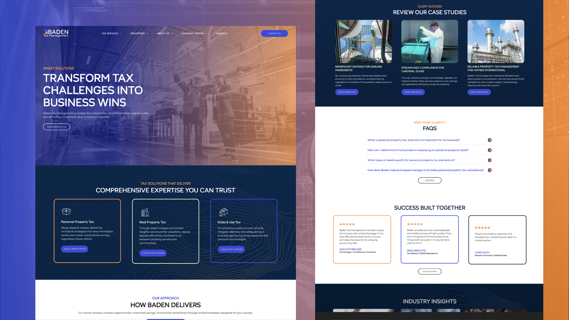
The Results
The updated Baden Tax site delivers on clarity, usability, and business function. Visitors now experience a streamlined path to services, with intuitive navigation that reflects how clients think (and not how firms typically organize).
The refreshed typography and color system shape the site’s tone without overcomplicating it, helping the brand feel modern without losing trust. Internally, the Baden team gained more control over updates and messaging, removing the friction of site edits.
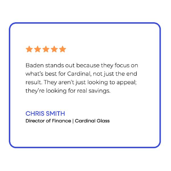
Externally, the response has been measurable. They’re already experiencing more page engagement, stronger lead quality, and a noticeable lift in initial client confidence.
Before & After
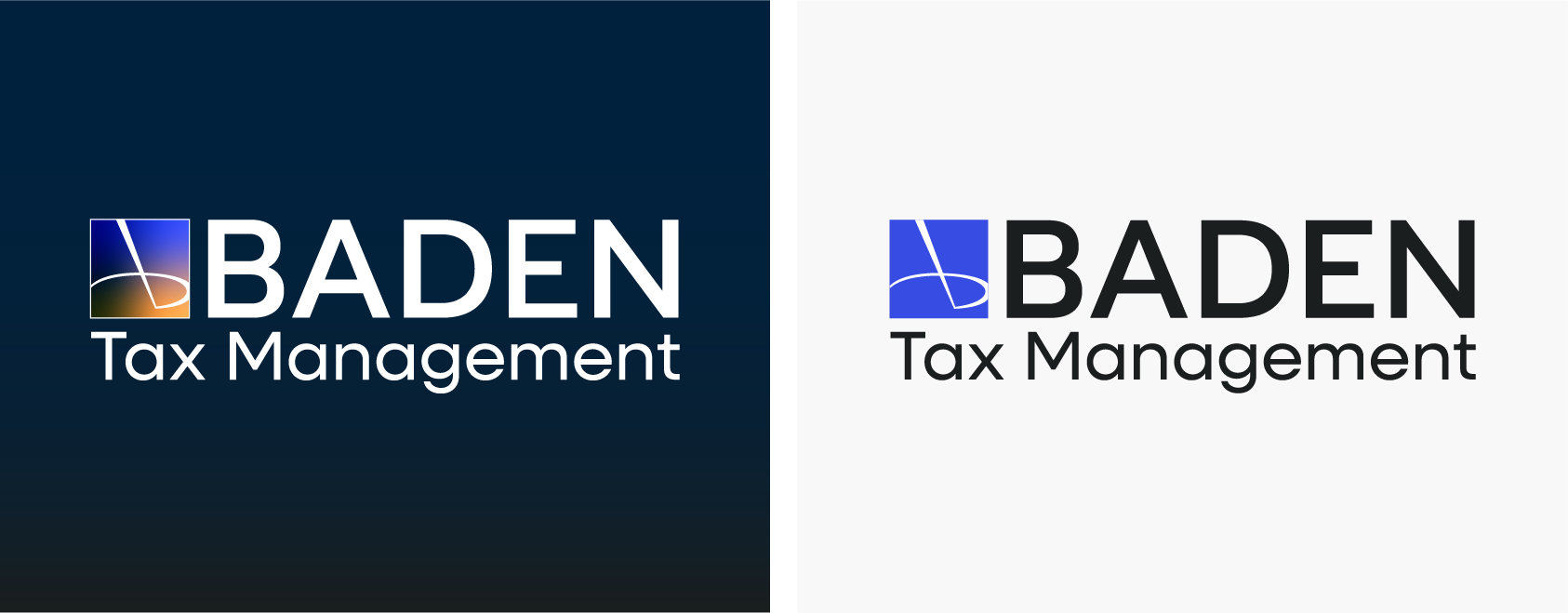
Bold, industrial logo.
Baden Tax entered the project with a strong logo that aligned well with their brand identity, so a full redesign wasn’t necessary. Instead, our team focused on refining the color treatment to better support the updated visual system. The new palette gave the logo a more modern, polished feel.
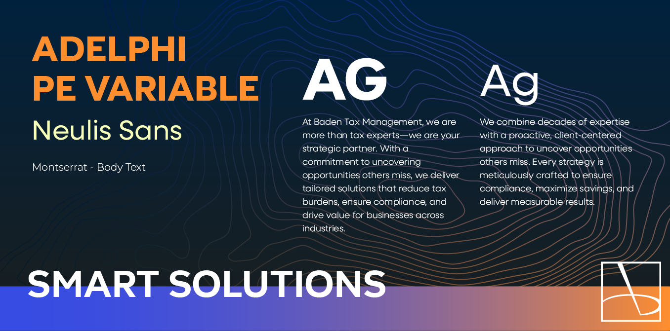
Simple but bold font.
Montserrat serves as the structural backbone. It's clean, geometric, and easy to read across multiple devices. Neulis Sans brings a sleeker, more modern edge to supporting text. It helps soften the overall tone without losing the firm’s credibility. For added character, Aldephi PE Variable introduces just enough refinement in key moments. Its subtle curves and polished feel give headlines and key messaging a tailored quality.
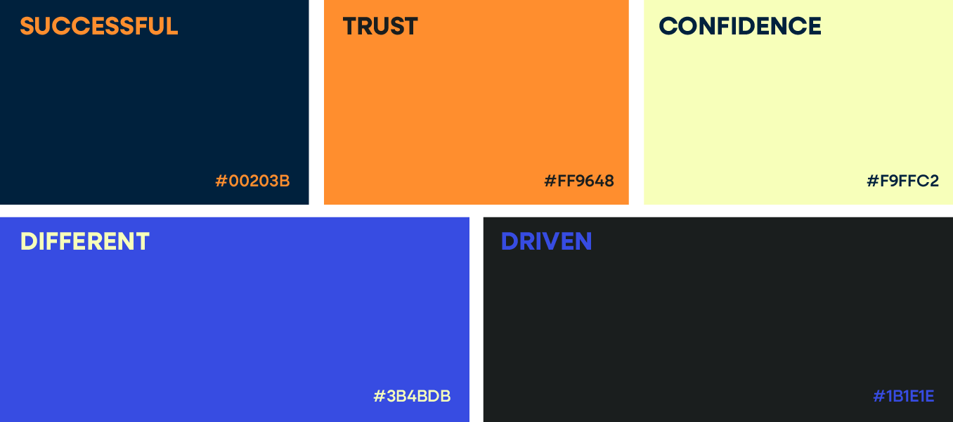
High-contrast color scheme.
Deep blues dominate the foundation, anchoring the brand in a sense of trust, professionalism, and calm authority. It’s a palette commonly associated with financial expertise, but here, it’s elevated through strategic restraint and thoughtful contrast. Instead of leaning into flat corporate tones, gradients add depth, which gives the site a more modern, dimensional feel.
Accents of orange and yellow provide balance. These warmer notes act as subtle attention cues, guiding the eye without overwhelming the message. It’s not flashy. It’s focused. Together, they suggest energy, accessibility, and a client-first attitude, all while staying firmly within a professional spectrum.

Staff Spotlight
Alexis Camp showcases her talent by crafting a diverse array of elements, ranging from captivating graphics to dynamic website designs. Rooted in her unwavering passion for design, Alexis's approach embodies a commitment to exploration, constantly seeking to push the boundaries of creativity. With an appetite for innovation, she pursues fresh perspectives and original concepts, ensuring that every project she undertakes resonates with creativity and excellence.
Specialties: Duda Web Development, Illustration, Logos/Branding
More Case Studies
We work across an expanse of projects at RivalMind, and we love to share our clients’ successes. For each case study, our goal is the same: bridging the gap between marketing and growth through innovative and custom design. This is why companies come to us. Dive into more of our favorite web design projects below!
Contact Us
It's time to grow your business.
Baden Tax Web Design Portfolio Contact Form
We will get back to you as soon as possible.
Please try again later.