
Is My Website Mobile Friendly?

Now more than ever, ensuring that your website is mobile friendly is critical. Why?
First, because over 60% of internet searches are completed on mobile devices. This means that if your website is not visually appealing and usable on mobile devices, you’re easily missing out on over half of all Google searches.
Beyond this, mobile friendliness is one of Google’s five page experience signals that affect website rankings.
Finally, Google switched to mobile-first indexing for all websites in 2019. This means that Google crawls the mobile version of your website for indexing and ranking. Mobile friendly sites are built with the mobile user in mind, and Google rewards this.
So, is YOUR website mobile friendly? Keep reading for a few free tools to answer this questions and a few tips for improving your site’s mobile friendliness.
The Easiest Mobile-Friendly Check
Google has built a free, easy-to-use tool to determine if a page on your website is mobile friendly, aptly called the Mobile-Friendly Test.
- To use, click on the link above.
- Enter the URL of the page you want to check, and click “Test URL.”
- From here, your mobile-friendliness result will appear.
We tested one of our service pages and received the following result:
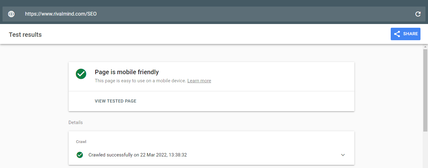
If your page is not mobile friendly, Google will provide a few reasons why.
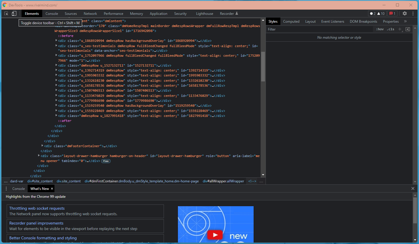
For a visual picture of how your website looks on a mobile device, use Chrome DevTools. Here’s how.
- Open your website in Google Chrome.
- Right click on the site and select Inspect. (Don’t be frightened by the DevTools popup that will appear. You didn’t just break your website.)
- Navigate to the Toggle device toolbar on the top left of the code window.
- Select Responsive or any other device model listed to see how your website appears on these devices. You may need to refresh the page to see an accurate picture of your website.
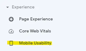
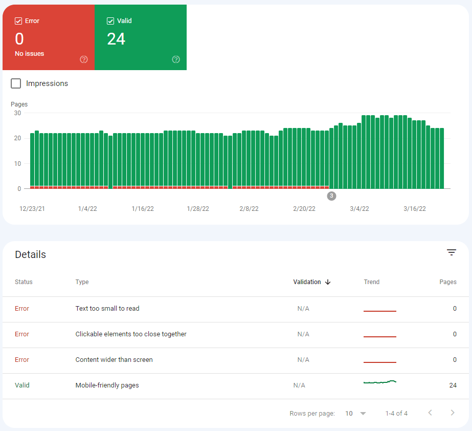
Use Google Search Console For a Site-Wide Report
Using Google’s Mobile-Friendly Test, you can check one URL at a time. However, it would take a long time to review your entire website. Google jumps to the rescue again with their Mobile Usability Report, found in Google Search Console.
Here’s how to get there!
Once in Search Console, navigate to “Mobile Usability” beneath the Experience category.
Mobile-Friendly Checklist
Another way to check (and fix) the mobile friendliness of your website is by running through a comprehensive checklist. Lists, such as the one I share below, are also extremely valuable if you’re completing a fresh website build or redesign.
Is your website responsive?
Responsive design means that your website will dynamically adjust to fit the device of the user. We recently wrote about the differences between responsive and unresponsive websites, exploring just why it is so important. Beyond mobile-friendliness, responsive websites tend to heighten conversion rates, provide a better user experience, and improve SEO efforts.
Is your website fast?
Google users expect very fast load speeds. “Very fast” is no exaggeration. Neil Patel once said, “If you don’t have a fast website, people will bounce faster than you can say ‘conversions.’”
Internet users expect their pages to load in 3 seconds or fewer, especially on mobile devices, attaching load speed irrevocably to mobile friendliness. SEMrush claims that a good page load time goal should be 1-2 seconds.
Once again, Google has a simple, helpful tool to diagnose page speed. PageSpeed Insights allows users to input a URL, analyze, and receive a score. Toggle between mobile and desktop speeds.
Some of the results you’ll see in your PageSpeed scorecard – such as First Contentful Paint (FCP) and First Input Delay (FID) – have become important elements of website optimization, since Google’s 2021 Core Web Vitals Update. They’re important to pay attention to.
Does your website use structured data?
Structured data helps search engines better understand your website. This is done by adding language to your pages that search engines can aptly understand, called schema. Learn more about schema options at schema.org.
Structured data often impacts the way your page results will show in search results, delivering “richer” snippets that provide greater value to the user.

For example, this search result for “world’s best brownies” includes more than just a link and meta description. At a single glance, I can see the star rating this recipe has, as well as how long it will take me to make them. This is a rich result.
Schema language also includes product pricing, carousels, events, FAQ lists, how-tos, job postings, and much more.
So, why is structured data important for your mobile-friendly website? Because structured data enhances the discoverability and understandability of your website, delivering better search results.
A Few Additional Best-Practices
- Make sure important elements are within thumb touch on a mobile screen.
- Keep your site design simple, reducing navigation difficulty.
- Include white space and/or negative space to eliminate a cramped feeling.
- Make sure your fonts, and other design elements, are large enough that the mobile user does not have to pinch and zoom.
- Include sub-menus to hide extraneous information.
- Use a hamburger menu for mobile navigation, rather than the traditional navbar.
- Minimize the number of clicks users must take to reach their destination.
- Make it simple to navigate to the previous page.
- Include a traditional Search option at the top right of the screen.
- Include filters in search results.
- Optimize performance with image compression.
- Minimize HTTP requests.
- Lazy load about the first fold.
- Remove unnecessary elements to minimize code bloat and improve speed.
- Keep form fields to a necessary minimum.
- Make calls to action (CTAs) clear and accessible at all times.
RivalMind: Mobile-Friendly Website Design
At RivalMind, we build websites to drive audiences to action. Our websites are platforms for long-term search visibility, brand management, and lead generation. Thus, we follow cutting-edge industry best practices for design and development.
View our website portfolio to explore some of our work.
If you’re interested in a new, strategically-built website for your business, you can start a conversation at (331) 228-9636 or via our online contact form. A specialist will be in touch shortly.

Meet the Author
Jessica Goodrum
Director of Content Marketing
Jessica Goodrum is the Marketing Director at RivalMind, responsible for brand management, marketing, social media, and networking. With over a decade of experience in digital project management, Jessica has a proven track record in driving business growth through innovative marketing strategies. She oversees the direction and success of RivalMind's marketing efforts and collaborative relationships, always striving to create authentic connections and deliver exceptional results. Jessica’s management philosophy is rooted in transparency, and clearly communicating project goals and the necessary steps to achieve them is a top priority.
Specialties: Brand Management, Media Relations, Keeping It All On Task
Looking for more organic website traffic?
Welcome to RivalMind. Our purpose is to help your business thrive. We are a digital marketing agency that offers SEO, PPC, Web Design, Social Media and Video Solutions as tools to our clients for online business development and growth.
Contact us today to get started!
Blog Contact Form
We will get back to you as soon as possible.
Please try again later.