Non-Profit Organization
The Special Needs Trust
Seeing the need, empathizing with the challenges, and wanting to help is one thing—launching a non-profit to turn the dream into a reality is another. When the entrepreneurial and creative leader of The Special Needs Trust came to us, we were thrilled to help establish the brand, build the website, and set this fantastic organization up for success.
In this case, success means reaching and financially helping families with children who have disabilities—so they can fully enjoy the blessing of raising a child with special needs.
Built & Hosted using

Friendly, Approachable, Inspiring
Website Design
Our Approach
Welcoming with warmth, understanding, and optimism.
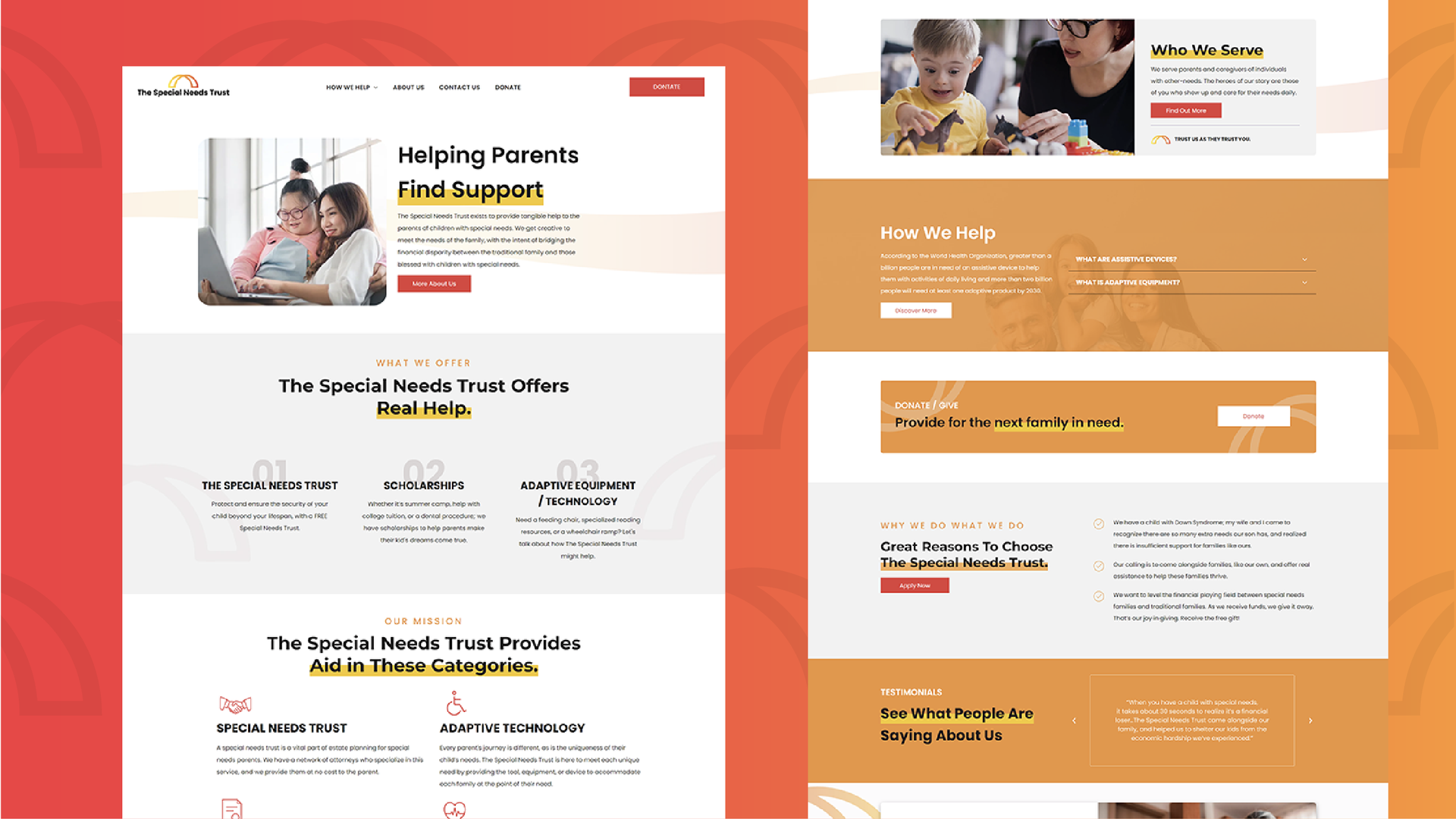
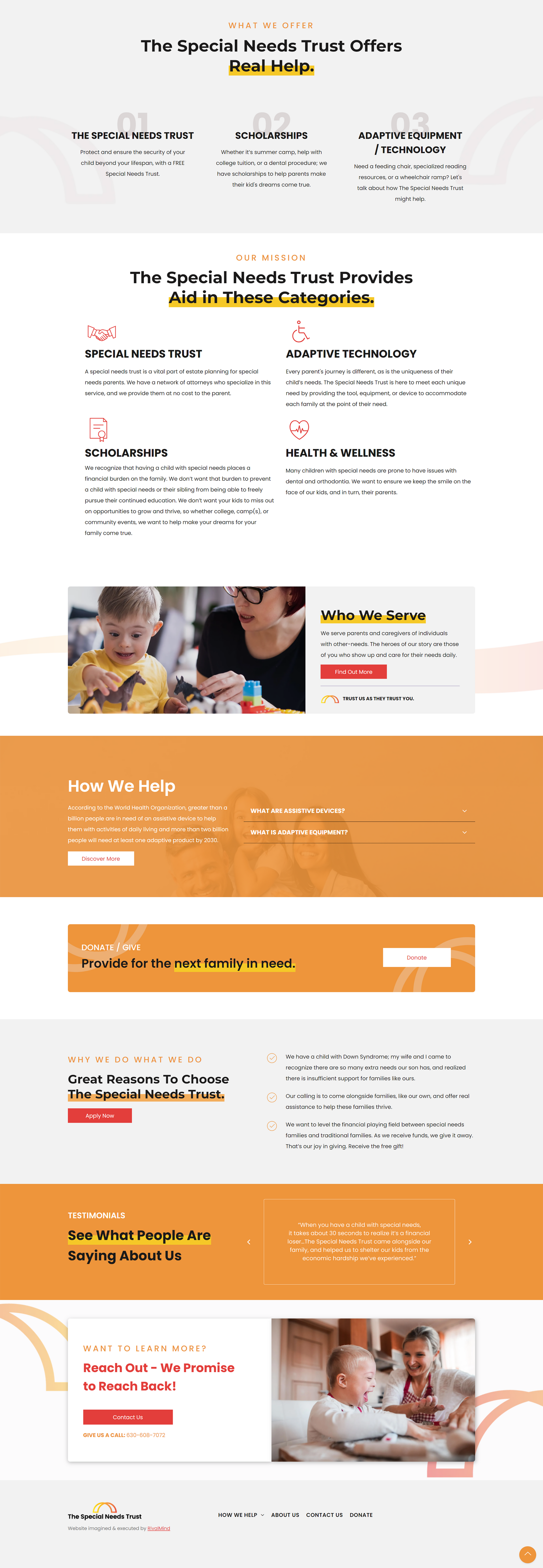
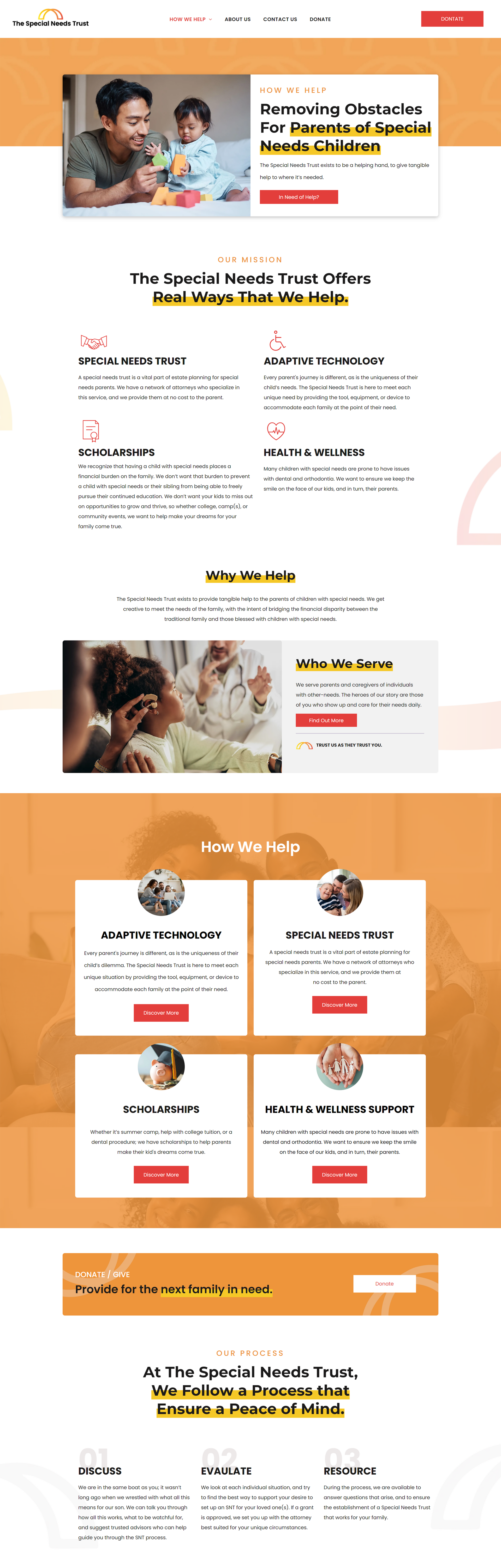
Along with being built to be fully strategized, the RivalMind team took the time to research and compare others in this sector to establish best practices, predictable navigation, and a well prioritized presentation of information.
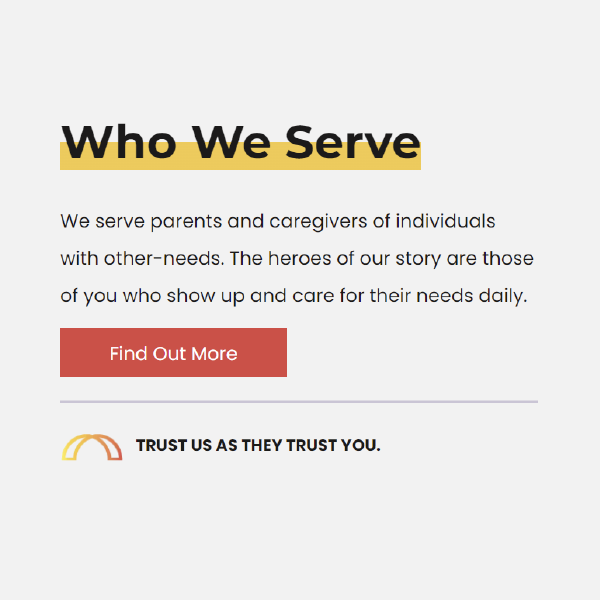
The site was also designed to attract and appeal to two audiences: families who have children with disabilities and donors considering how they can support them.
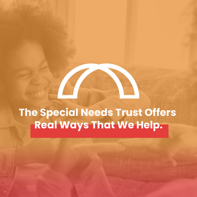
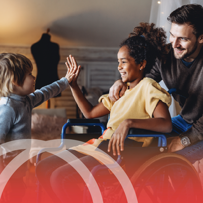
The client’s logo, an iconic image of a bridge, served as an excellent picture of how this organization creatively bridges the gap of financial disparity between the traditional family and those blessed with children who have special needs. It became a starting point for the development of the entire brand and a star player on the website. You’ll see it in backgrounds, graphics, and used to interact with copy, playing a powerful role in maintaining a warm and inviting tone throughout the site.
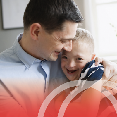
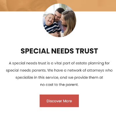
You’ll also see images that focus on family, exuding authentic joy and optimism.
The Results
Launching a new brand made our dedication to executing a vision perfectly key to this project. It took time, a few rounds of ideas and refinement, but in the end, not only was our client extremely pleased, but we are also extremely proud to be part of the effort to help make life easier for these special families.
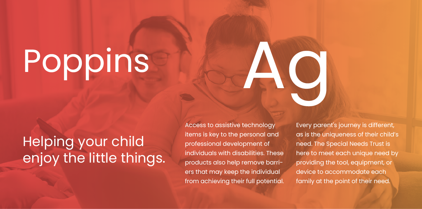
Soft, approachable font.
Poppins was the font selected, and its versatility made it suitable for both headers and body copy. The letterforms are soft and gentle, evoking a sense of friendliness. Its high legibility and straightforward nature make it a perfect choice for the comfort and clarity needed for the Special Needs Trust brand.
Warm and enthusiastic color scheme.
Sunshine, tangerine, scarlet, and gray; this color scheme was chosen by the client to create a visually stimulating and energetic palette that evokes a sense of warmth and enthusiasm. These bold colors are vibrant and are also an ideal choice for conveying optimism and positivity.

More Case Studies
We work across an expanse of projects at RivalMind, and we love to share our clients’ successes. For each case study, our goal is the same: bridging the gap between marketing and growth through innovative and custom design. This is why companies come to us. Dive into more of our favorite web design projects below!

Contact Us
It's time to grow your business.
The Special Needs Trust Web Design Portfolio Contact Form
We will get back to you as soon as possible.
Please try again later.