Home Improvement
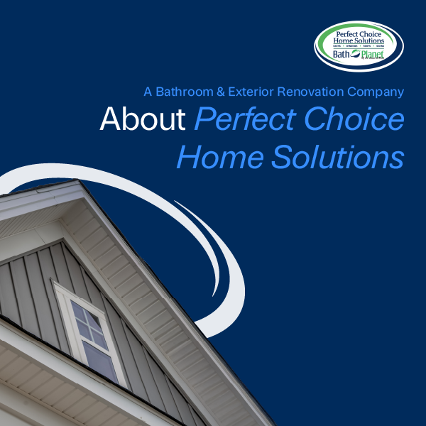
Perfect Choice Home Solutions
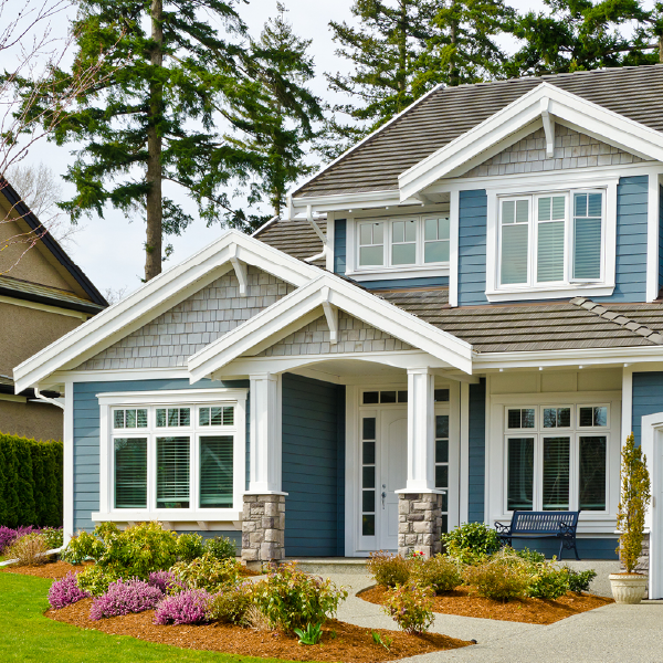
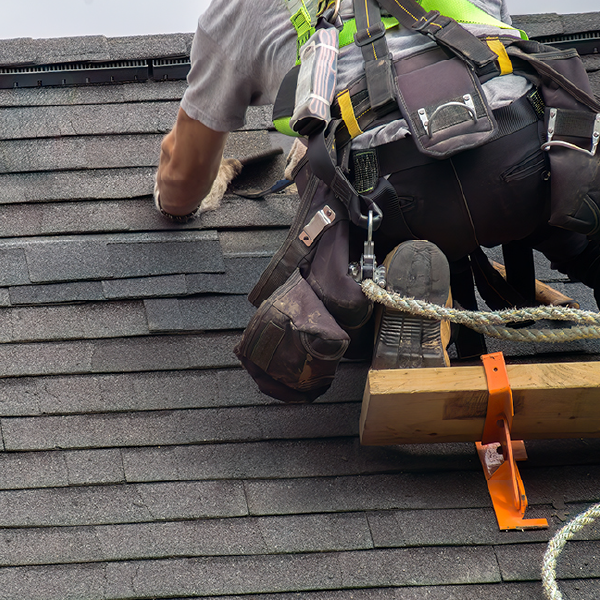
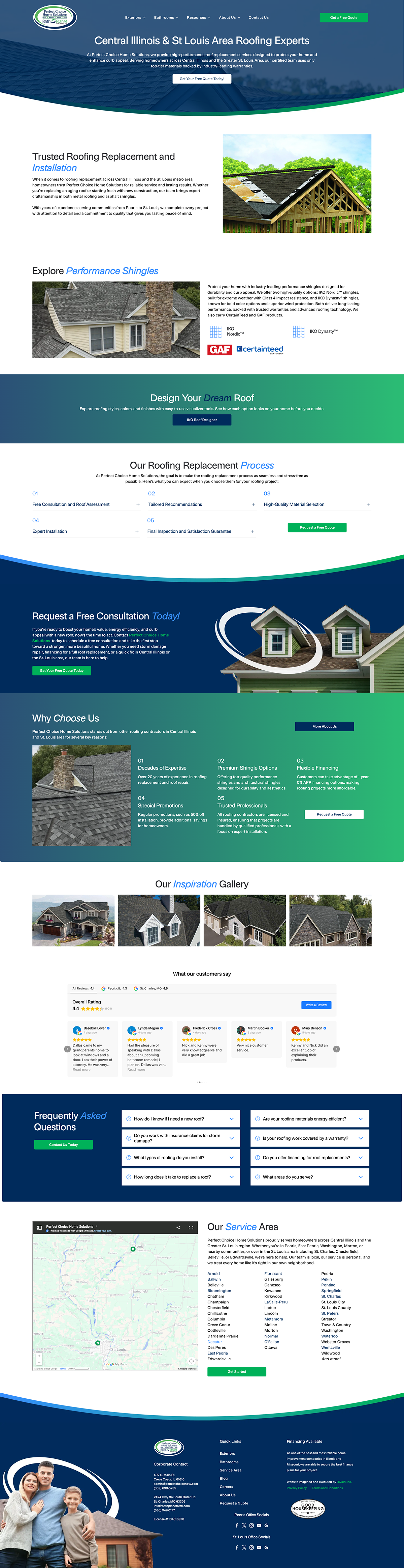
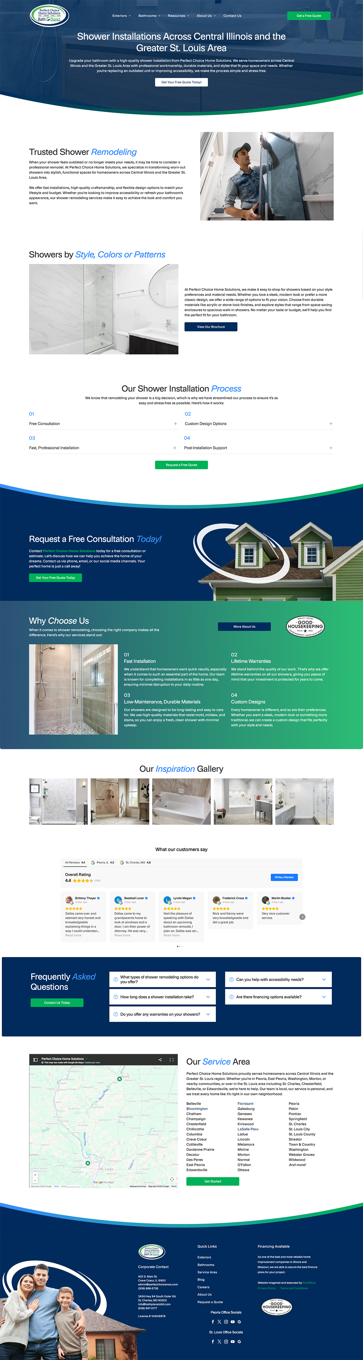
Perfect Choice Home Solutions partnered with RivalMind to unify two existing brands under a single, cohesive digital presence. As a company specializing in roofing, siding, windows, and bathroom renovations, their work protects homes, improves energy efficiency, and enhances curb appeal. The new website needed to reflect that breadth of expertise while presenting a clear, confident identity.
On top of preserving SEO value from two sites through page redirection, we saw an opportunity to clarify the brand, define its audience, and create a modern foundation that felt professional without leaning overly elegant or luxury-driven. The result is a site that positions Perfect Choice as a trusted home improvement partner with a forward-thinking mindset and a strong commitment to craftsmanship.
Built & Hosted using

Fresh, Modern, Open
Website Design / SEO
Our Approach
Blueprint for a unified brand
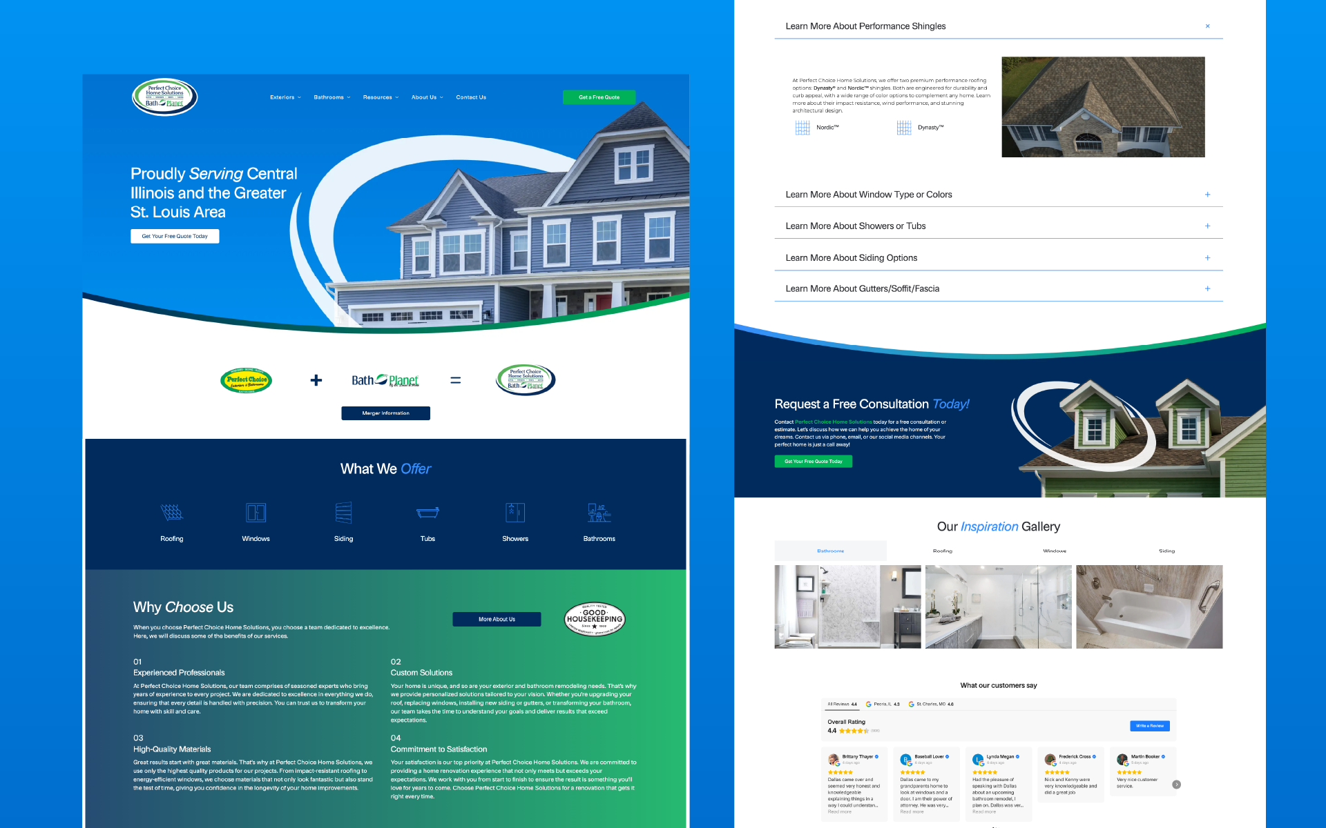
Merging two brands required more than combining content. It called for thoughtful brand refinement and strategic alignment. We worked closely with the Perfect Choice team to define their target audience and establish a visual direction that balanced credibility with approachability.
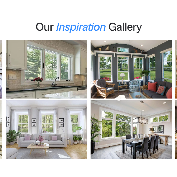
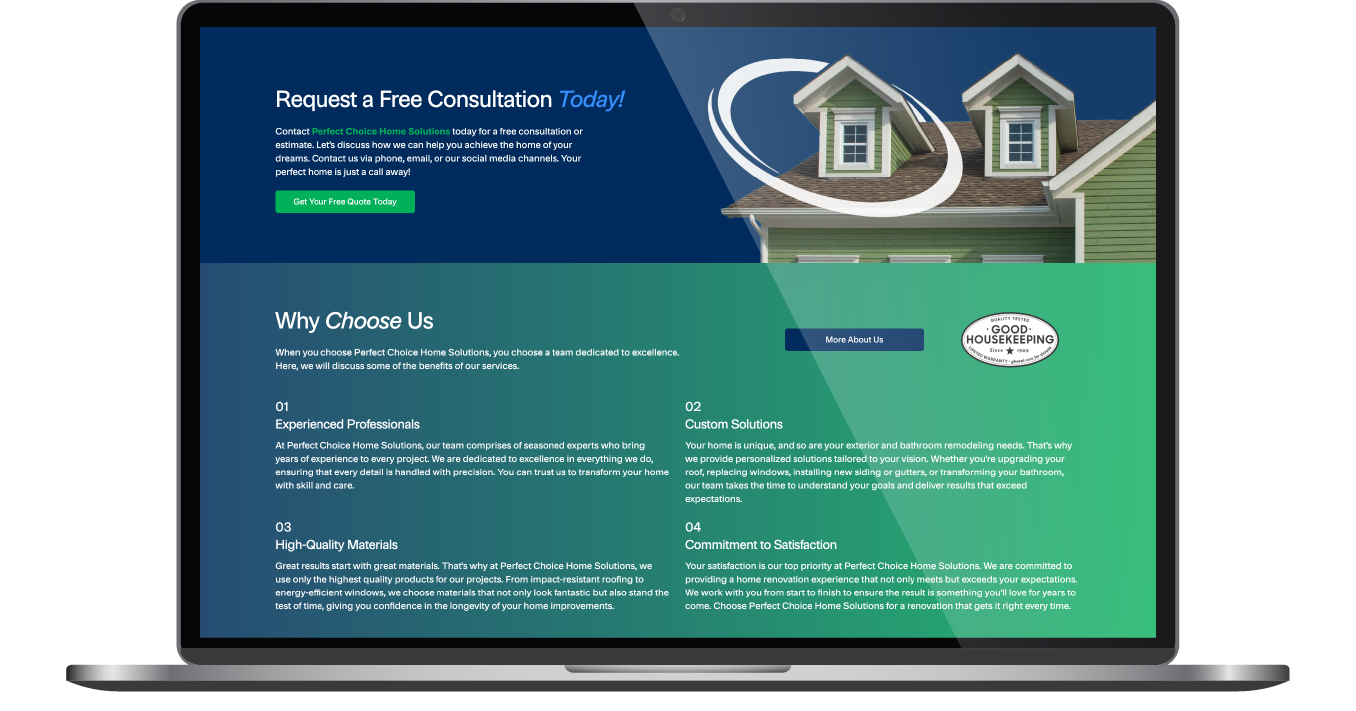
Visually, we moved away from stark minimalism and introduced depth through dark tones, gradients, and curved arcs that guide the eye and break up content sections. Service-focused imagery highlights specific areas of the home, reinforcing expertise in roofing, siding, windows, and bathrooms. People-focused imagery was used sparingly to keep attention on the work itself.
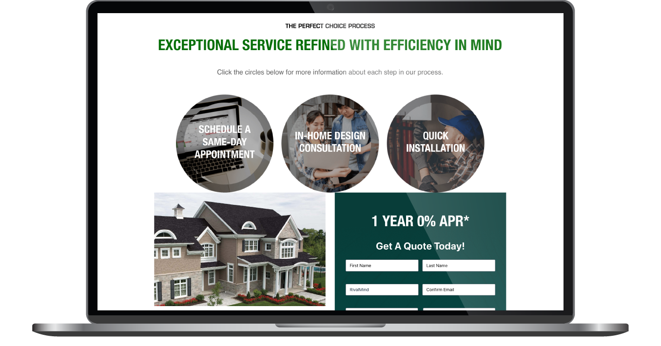
From a usability standpoint, we structured the site to simplify navigation across service lines and galleries.
The Results
The new Perfect Choice Home Solutions website brings two brands together under a unified, clearly defined identity. Visitors can now explore services and project galleries with greater ease, thanks to streamlined navigation and advanced tab functionality that simplifies browsing.
The refined visual direction reinforces credibility while maintaining an approachable tone, supporting lead generation across roofing, siding, windows, and bathroom renovations. The updated logo and expanded color system create consistency across digital marketing efforts, strengthening brand recognition.
Internally, the team now has a flexible platform that reflects their growth goals and positions them for continued expansion. The site presents Perfect Choice as a polished, trustworthy home improvement leader, aligned with their vision to become the most recognized and respected name in their market.
Before & After
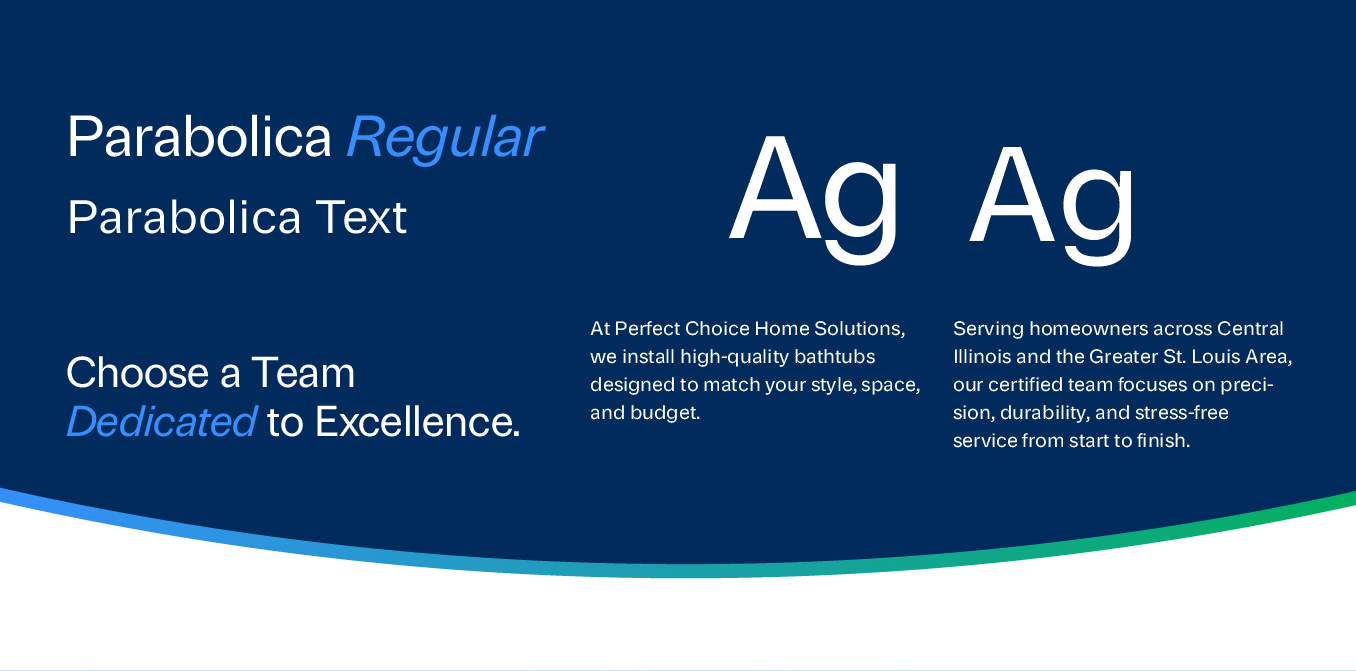
Framing the message with typography
The site features the Parabolica type family, selected for its clean, contemporary letterforms and refined presence. Parabolica strikes a balance between lightness and structure, offering strong readability across devices while reinforcing a modern, professional tone.
Headlines carry clarity and confidence, while body text remains approachable and easy to scan. The typography supports the site’s open layout, complementing the curved graphic elements and ensuring that content remains the focal point without visual clutter.
A fresh coat of identity for curb appeal
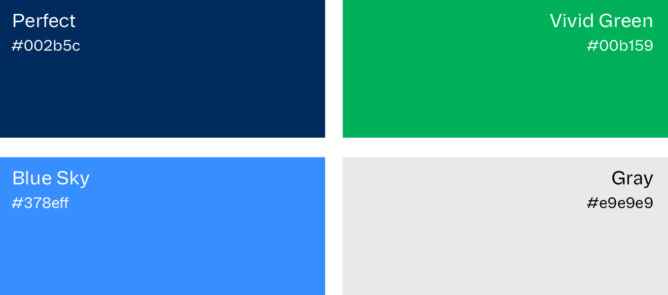
The color palette draws directly from the client’s existing logo, centered on bright green and dark blue. We expanded this foundation by introducing a brighter blue accent to bring energy and contrast throughout the site.
Dark blue grounds the design and reinforces trust and stability, while green signals growth, improvement, and forward momentum. Gradients between the two shades introduce depth and movement, softening transitions between sections and enhancing the modern feel. Together, the palette works in harmony with the typography and layout, creating a cohesive and recognizable visual identity.

Staff Spotlight
Krystyanna Joseph is the driving force behind groundbreaking website designs at RivalMind. Her approach is defined by a relentless pursuit of innovation, fueled by a deep commitment to research, boundless creativity, and an unwavering dedication to pushing the boundaries of her skills and perspectives. With every project, she sets the bar higher, ensuring that RivalMind remains at the forefront of cutting-edge design and client satisfaction.
Specialties: Duda Web Development, Animation/Motion Design
More Case Studies
Ambitious companies come to RivalMind to close the gap between marketing and growth. They need more than a good looking website. They need a strategic, custom solution that drives real results.
Every case study below highlights how we combine strategy, design, and technology to turn digital experiences into measurable growth.
Explore more of our favorite web design projects and see what is possible when marketing works as hard as you do.
Contact Us
It's time to grow your business.
Perfect Choice Web Design Portfolio Contact Form
We will get back to you as soon as possible.
Please try again later.