IT Hardware / Services
Mercom
The leadership team at Mercom approached RivalMind with a severely outdated brand, website, and online persona. As specialists in hardware repair, Mercom needed a sleek and professional digital presence to be competitive in their space – their former branding and website failed to demonstrate excellence and experience.
As a company, Mercom wanted exponential online growth, but their brand, website, and client portal were not ready. The hardware repair company tasked RivalMind with a complete digital overhaul.
Built & Hosted using

Efficient, Futuristic, Sleek
Logo Design / Website Design / SEO
Our Approach
Drive exponential online growth through rebranding
We defined two project focuses during our initial meeting with the Mercom leadership team: the website and the client portal.
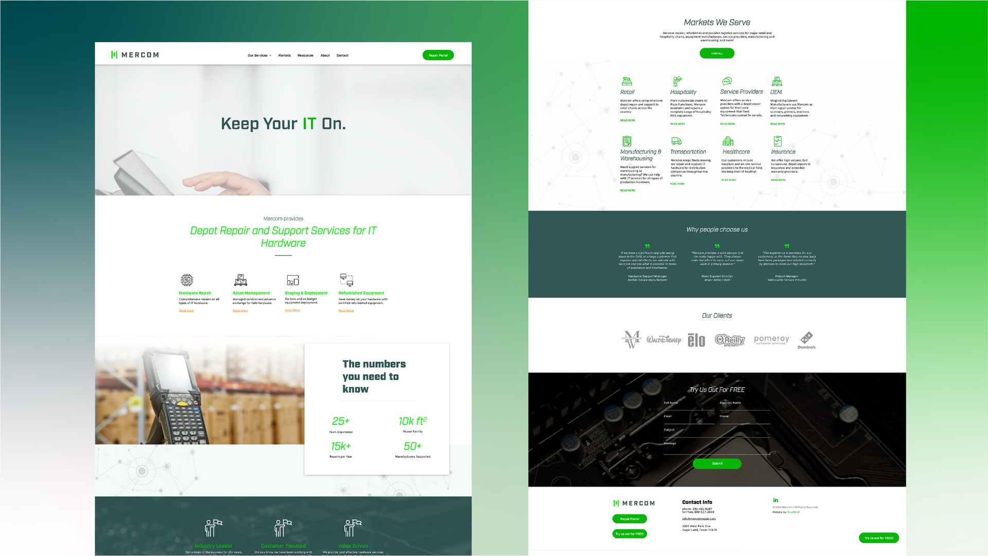
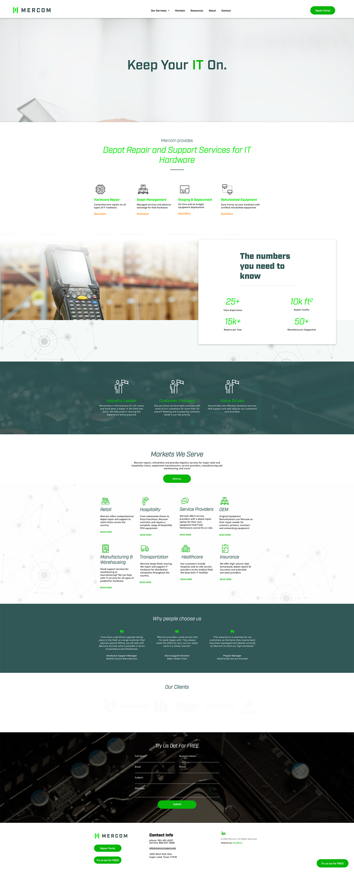
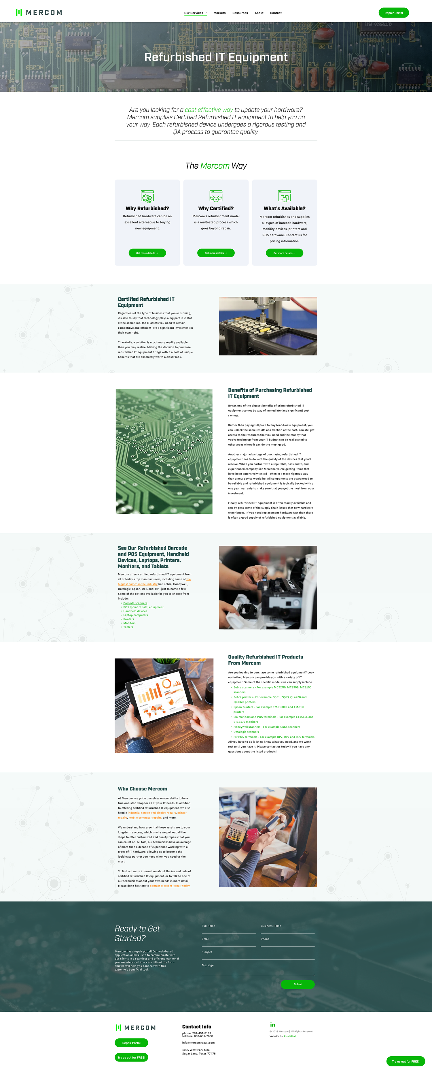
First, we overhauled Mercom’s branding. Our design team outlined new brand guidelines, including logo, colors, print collateral, merchandise, and apparel. Once the RivalMind design team created a sleek, futuristic, and reputable face for Mercom, we developed a modern website in step with the new branding guidelines.
Our team aimed to clearly communicate Mercom’s services, primary markets, and the process for becoming a client and maintaining a partnership.
Finally, we developed an updated and efficient client portal. We built the new portal for a significant increase in users and streamlined daily workflow for Mercom team members. Additionally, we designed the client portal according to Mercom’s updated branding guidelines, creating a system that looked and felt congruent with the new website.

The Results
At project close, Mercom's brand, website, and client portal were aptly prepared for exponential business growth. Determined to make the most of their new marketing tools, Mercom began ongoing SEO with RivalMind directly after launch.
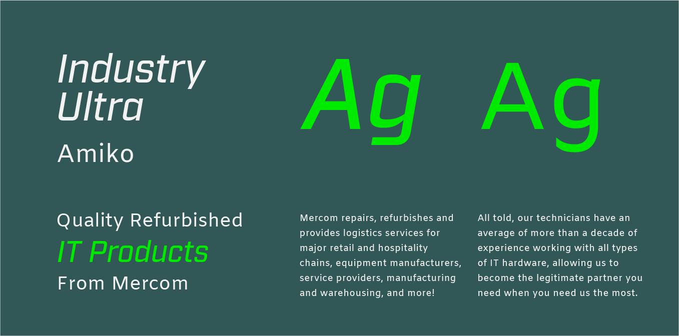
Futuristic, geometric font.
The usage of Industry Ultra and Amiko gives this website a unique futuristic feeling, which establishes Mercom as an innovative, forward-thinking company. The brand's core values of quality and technology are clearly communicated through the text.
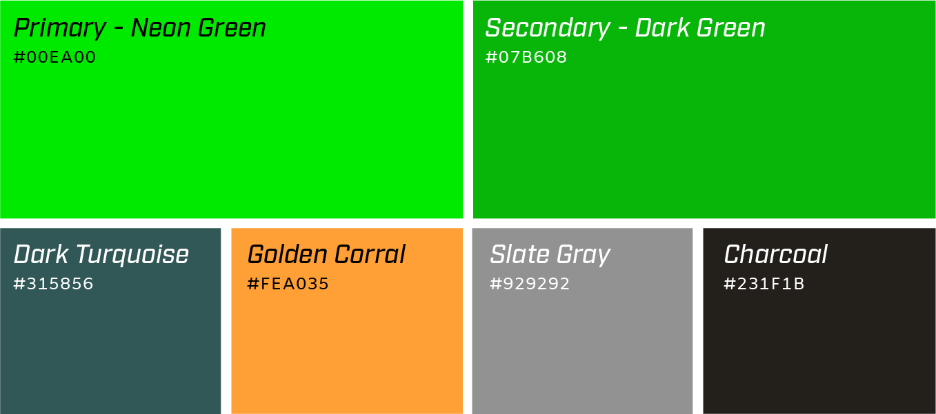
Vibrant greens with orange and gray accents.
Mercom's signature neon green stands out as a technologically advanced shade amidst the darker greens of the site's pallete. A bright orange accent keeps the brand balanced and adds a touch of energy to the tech-focused site.
More Case Studies
We work across an expanse of projects at RivalMind, and we love to share our clients’ successes. For each case study, our goal is the same: bridging the gap between marketing and growth. This is why companies come to us. Please enjoy exploring a sample of our favorite projects and digging into the remarkable results of a transformed digital presence.

Contact Us
It's time to grow your business.
Mercom Web Design Portfolio Contact Form
We will get back to you as soon as possible.
Please try again later.