Interior Design
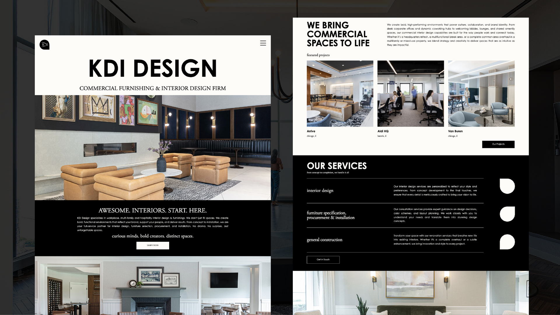
KDI Design
A bold portfolio, rebuilt to support growth and finally drive action
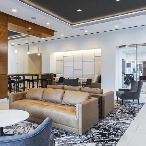
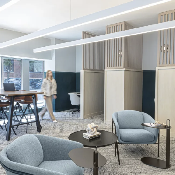
KDI Design is a full-service interior design studio known for creating spaces that feel as intentional as they are visually striking. Their work was strong. Their portfolio was deep. But their website was not converting, and it was holding the business back from the next phase of growth.
They needed more than a visual refresh. They needed a site that could reflect their level of work while quietly doing its job in the background, turning interest into real inquiries.
Built & Hosted using

Clean, Luxury, Professional
Website Design / SEO
Our Approach
Designed to Reflect the Work and Support What’s Next
KDI Design came into the project with a clearly defined brand and a strong point of view. The challenge was not to reinvent that identity, but to translate it into a digital experience that felt just as considered as the spaces they design.
At the same time, there was a practical shift underway. The client wanted to move onto a platform that would reduce the need for constant updates while opening the door for SEO growth. That meant balancing design fidelity with long-term usability.
As the project evolved, the direction shifted late in the process. The client introduced a new design concept built in another platform and asked for it to be recreated in Duda.
Rather than forcing a different path, RivalMind focused on execution. The goal became clear. Preserve the integrity of the design while ensuring the site functioned as a streamlined, conversion-focused experience.
Custom Duda widgets were developed to support specific layout and visual requirements. The structure remained intentionally minimal, aligning with the client’s preference while maintaining clarity for users navigating the site.
The result is a website that feels clean and confident, allowing the work itself to lead while still guiding visitors toward taking the next step.
A Stronger Foundation for Growth
The new site gives KDI Design something they did not have before. A digital presence that supports their reputation instead of quietly working against it.
It creates a stronger foundation for conversions, even in a minimal environment. It reduces the need for constant updates, giving time back to the business. And it positions the brand for future SEO efforts without requiring another rebuild down the line.
Most importantly, it aligns the online experience with the level of work KDI Design is already known for. The gap between brand perception and digital presence has been closed, which sets the stage for more consistent growth moving forward.


A Mark That Already Carried Its Weight
The KDI Design logo remained unchanged throughout the project, which speaks to the strength of the existing brand. It already carried the confidence and clarity needed to represent the business.
Rather than altering it, the focus was on giving it the right environment to live in. Within the new site, the logo feels more intentional and better supported by the surrounding layout, spacing, and visual rhythm.
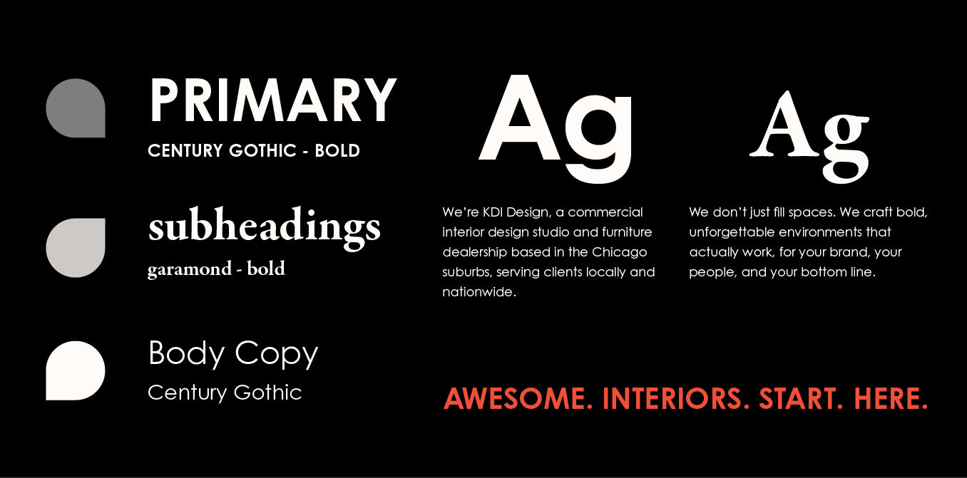
Balancing Boldness with Approachability
The typography pairing plays a quiet but important role in the overall experience.
Century Gothic Bold is used for primary headlines, delivering a clean, modern presence that feels confident without being overwhelming. It draws attention in a way that mirrors the bold nature of the brand.
Garamond Regular introduces contrast. Its serif style softens the experience slightly, adding a sense of approachability and balance. Together, the combination creates a rhythm that feels both refined and human.
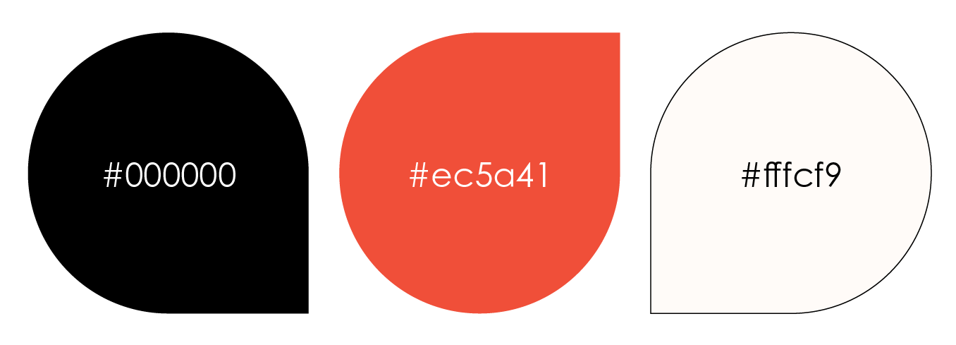
Letting the Work Take the Lead
The color palette was carried over from the existing brand, reinforcing continuity across every touchpoint.
Within the new site, those colors are given more space to breathe. The minimal design allows contrast, imagery, and negative space to do more of the work. This creates a refined visual experience that feels intentional rather than crowded.
The result is a palette that supports the work instead of competing with it, allowing each project to stand on its own while still feeling part of a cohesive brand.
See What Strategic Clarity Looks Like in Action
Every brand has a different starting point, but the goal is always the same. Create a digital experience that works as hard as the business behind it. Explore more case studies to see how RivalMind helps turn strong brands into strategic, conversion-focused websites.

Contact Us
It's time to grow your business.
KDI Design Web Design Portfolio Contact Form
We will get back to you as soon as possible.
Please try again later.