Commercial Printing Services
BFC Print
BFC came to RivalMind looking for a website that left a stronger impression online. As a technology-driven print, fulfillment, and marketing solutions provider, BFC helps organizations simplify complex marketing operations through integrated production, logistics, and digital platforms.
Their reputation was already well established, but their digital presence was not fully reflecting the breadth of the business. Rather than rewriting the brand, RivalMind brought the story into sharper focus, with a refreshed visual experience, authentic imagery, and a website positioned for stronger online visibility and long-term growth.
Built & Hosted using

Bold, Professional, and Technical
Website Design / SEO
Our Approach
Making every impression count
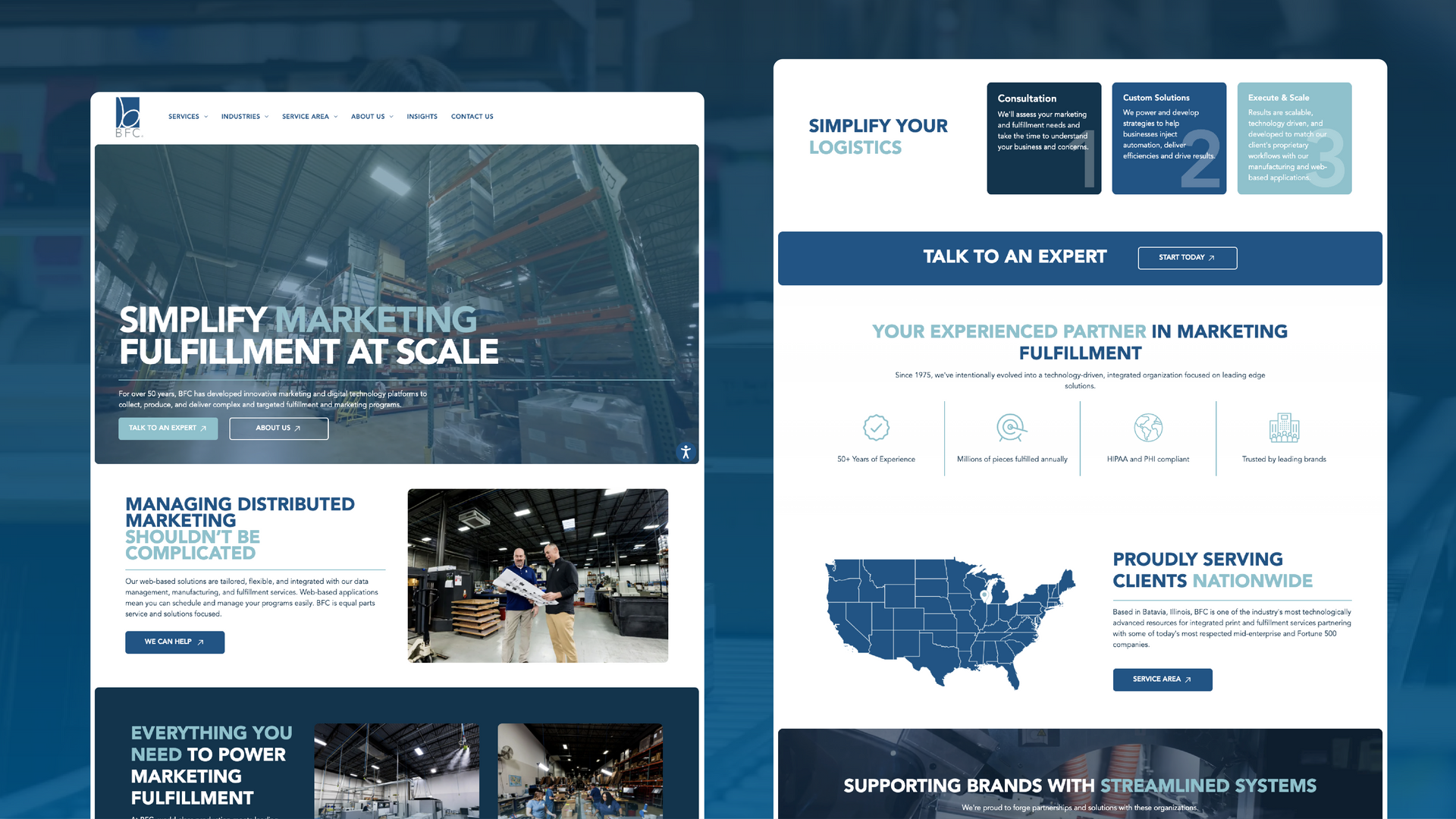
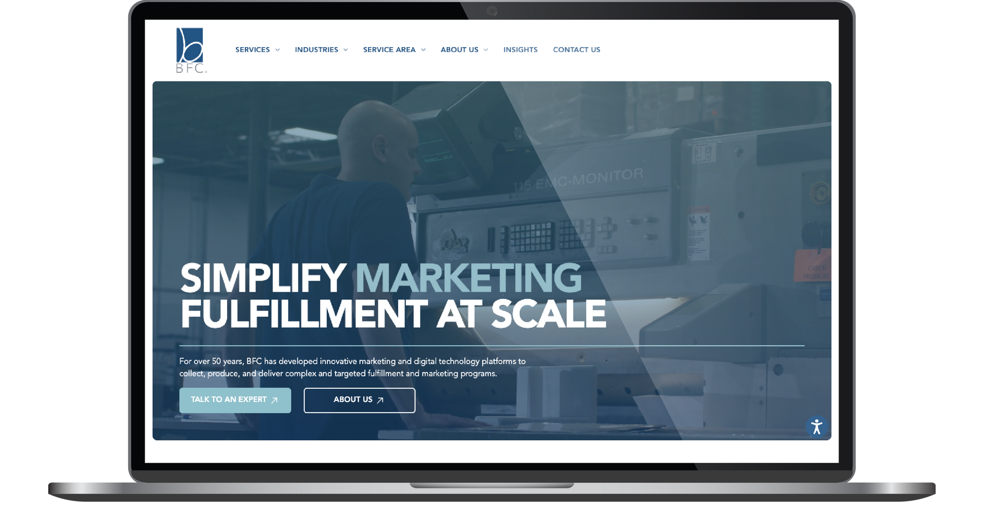
BFC had already built a reputation for helping organizations simplify complex marketing operations. The opportunity was to create a website that put the company’s strengths front and center. Rather than reinvent the brand, RivalMind refined the supporting visual identity while preserving the familiar logo and signature BFC Blue customers already recognized.
To reinforce the company's people-first approach, BFC invested in a dedicated photo and video shoot that captured its team and day-to-day operations in action.
These authentic visuals became the centerpiece of the website, bringingprospective customers behind the scenes to see the people, technology, and processes that keep every project moving, while creating a more cohesive brand experience.
The refreshed design paired bold typography, an expanded blue color palette, and thoughtful motion throughout the site to create a modern experience with purpose. Custom hero animations introduce BFC's capabilities in a more engaging way, while a scalable mega menu keeps the experience ready for whatever comes down the line without sacrificing usability.



Ready to deliver at every click
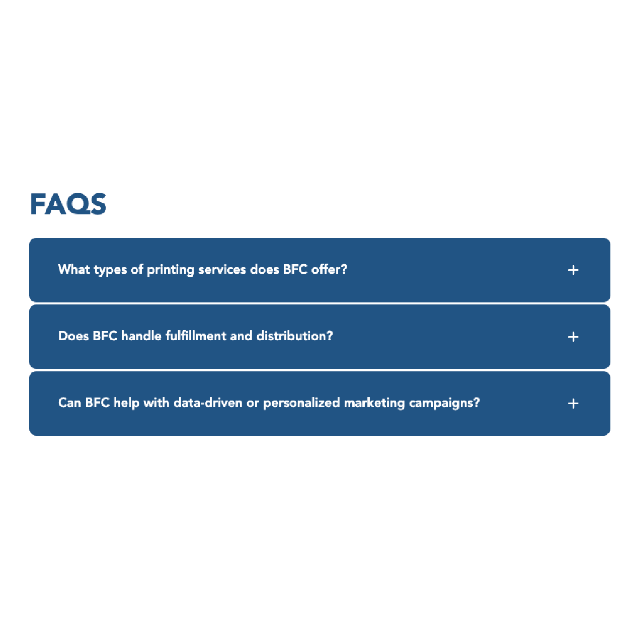
The redesigned website reflects the scale, professionalism, and technology-driven mindset behind the BFC brand. A refreshed visual identity, authentic photography, and thoughtful motion work together to put the full scope of the business on display, helping prospective customers better understand BFC's capabilities from the very first interaction.
The updated experience also lays the groundwork for stronger online visibility. A scalable site structure, expanded navigation through a new mega menu, and a modern design system keep every destination within easy reach while creating flexibility for tomorrow.
Most importantly, BFC now has a website that matches the confidence of its brand and the direction of the business. It's a digital experience designed to reinforce trust, showcase the company’s decades of experience, and keep the brand moving forward.


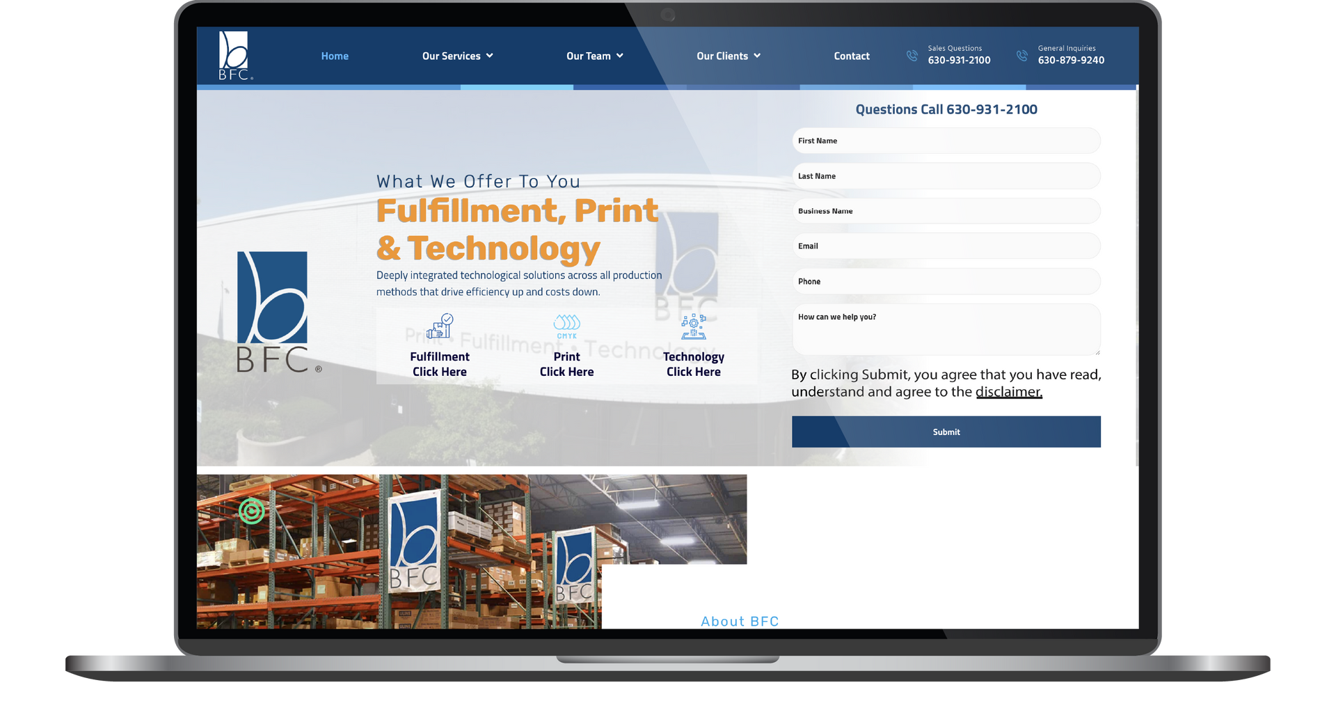
Before & After
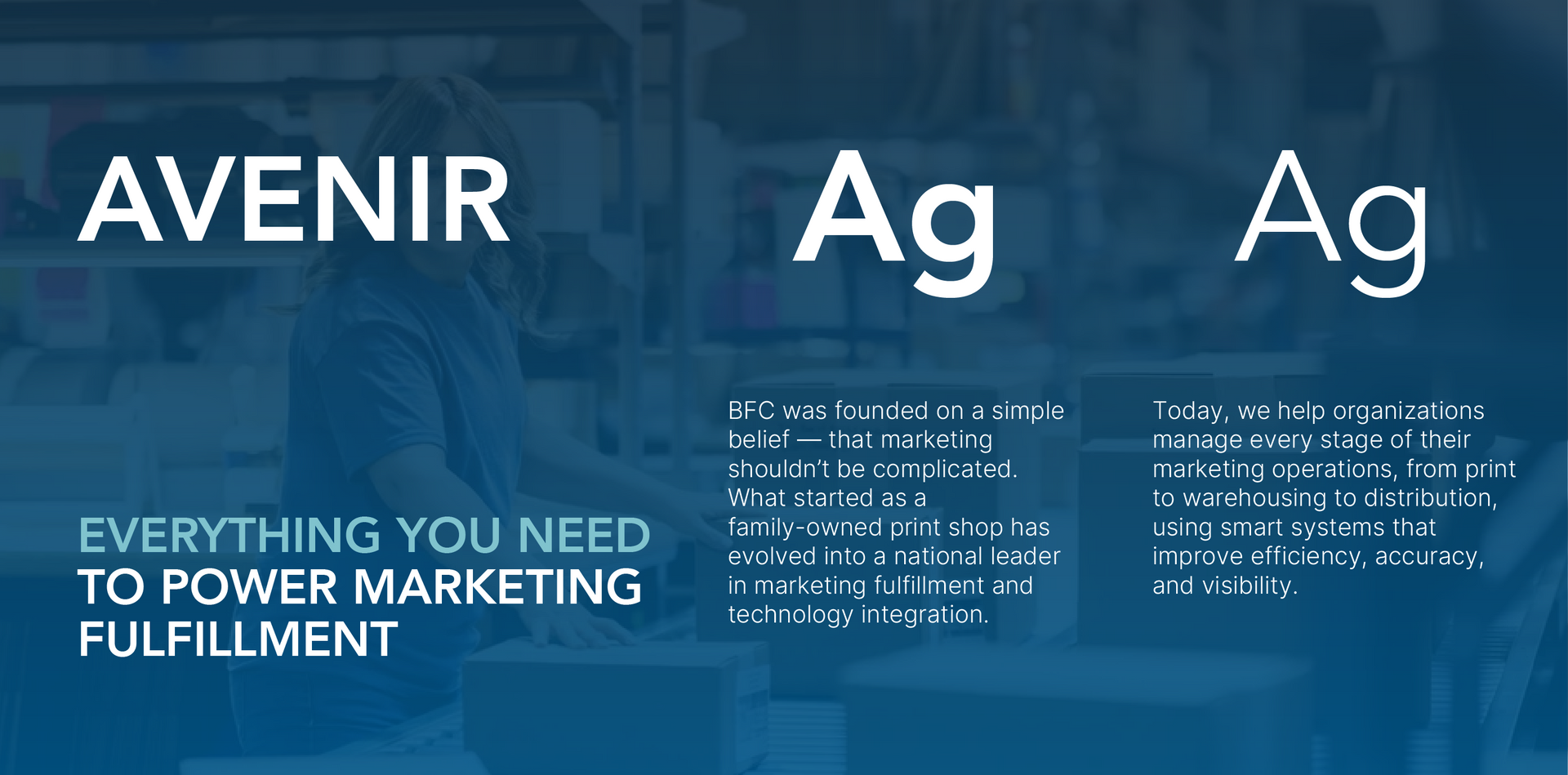
A typeface that speaks with confidence
Typography plays a central role in reinforcing BFC's dependable, technology-driven brand. Avenir was selected for its clean geometric forms and modern character, giving headlines a bold, professional presence while remaining approachable across every page.
Its exceptional readability keeps everything from service overviews to more detailed content clear and easy to scan across devices. The result is a typography system that communicates with confidence, strengthens the refreshed visual identity, and keeps the focus on BFC's solutions-first approach.
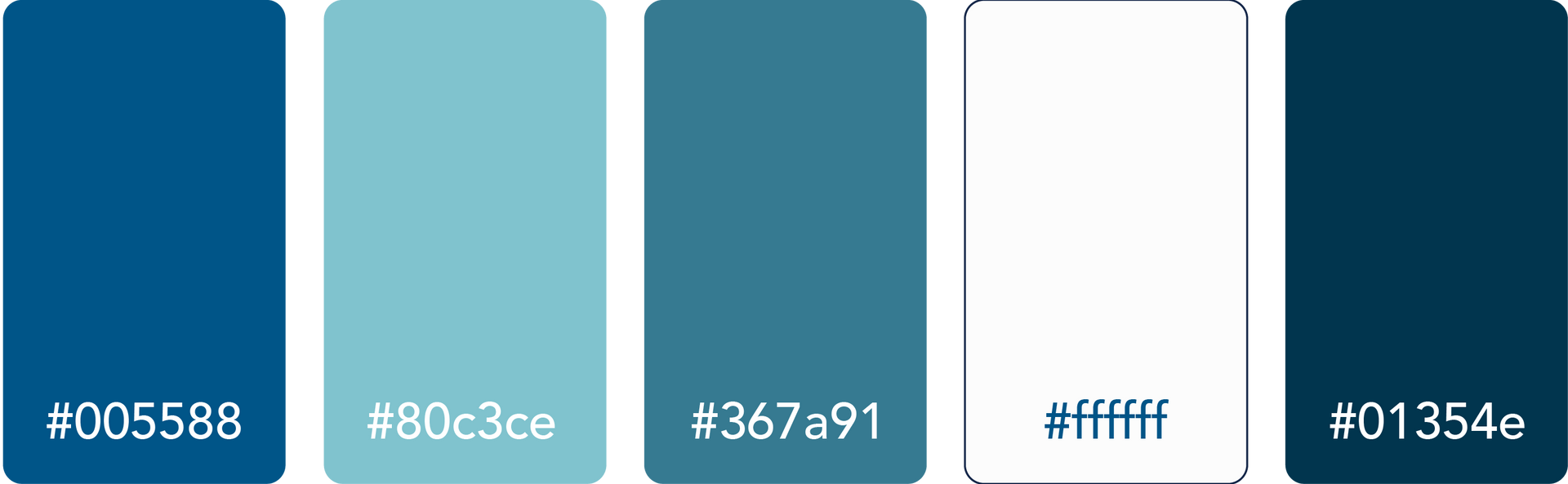
Built on BFC blue
BFC blue has long been synonymous with the company's brand, making it a natural foundation for the refreshed visual identity. Rather than introducing an entirely new palette, RivalMind expanded the existing family of blues to create greater depth, contrast, and flexibility throughout the website.
Layered with clean neutrals, the palette reinforces the trust, reliability, and professionalism that define the BFC brand. Strategic use of color also guides the eye from one message to the next, while authentic photography and key messaging remain the focal point.

Staff Spotlight
Designed by Alexis Camp
Alexis Camp showcases her talent by crafting a diverse array of elements, ranging from captivating graphics to dynamic website designs. Rooted in her unwavering passion for design, Alexis's approach embodies a commitment to exploration, constantly seeking to push the boundaries of creativity. With an appetite for innovation, she pursues fresh perspectives and original concepts, ensuring that every project she undertakes resonates with creativity and excellence.
Specialties: Duda Web Development, Illustration, Logos/Branding



More Case Studies
Every business has a message worth putting into the world, but the right strategy ensures it arrives with impact. RivalMind helps organizations transform their knowledge and experience into strategic digital experiences that build trust, strengthen visibility, and support long-term growth.
Explore more of our case studies to see how thoughtful branding and website design help businesses create lasting impressions and meaningful connections.


Contact Us
It's time to grow your business.
BFC Print Web Design Portfolio Contact Form
We will get back to you as soon as possible.
Please try again later.
By checking the box above, you consent to receive informational SMS and appointment/meeting reminders from RivalMind at the phone number provided. Msg & data rates may apply. Msg frequency varies. Unsubscribe at any time by replying STOP. Reply HELP for help. Consent is not a condition of purchase. Privacy Policy & Terms.