Power Infrastructure and Energy Solutions
Vertiv UPS
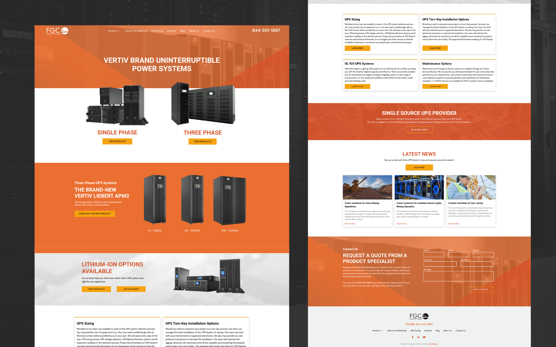
Vertiv UPS Systems partnered with RivalMind to move their site to a more flexible, SEO-ready platform. As part of Facility Gateway Corporation (a longtime RivalMind client), they trusted us to handle the transition with the same care and consistency we've brought to other projects over the years.
Their brand was already well-established, built on a bold orange palette and structured typography. Our role wasn’t to rewire it, it was to fine-tune the current running through it. We preserved what worked and optimized what didn’t, creating better flow, faster updates, and a site ready to power up Vertiv’s SEO performance without losing their established identity.
Built & Hosted using
Bold, Clean, Open
Website Design / SEO


The Results
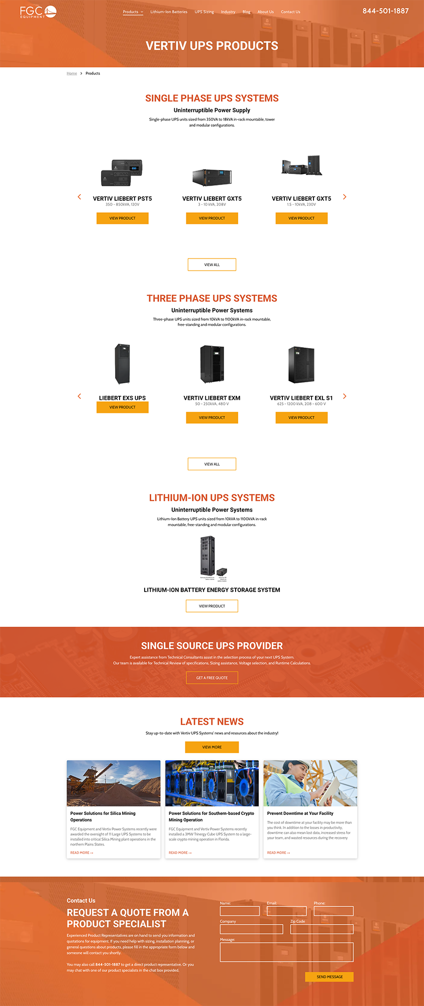
The new Vertiv UPS Systems site keeps everything that made their brand recognizable, but now it moves faster, works smarter, and supports their long-term growth goals.
Navigation is cleaner, updates are easier, and the platform is primed for SEO, giving their team more control and setting the stage for stronger rankings and better conversion paths.
For visitors, the experience feels familiar but sharper. It features quicker load times, clearer structure, and an easier path to the products and information they need.
For Vertiv, it’s built to handle future growth without losing the brand’s established power.

Before & After
Powered Print
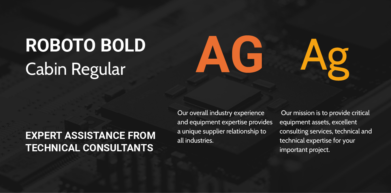
Vertiv UPS Systems’ type system was bold, modern, and highly legible, so we preserved it. Roboto anchors the headings with clean, structured lines that command attention without overwhelming the page. Its sharp geometry balances professionalism with clarity, ensuring product details and service information are easy to scan.
For body text, Cabin steps in. It’s a softer sans-serif with open curves and a friendly, approachable feel, subtly contrasting Roboto’s strength. Together, the two fonts create a reading experience that’s confident but comfortable, guiding visitors through technical content without fatigue.
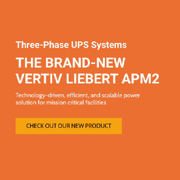
High-Voltage Hues
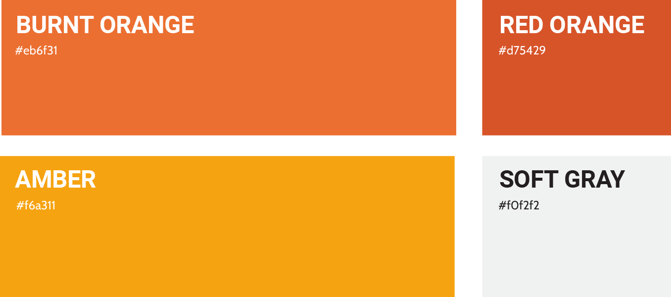
Vertiv UPS Systems’ color palette is simple and striking, a bold, monochromatic range of oranges that commands attention without feeling aggressive. We preserved this palette to maintain brand consistency, using the strong orange tones to anchor key sections and create visual rhythm across the site.
The boldness of the orange reinforces Vertiv’s industry position: strong, reliable, and impossible to miss. Paired with ample white space and neutral accents, the color strategy keeps the site clean and approachable while still carrying the weight and energy of the brand.

Staff Spotlight
Designed by Krystyanna Joseph
Krystyanna Joseph is the driving force behind groundbreaking website designs at RivalMind. Her approach is defined by a relentless pursuit of innovation, fueled by a deep commitment to research, boundless creativity, and an unwavering dedication to pushing the boundaries of her skills and perspectives. With every project, she sets the bar higher, ensuring that RivalMind remains at the forefront of cutting-edge design and client satisfaction.
Specialties: Duda Web Development, Animation/Motion Design
More Case Studies
We work across an expanse of projects at RivalMind, and we love to share our clients’ successes. For each case study, our goal is the same: bridging the gap between marketing and growth through innovative and custom design. This is why companies come to us. Dive into more of our favorite web design projects below!