Migration Motivation

Wrecktify Collision

With a site that was six years old and throwing errors when modified, our client knew it was time for an upgrade, but wasn't quite ready for a redesign. A website migration would fix what was broken—and RivalMind delivered an unexpected bonus.

Built & Hosted using
Duda logo in white text on an orange rounded rectangle background
Warm, Inviting, Powerful

Website Design

Website landing page mockup with red and black sections, service cards, pricing, and a contact form

Our Approach

Challenges

Wrecktify's original site had a lengthy, disorganized gallery page with some less-than-ideal images. The RivalMind team used image sliders to condense the page height to organize projects, make them more accessible, and greatly improve how each project showcases their expertise in car repair.

The Results

Without losing brand identity or key content, the RivalMind team left the previous site's style and basic layouts behind. Custom image headers now keep users engaged and give each page a stronger design. With content broken into smaller segments with more imagery and more engaging calls to action, the user experience was greatly improved. RivalMind delivered far beyond the goal of fixing what was broken.

Fitness club webpage with red and black sections, workout class cards, membership info, and a contact form with a trainer photo
Dark-themed sports website homepage with multiple article thumbnails and a top navigation bar

Before & After

Laptop displaying a car restoration website with a dark classic car hero image and red service icons below
Laptop displaying a dark website homepage with the headline “At We Work For You, We’ve Got You Covered” and three service cards.

Strong, striking font.

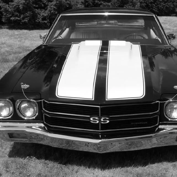
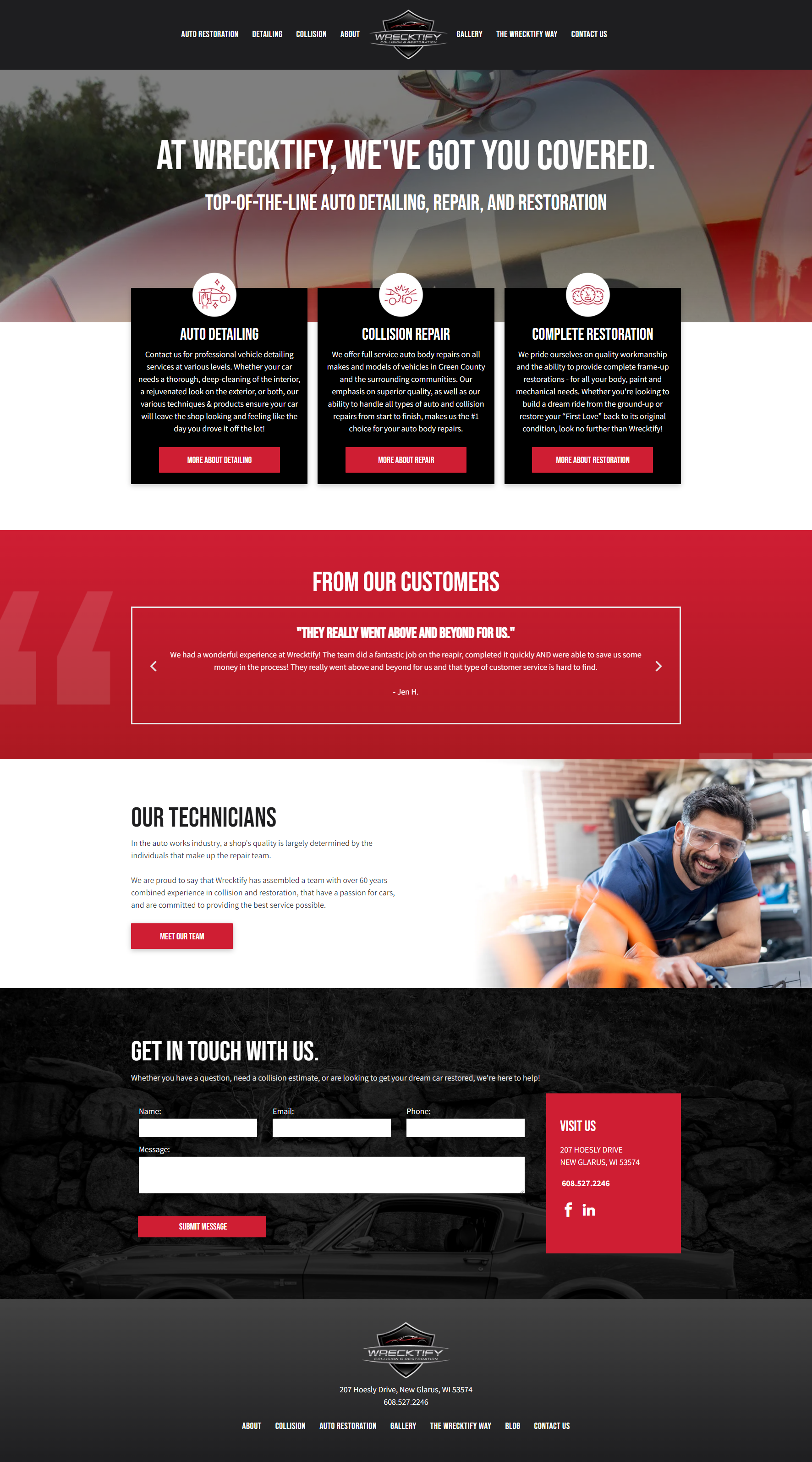
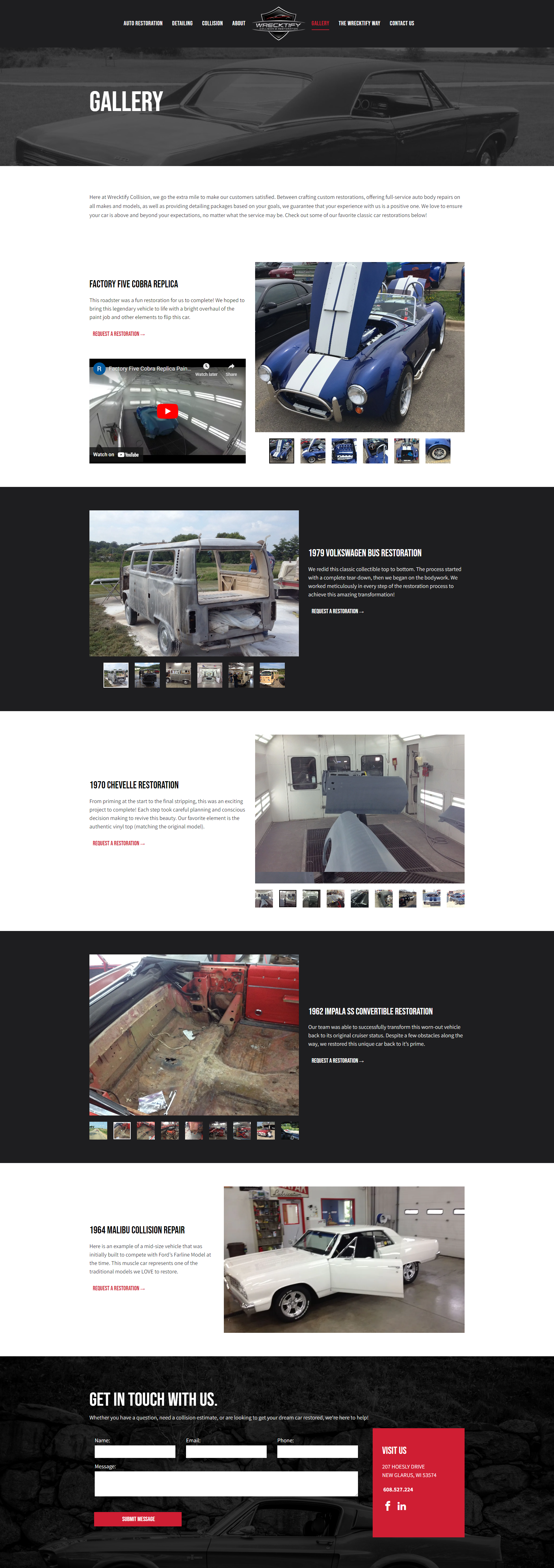
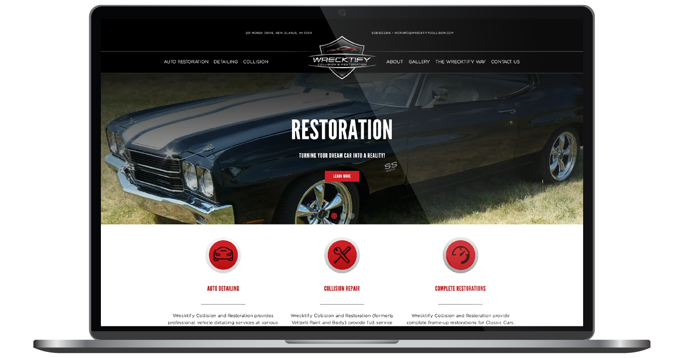
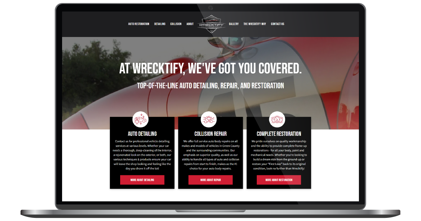
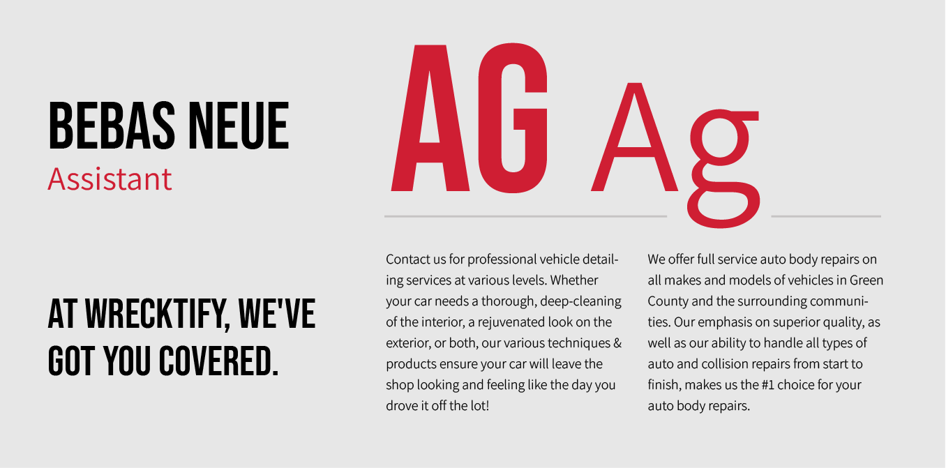
In order to further establish Wrecktify's standing as a reliable and efficient auto restoration company, we integrated the bold and condensed typeface Bebas Neue, accompanied by Assistant, a more approachable font. These font choices harmonize with the website's overall theme of strength and assurance.

Typography poster comparing Bebas Neue and AG Ag in black and red on a white background.

Bold, bright reds and high-contrast grays.

Incorporating the original brand, Wrecktify's red communicates boldness and reliability for this car restoration business. The combination of red and black tones helps to create contrast and engage the user, enhancing the visual appeal of the page.

Color palette swatches labeled primary rose, secondary charcoal, accent red, and light gray.

More Case Studies

We work across an expanse of projects at RivalMind, and we love to share our clients’ successes. For each case study, our goal is the same: bridging the gap between marketing and growth through innovative and custom design. This is why companies come to us. Dive into more of our favorite web design projects below!

Worker in hard hat with

Lighting Inverter

Equipment Supplier

FGC Equipment logo in white on a blue industrial background

Industrial UPS

Equipment Supplier

Contact Us

It's time to grow your business.

Wrecktify Web Design Portfolio Contact Form