Our Approach
Design That Supports the Next Step
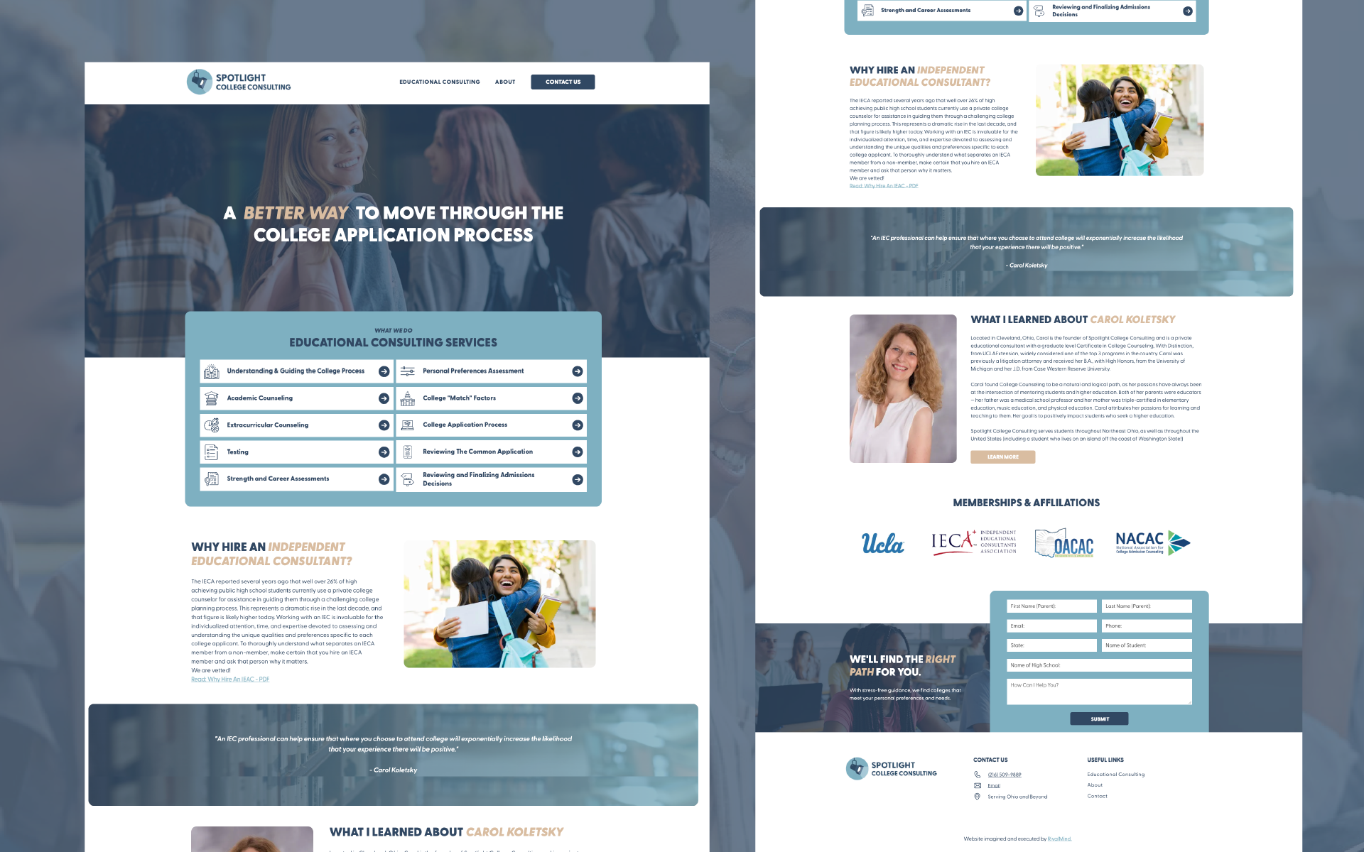
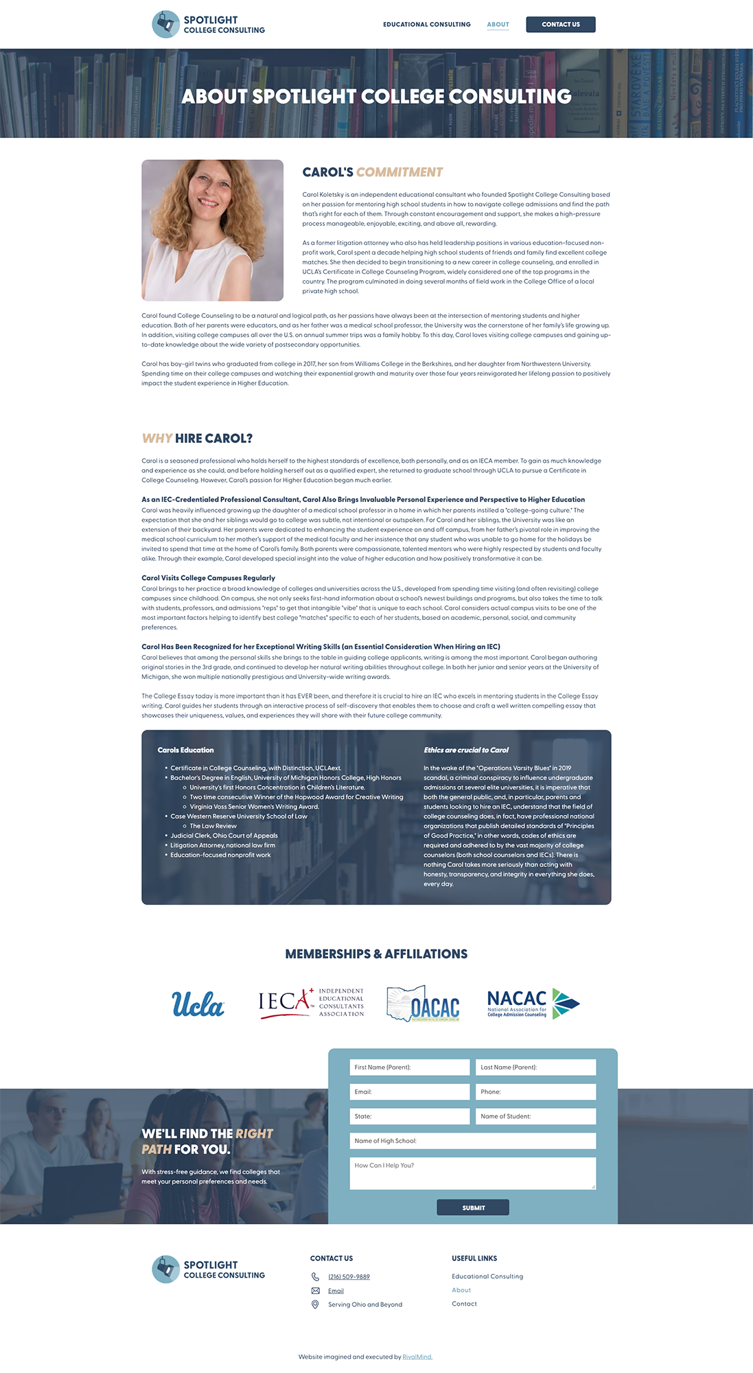
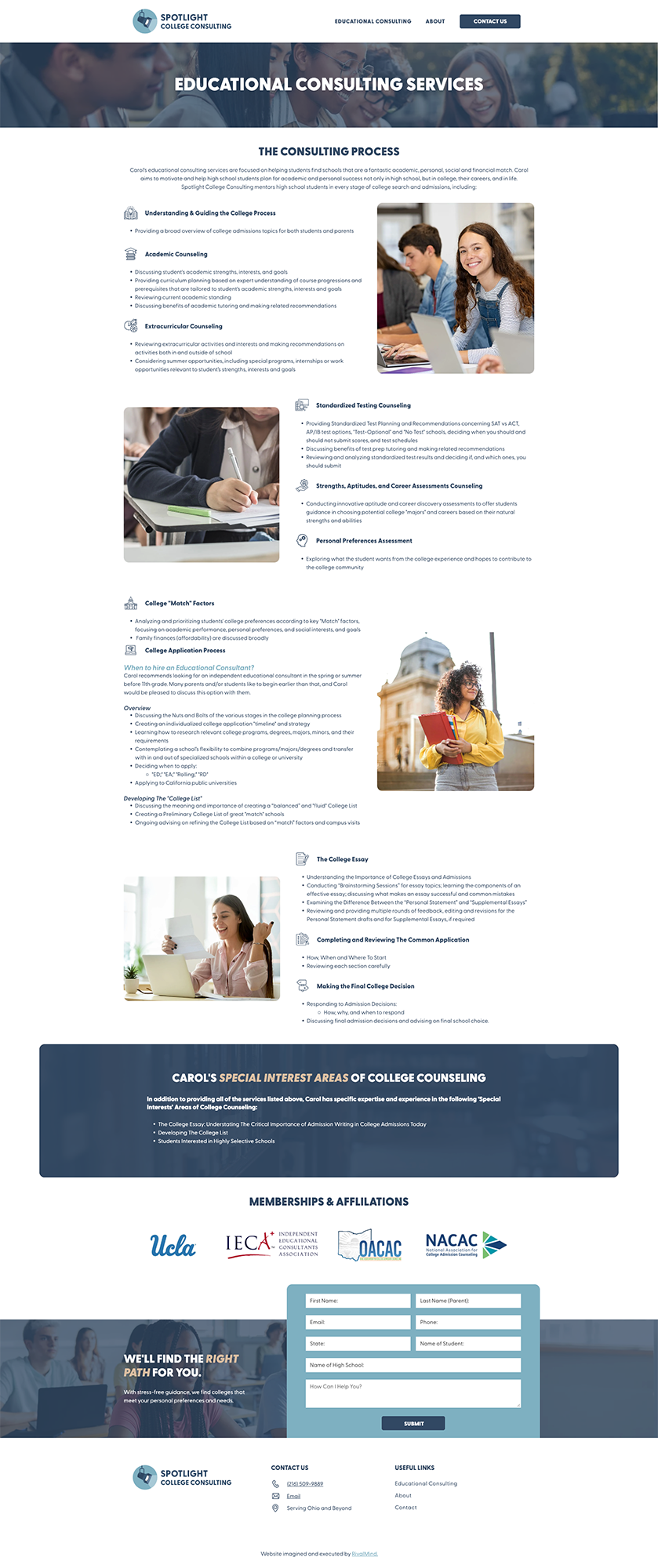
Spotlight College Consulting came to us with a strong vision but needed a clearer, more approachable digital presence to match the trust and expertise they bring to families. Our approach centered on refining what was already working and eliminating anything that stood in the way.
We updated the logo and refreshed the color palette to bring a modern but welcoming tone to the brand. Layouts were restructured to prioritize clarity and ease of use, keeping the focus on the personalized support Spotlight is known for. Every decision, from typography to imagery to navigation, worked toward a clean, confident experience that mirrors the guidance students and parents expect at every step.


The Results
The new Spotlight College Consulting website transformed how families engage with the brand. Instead of getting lost in too many pages or overwhelmed by dense content, visitors now move smoothly through a clear, welcoming experience designed around their needs.
The refreshed logo and color system create a sense of trust, while streamlined layouts guide parents and students to the right information without confusion. What once felt busy and fragmented now feels focused, approachable, and professional.
The site now serves as a trusted extension of Spotlight’s commitment to guiding students toward the right college fit. It’s clear, confident, and built for the journey ahead.
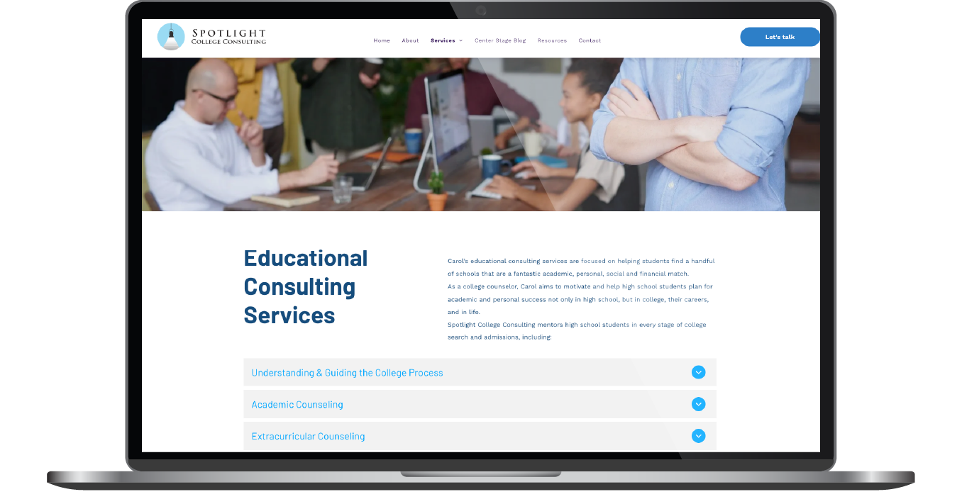
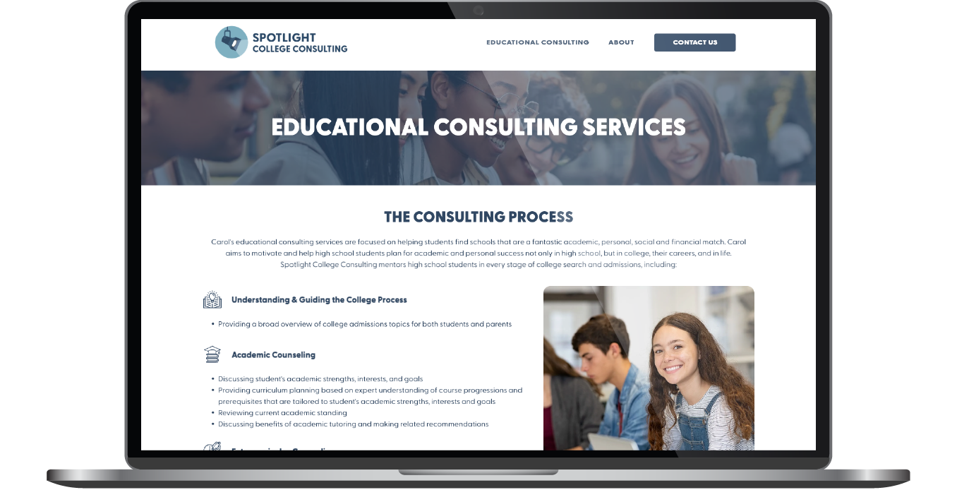
Before & After
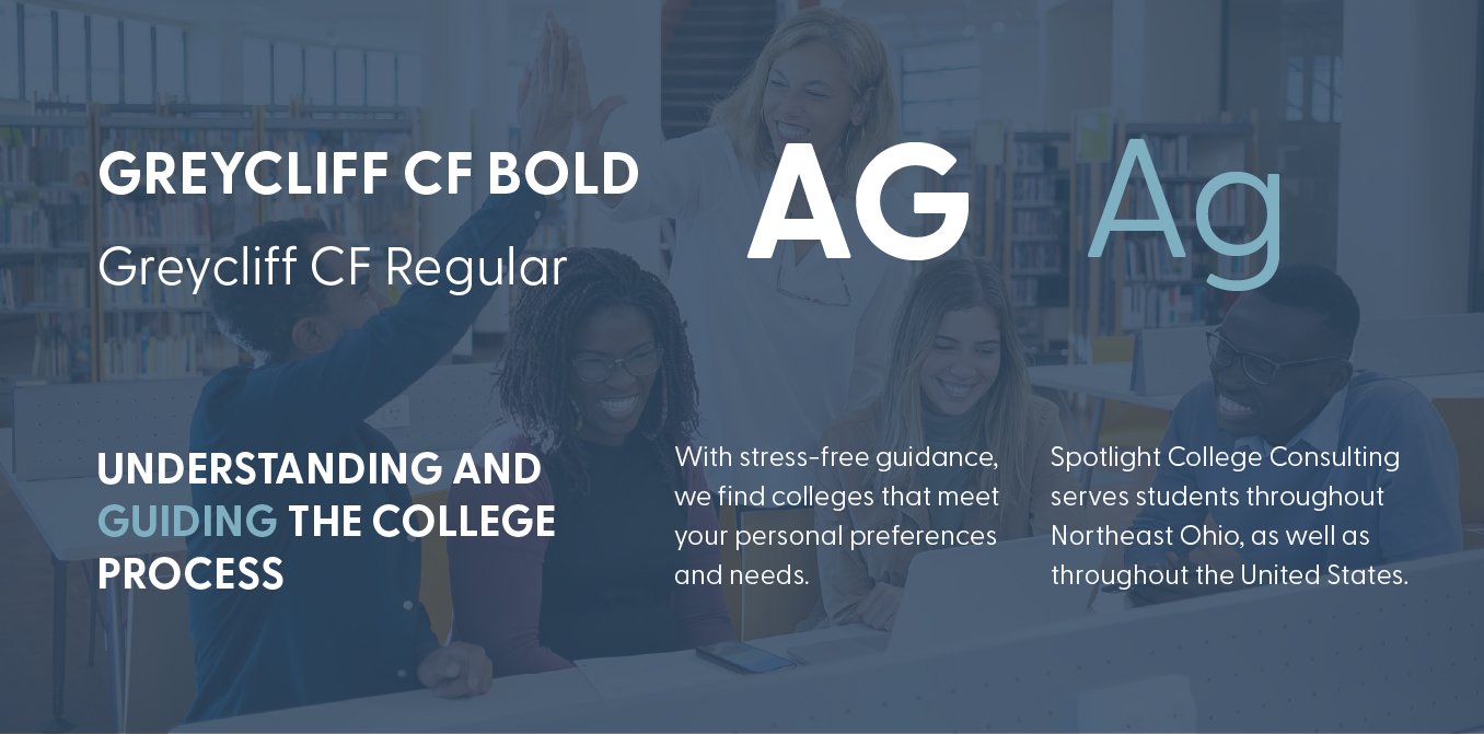
Type That Makes the Grade
Spotlight College Consulting’s type system balances clarity, warmth, and an academic edge. It’s the kind of typography that feels just as natural on an acceptance letter as it does on a trusted guide’s website.
We selected Avenir Next, Uni Neue, and Poppins for their font family. This trio brings structure and approachability together. Avenir Next lends clean, geometric confidence to headlines; Uni Neue introduces a steadier, scholastic tone for subheadings; and Poppins keeps the body copy readable and friendly, like a well-marked syllabus.
Together, they create the right mix of authority and encouragement for families navigating the college admissions process.
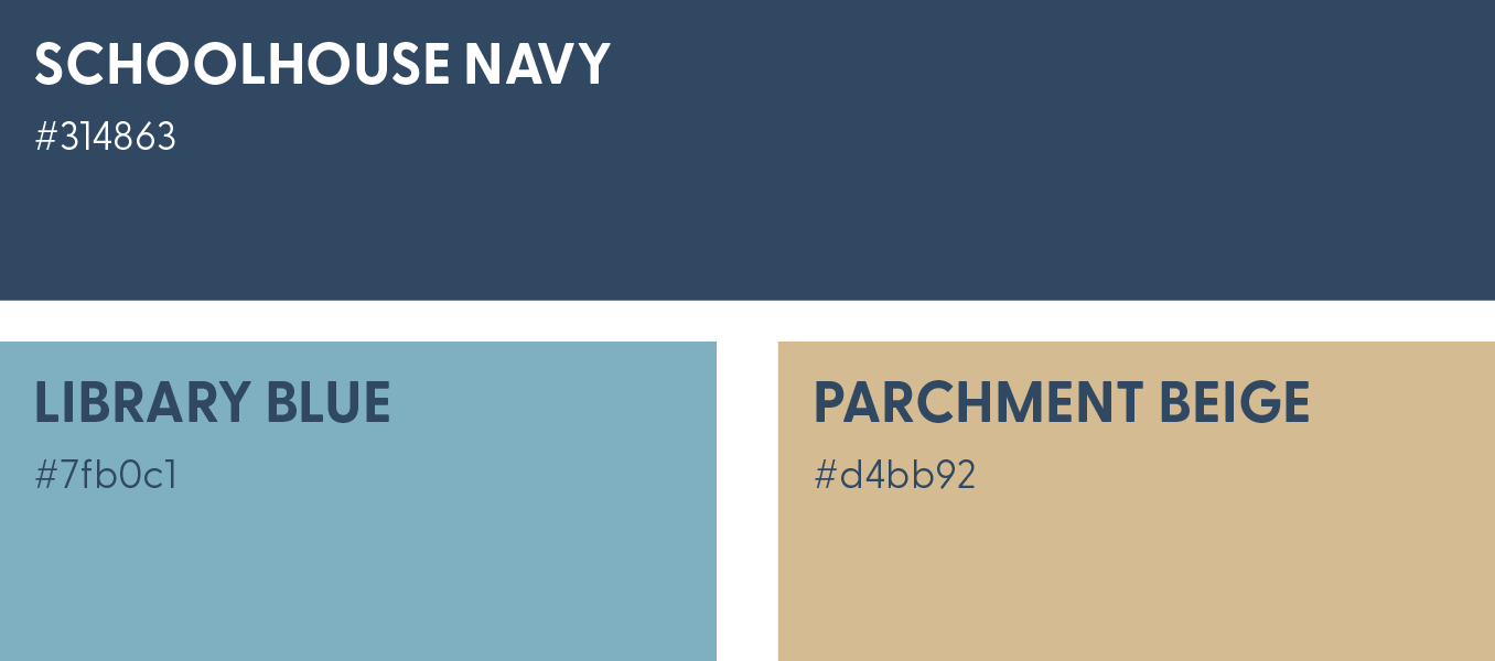
Color-Coded for Success
Spotlight College Consulting’s color palette was designed to feel both scholarly and accessible. The primary blue is deep and steady, while a softer secondary blue brings in a fresher, more approachable tone. They make the site feel inviting without losing professionalism.
To round it out, a muted gold-beige introduces warmth and a hint of aspiration. It’s not flashy, but mature and encouraging. Together, the palette feels composed and grounded, creating a digital environment where families can feel both reassured and inspired as they navigate the admissions journey.

Staff Spotlight
Designed by Haley Stein
Haley Stein, a seasoned web graphic design, harnessing years of invaluable agency experience to deliver exceptional design excellence. She specializes in crafting not just websites, but immersive digital experiences that transcend mere aesthetics. From captivating social media campaigns to visually stunning website interfaces, Haley's creations leave a lasting impression on our client's and their audiences.
Specialties: Duda Web Development, Branding/Identity, Packaging


More Case Studies
We work across an expanse of projects at RivalMind, and we love to share our clients’ successes. For each case study, our goal is the same: bridging the gap between marketing and growth through innovative and custom design. This is why companies come to us. Dive into more of our favorite web design projects below!