Travel Experiences
Culture Beyond Borders
It’s great to start with well-defined goals. This client wanted a rebranded website; one that would provide a fresh and compelling vision for the immersive study abroad and leisure travel programs they offer.
Built & Hosted using

Earthy, Vibrant, Impactful
Logo Design / Website Design
Our Approach
Elevating the value
of immersive travel
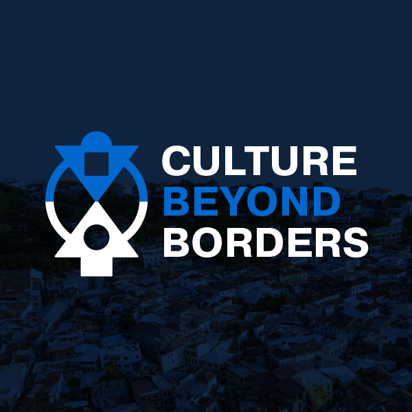
Entrusted with redesigning the logo, our team quickly recognized the significance of the adinkra symbol in the existing logo. It was doing a great job representing the cooperation, collaboration, and understanding that grows through immersive travel, but was ready for a thoughtful update. The new logo retains the original adinkra symbol but features bolder, more powerful text and a subtitle that reinforces the message of embracing culture. Now the overall message comes through with clarity: there is great value in bold, adventurous cross-cultural travel.
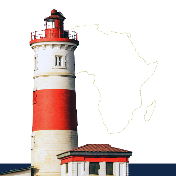
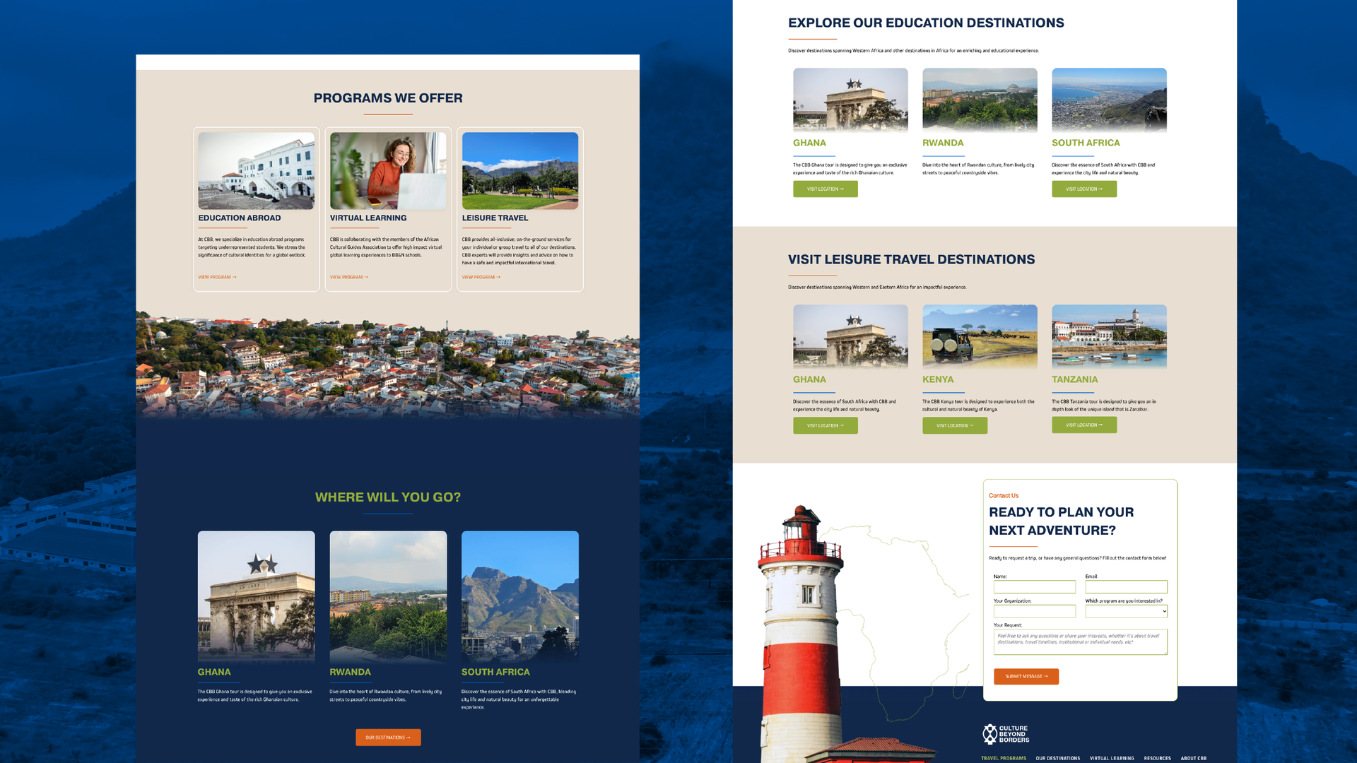
We also prioritized imagery around traveling to Africa, the client’s area of focus, and selected real photos of college students engaging in cross-cultural collaboration. Incorporating icons and graphics, like the transparent images of the Accra Tower and Zanzibar on the homepage, also highlight location.
The Results
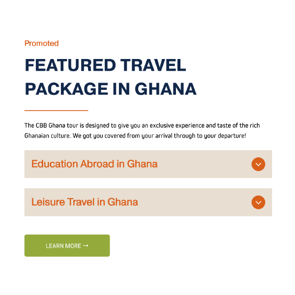
The client was very pleased with the consistent but clarified brand direction, as well as the revised layout. Architecture and navigation were completely reconsidered to drive visitors to the client’s two distinct offerings: educational and leisure travel. This change represented the fresh vision the client was looking for and had great impact on ease of use.
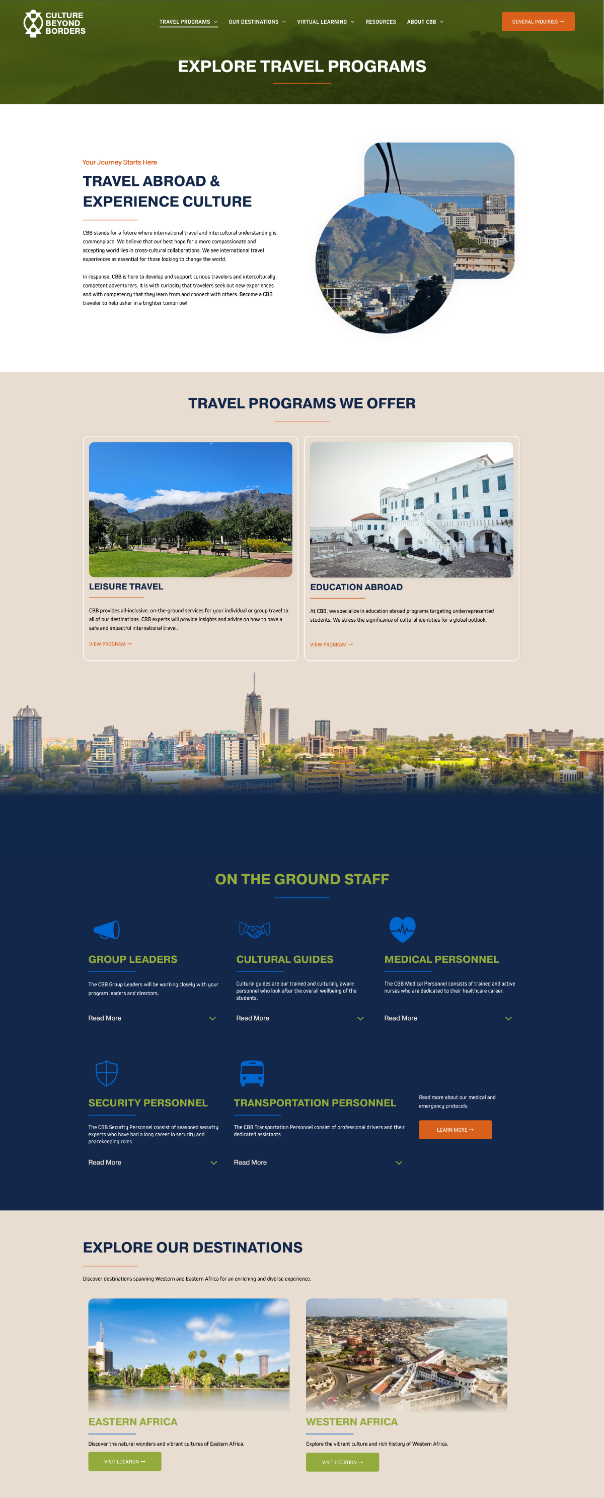
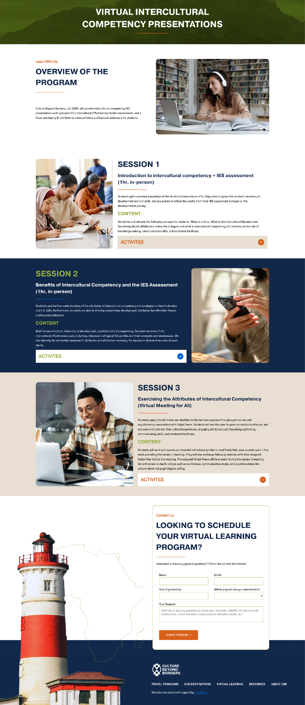
Before & After
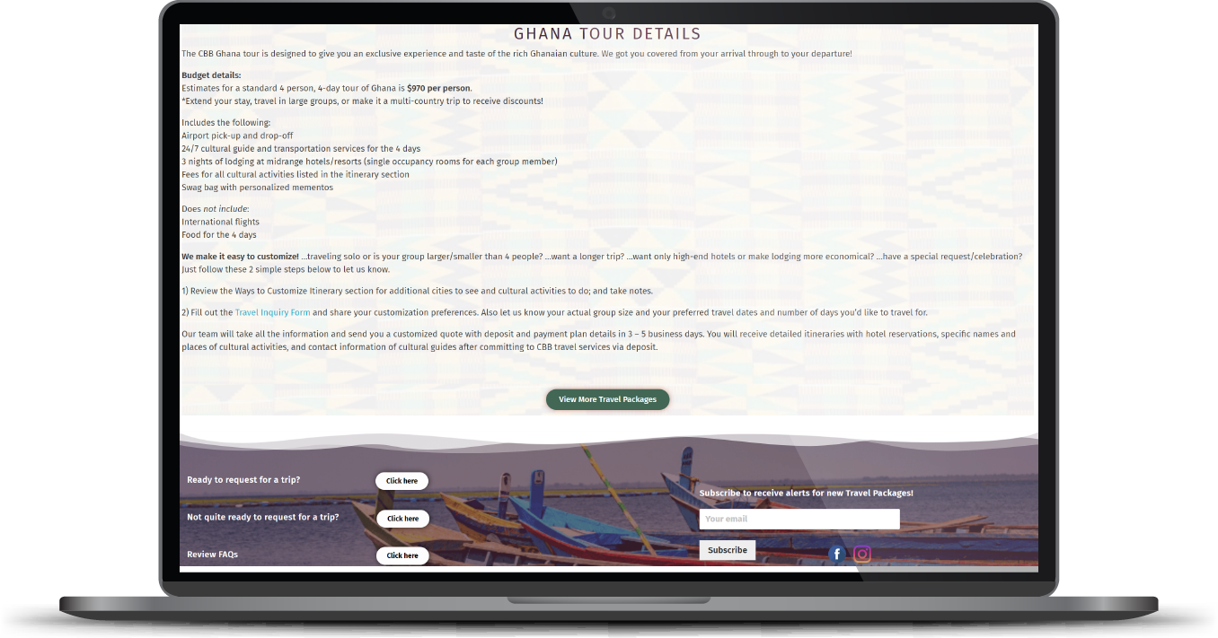
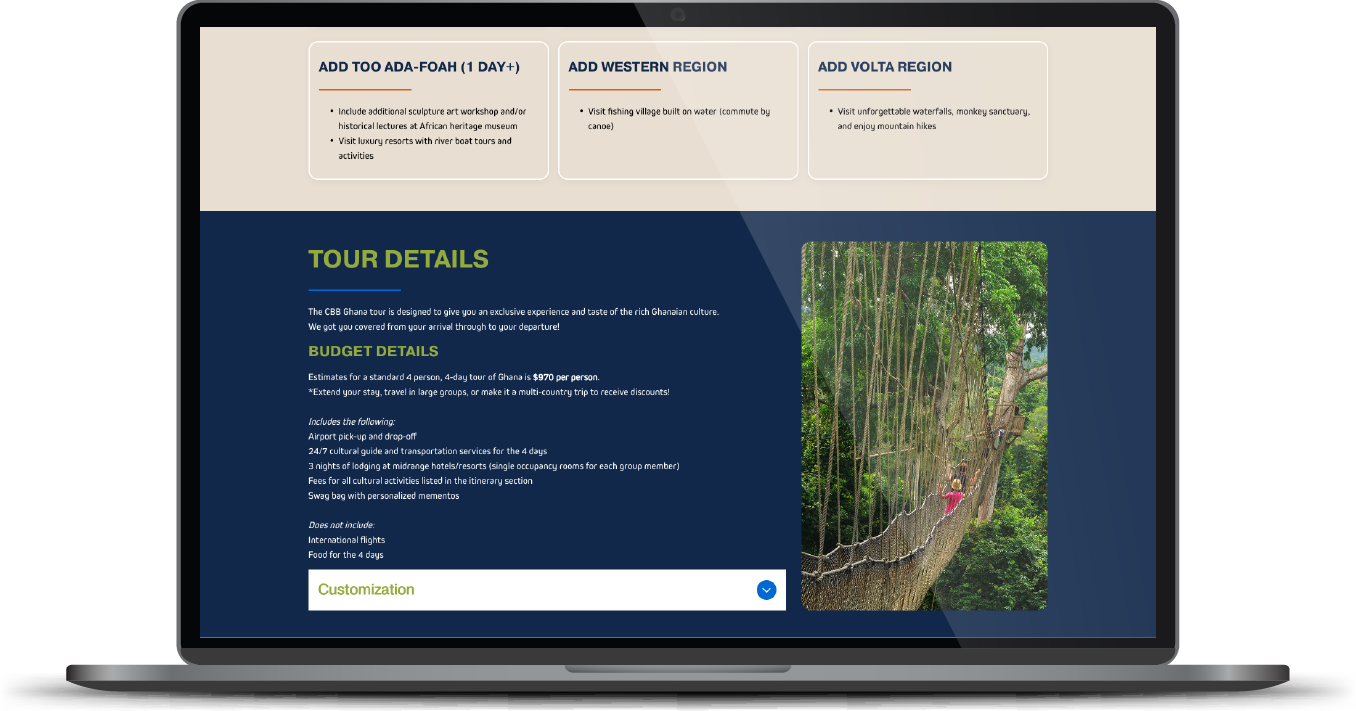
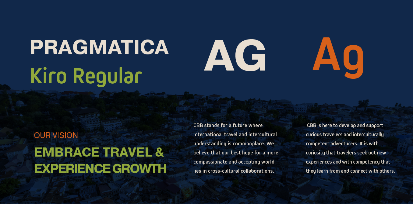
Solid and professional font.
Knowing that international travel is an area where experience and trustworthiness are extremely important, our team selected Pragmatica and Kiro fonts to ensure readability and convey a sense of professionalism and style. Also used in the logo, these fonts also highlight the strong influence of international travel to Africa.
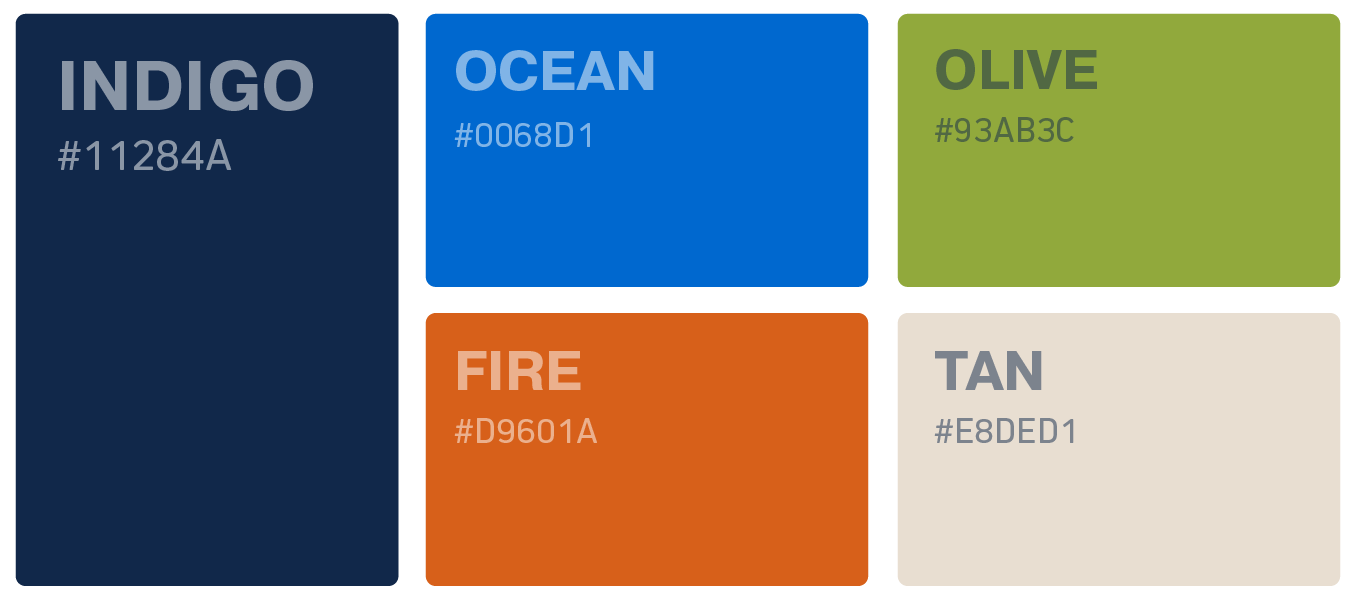
Earthy excitement
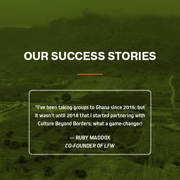
The imagery provided by our client is both vibrant and earthy and became the inspiration for the new color palette. The blues, refreshed from CBB’s old logo, were used to add strong contrast. The other colors selected—olive, fire, and tan—were colors often shown in the client’s photos. Overall, the color palette works to reflect African culture and its use of patterns while its boldness creates excitement as visitors consider immersive travel.

Staff Spotlight
Designed by Krystyanna Joseph
Krystyanna Joseph is the driving force behind groundbreaking website designs at RivalMind. Her approach is defined by a relentless pursuit of innovation, fueled by a deep commitment to research, boundless creativity, and an unwavering dedication to pushing the boundaries of her skills and perspectives. With every project, she sets the bar higher, ensuring that RivalMind remains at the forefront of cutting-edge design and client satisfaction.
Specialties: Duda Web Development, Animation/Motion Design



More Case Studies
We work across an expanse of projects at RivalMind, and we love to share our clients’ successes. For each case study, our goal is the same: bridging the gap between marketing and growth through innovative and custom design. This is why companies come to us. Dive into more of our favorite web design projects below!


