GPR Technology
GPR USA
GPR USA came to RivalMind with a blank slate and big plans: build a brand, sell ground penetrating radar systems, and train the crews who know how to use them. After years in the field, scanning concrete, chasing anomalies, and making sense of what lies beneath your feet, they saw a clear opportunity to turn their expertise into a business.
But as a brand-new name in a market full of heavy hitters, they needed a site that looked sharp, worked hard, and built trust fast. It had to feel real, bold, structured, and tough enough to stand out.
So we got to work. From scratch, we created a distinctly American brand anchored by a strong emblem, authentic imagery, and a no-nonsense tone. Drawing from past collaborations with the client’s other companies, our team helped shape GPR USA into a confident and scalable brand within a technical market. We prioritized structure, clarity, and the long-term goal of a full eCommerce experience.
Built & Hosted using

Energetic, Bold, Inspiring
Website Design
Our Approach
Built from the Ground Up
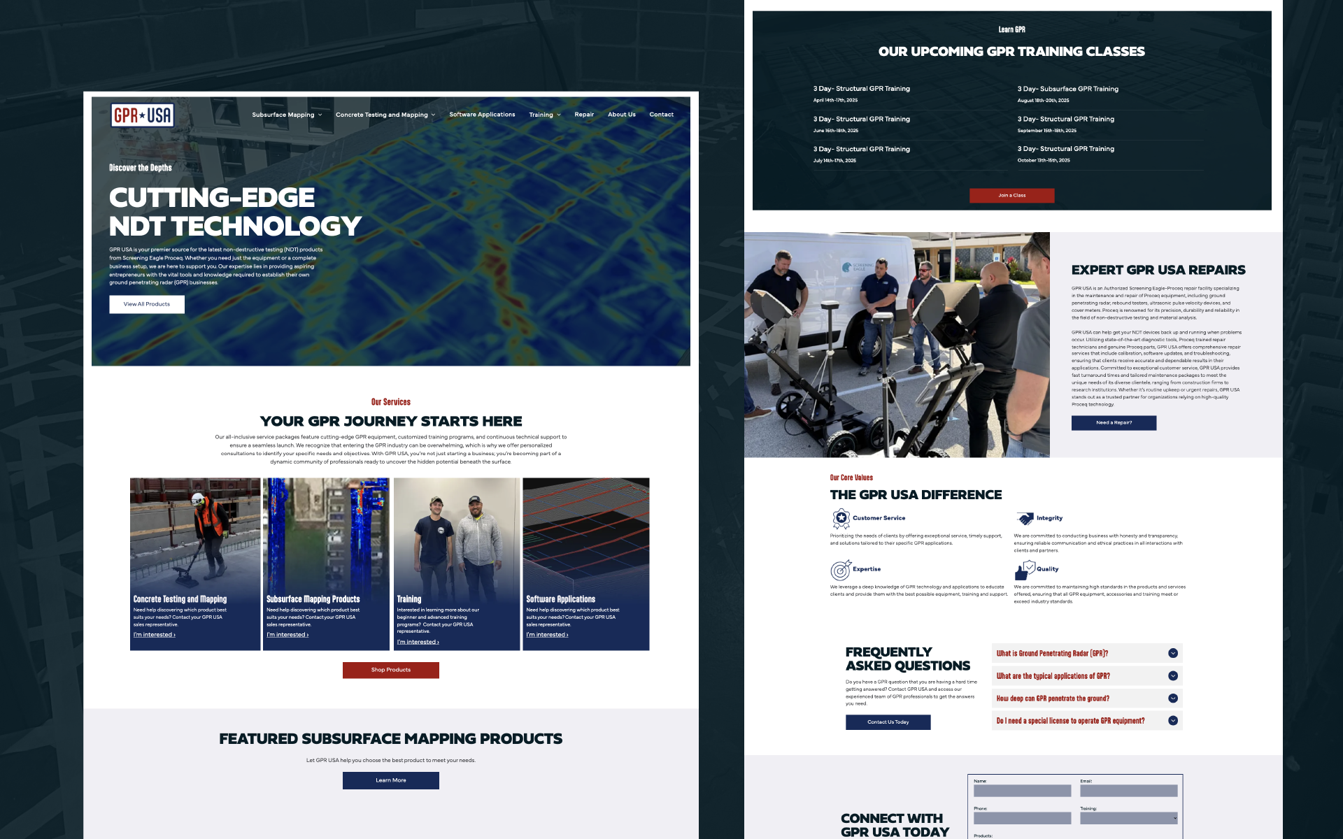
From the start, GPR USA needed a brand that could carry weight in a serious industry. So we built it from the ground up. Our team focused on architecting a digital presence that balanced eCommerce functionality with strategic brand development, including a strong emblem logo, a bold patriotic color palette, and typography that looks like it belongs on a job site, not a showroom.
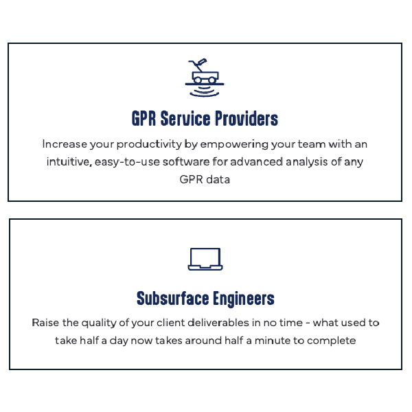
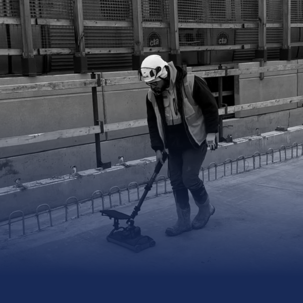
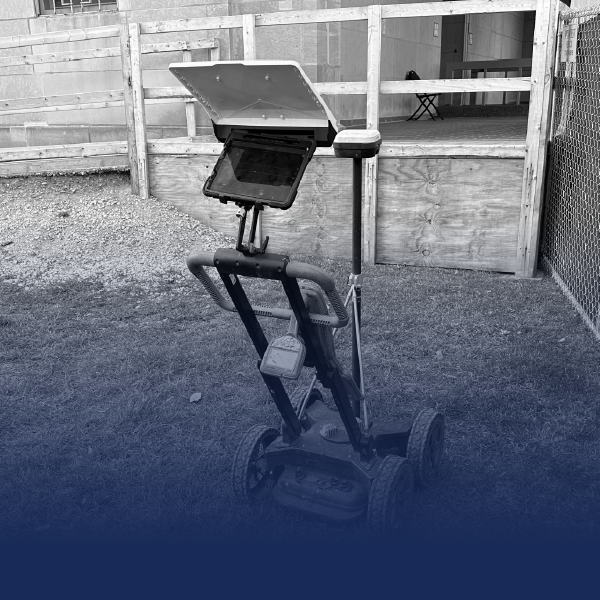
Real work also calls for real imagery. Every photo on the site shows the gear and crews in action, reinforcing credibility from the first click. The layout stays clean and sharp, moving users toward products and training without distractions. The result is a website that feels purposeful, cohesive, and ready to scale alongside GPR USA’s ambitions.
The Results
The final product gave GPR USA exactly what they needed: a credible platform that feels as serious as the work they do. A new logo that sets a confident tone from the start, while the structured layout keeps users moving, whether they’re looking to buy systems or book training.
With authentic imagery and no wasted space, the site builds trust fast. Plus, the e-commerce framework is built in, ready to scale as GPR USA grows its offerings. Early feedback has been strong, and more importantly, the site now gives the site gives GPR USA the platform they need to build real traction in search and grow their online presence.
Altogether, RivalMind built a foundation as tough and ready as the brand itself.
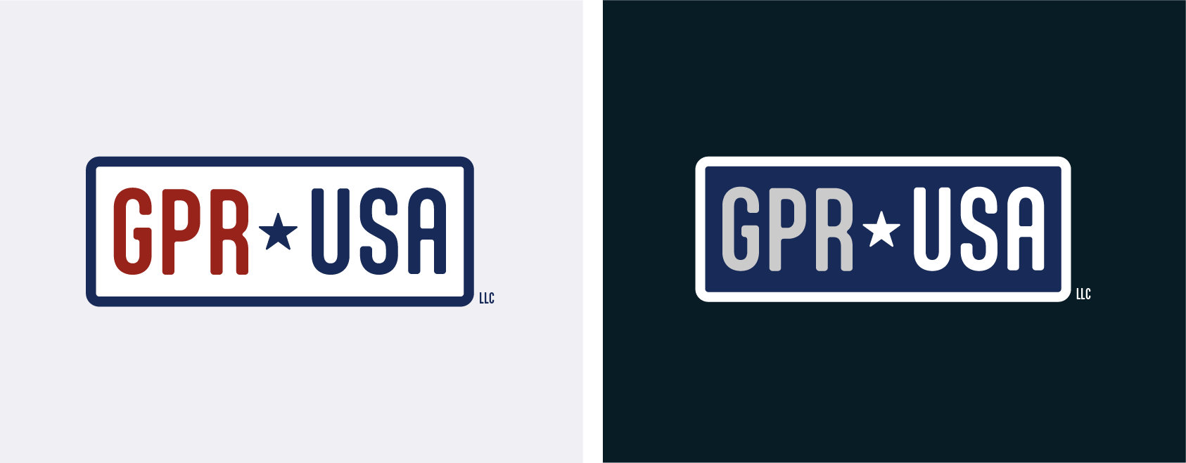
Stamped Tough
Built to match the grit and durability of the concrete and construction industries they serve, the logo balances strength and simplicity. It features bold, block lettering that sits inside a sturdy, rounded rectangle. It’s a shape that calls to mind heavy-duty signage or stamped steel plates. Anchoring the design is a navy star, centered between GPR and USA, offering a nod to their American roots and reputation for solid, dependable work.
Fonts reinforced for the job
We chose Fieldwork for headings. It’s bold, structured, and strong enough to stand out without shouting. The kind of typeface that feels right at home in tough industries, delivering clarity and weight where it counts.
Aptly was pulled from their logo design, carries through to subheadings, bringing a clean, balanced look that keeps the site feeling approachable. For body copy, Mundial steps in, keeping the site crisp, steady, and easy to read across any device, even in less-than-perfect field conditions.
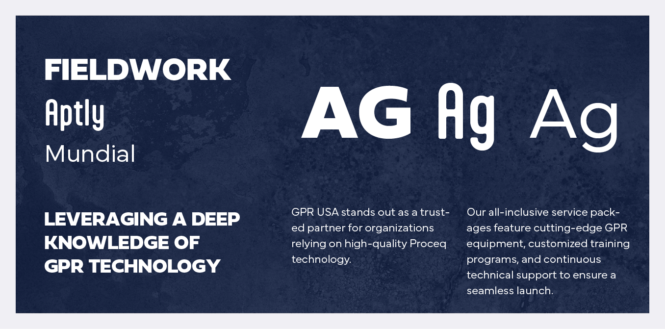
Red, white, and built right
GPR USA’s color palette leans hard into bold, unapologetic strength. The deep blues and sharp reds draw straight from the American flag, but the tones are richer and tougher.
These colors aren’t just for show. They deliver a strong contrast across the site, separating content without clutter and creating a sense of structure and order. Paired with the sharp typography, the palette holds attention and guides users without shouting for it.
Patriotic but practical, these colors reflect what GPR USA is about: serious work and real results, both on-site and online.


Staff Spotlight
Designed by Krystyanna Joseph
Krystyanna Joseph is the driving force behind groundbreaking website designs at RivalMind. Her approach is defined by a relentless pursuit of innovation, fueled by a deep commitment to research, boundless creativity, and an unwavering dedication to pushing the boundaries of her skills and perspectives. With every project, she sets the bar higher, ensuring that RivalMind remains at the forefront of cutting-edge design and client satisfaction.
Specialties: Duda Web Development, Animation/Motion Design


More Case Studies
We work across an expanse of projects at RivalMind, and we love to share our clients’ successes. For each case study, our goal is the same: bridging the gap between marketing and growth through innovative and custom design. This is why companies come to us. Dive into more of our favorite web design projects below!