Ceramic Coatings
BK Industrial
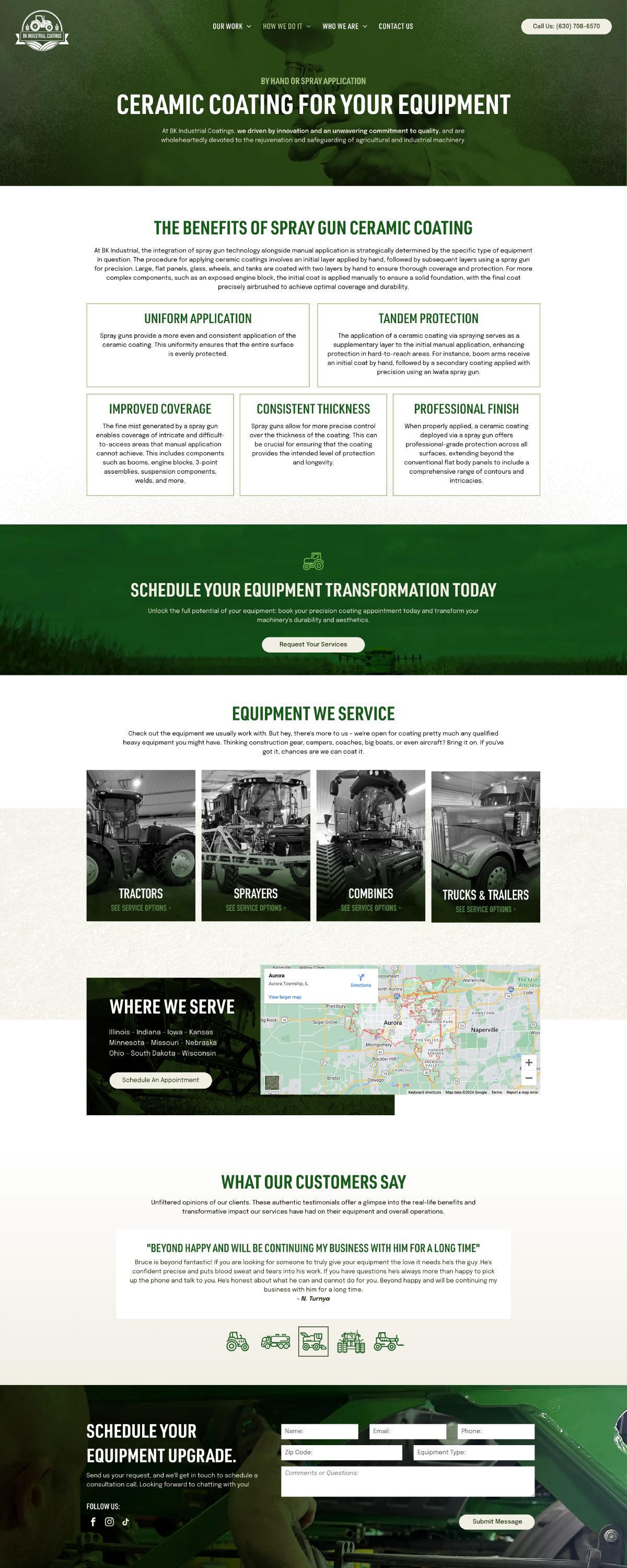
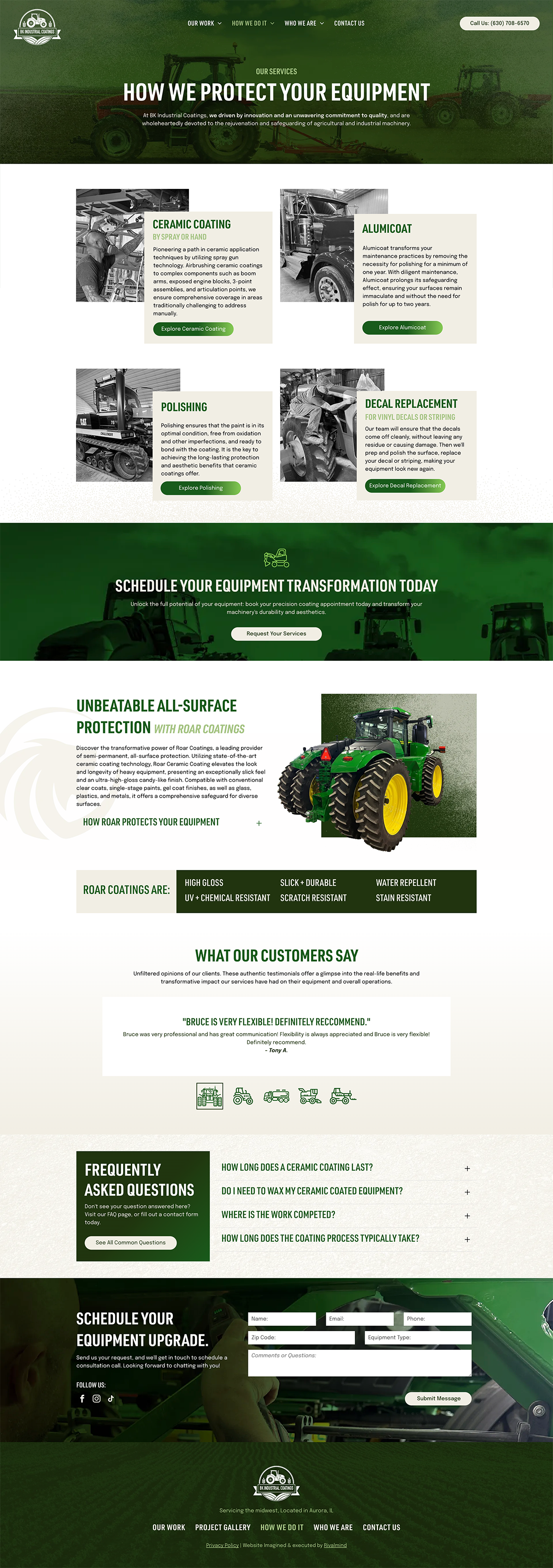
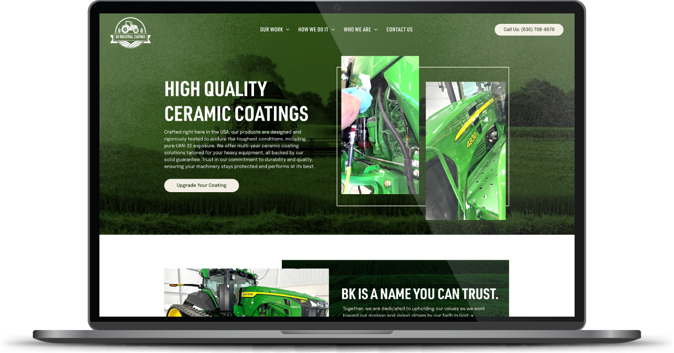
Enhancing and protecting the value of expensive machinery through a unique, hand-applied coating is the goal of this family business. With services originally targeted to farming equipment, they were ready to extend their offering to semi-trucks, construction gear, campers, boats, and even aircraft.
While the company leadership was ready to say, “Bring it on!” their website wasn’t built to support that message. Through good ole fashioned word of mouth, they came to RivalMind to establish a new brand identity and develop a website that would quickly display their capabilities and support their growth.
Built & Hosted using

Gritty, Rugged, and Layered
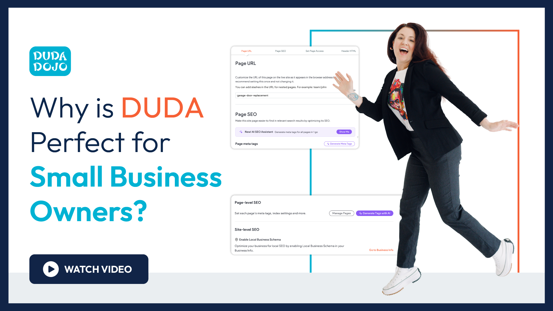
Website Design
Our Approach
Attract motivated people through dynamic design
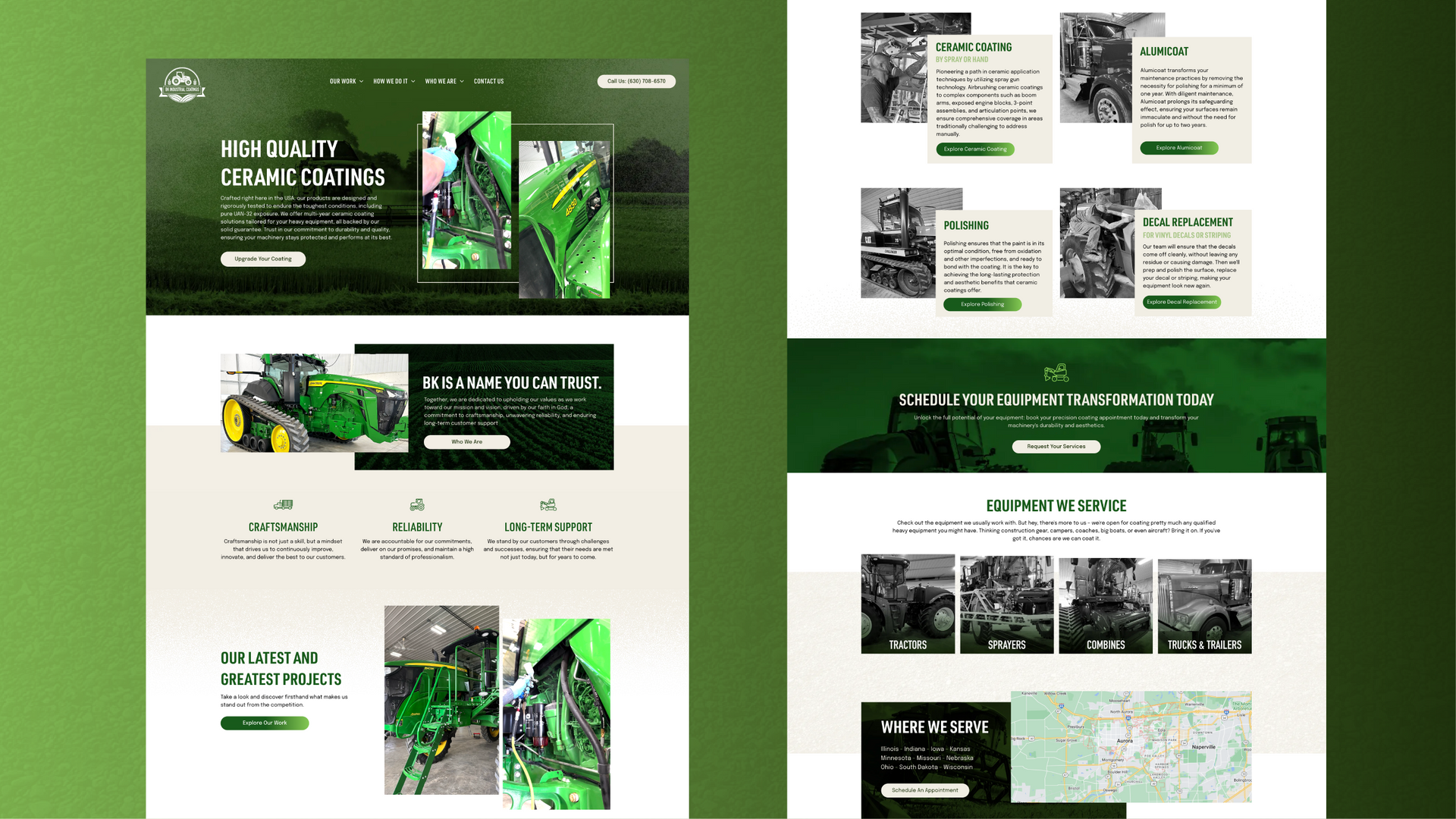
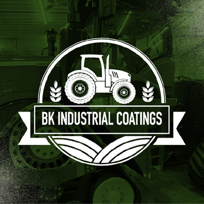
The client provided a logo that served as inspiration to build a more robust brand. We expanded their brand identity to include a full color pallet, a company voice, consistent imagery, and other graphic identifiers that represent what this company does and how they do it.
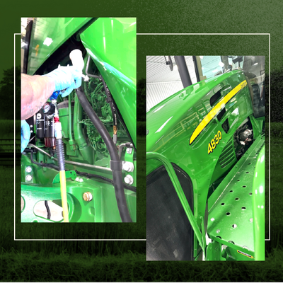
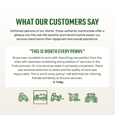
The client supplied ample imagery and videos for our team to incorporate, and we selected key images to present a new section of before and after examples that now powerfully display the impact of BK’s work.
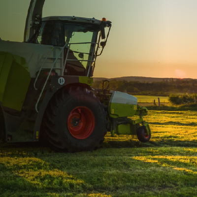
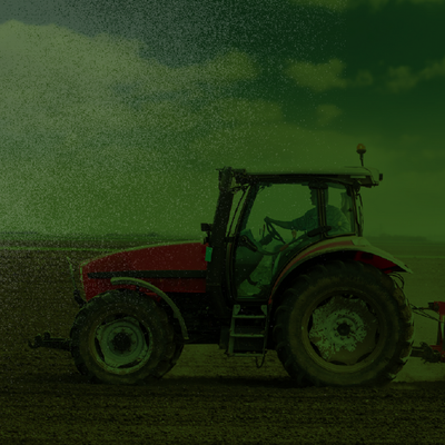
Our team also sourced stock imagery of tractors and other machinery at work for use in the background of various website pages. This active imagery allows users to visualize their equipment being upgraded and used to its full potential. Drawing inspiration from the spray application of ceramic coating, our team also integrated a grainy spray texture throughout the site, reinforcing the brand message of a unique technique.
The Results
Now infused with high-contrast imagery and colors to appeal to a more masculine, strong, and rugged audience, BK’s new website immediately connects with their target audience. It also quickly represents their expanded offerings and their high-level of expertise and quality commitment.
Before & After
Balanced, brand-consistent fonts.
DIN Condensed was pulled from the client’s logo file and integrated into all site headers. Epilogue was chosen for the body copy based on its memorable characteristics of balanced rigidity and roundedness. It pairs well with the simple and geometric sans-serif typeface of DIN Condensed.
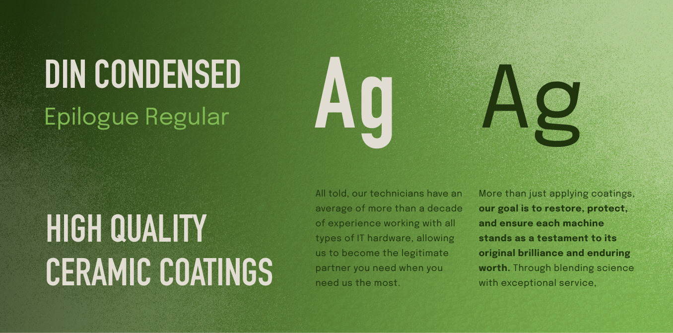
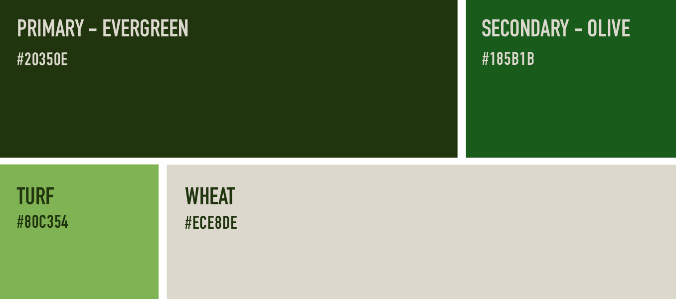
Greens with earthy tones.
Using the client’s logo as a starting point, our team chose a green color scheme with reduced vibrancy and darker colors. After adding in a sandy beige for backgrounds and accents, our high-contrast, earthy palette became a foundational element to ground BK Industrial’s cohesive brand.
More Case Studies
We work across an expanse of projects at RivalMind, and we love to share our clients’ successes. For each case study, our goal is the same: bridging the gap between marketing and growth through innovative and custom design. This is why companies come to us. Dive into more of our favorite web design projects below!
Contact Us
It's time to grow your business.
BK Industrial Web Design Portfolio Contact Form
We will get back to you as soon as possible.
Please try again later.