Picture This–Your Blog, But Better
Visual Content Marketing Strategy for SEO
At its best, a visual content marketing strategy is more than adding “a few pictures.” It’s using purposeful design, like infographics, charts, and data visuals, to make complex ideas easier to digest, harder to ignore, and more likely to be remembered.
More than that, however, visuals are functional. They improve comprehension, yes, but they also drive results. Search engines reward content that meets intent with speed and clarity, and visuals help deliver both. When crafted with care, they reduce bounce rates, increase shareability, and attract backlinks from sources that matter. They serve both the reader and the algorithm without compromising either.
So, on the surface, it’s design. But underneath, it’s structure, strategy, and storytelling working together.
Still, successful great visual content marketing requires direction. From the type of visuals used to how they’re optimized and where they’re placed, every design choice should serve a larger strategy. They should be built to rank, built to convert, and built to scale.
Key Takeaways:
1. The Power of First Impressions:
Visuals stop the scroll and shape how your content is experienced. Infographics are tools that lead to decisions.
2. SEO Meets Aesthetics:
Search engines reward content that’s clear, fast, and relevant. Optimized visuals help keep users on the page longer, which reduces bounce rates and drives organic traffic.
3. Why DIY Isn’t Always Enough:
Scattered or mismatched visuals erode trust. Cohesive, on-brand design signals professionalism and purpose.
4. Future-Proofing Your Content Strategy:
As platforms evolve and attention spans shrink, content strategies must prioritize clarity, speed of understanding, and strong visual storytelling.
The Rise of Visual Content in Digital Marketing
How Visuals Shape What We See, Understand, and Remember Online
Information moves fast. Attention moves faster. For brands trying to build awareness, educate, or convert, the first few seconds matter most. Text-heavy content can work, but it asks more from the reader.
Visual content reduces that ask. Readers understand more in less time, and that leads to higher retention and more meaningful engagement.
Brands that invest in visuals find themselves creating a visual shorthand that acts like branding and improves visibility in search and social. They communicate more effectively. And when messaging lands faster, conversions follow.
Numbers That Don’t Lie: Visual Content by the Stats
Mobile behavior and visual engagement
More so than any other platform, mobile invites rapid decision-making. Users aren’t carefully digesting, they’re making split-second judgments about value based on layout, clarity, and visual cues.
Visuals help cut through friction. Studies show that content paired with relevant images gets viewed up to 94% more than text-only versions. That means better reach and stronger engagement on smaller screens.
Social media performance and visuals
On platforms like Instagram and LinkedIn, posts that include infographics or designed visuals generate higher shares, clicks, and saves because they make key points instantly clear and easily digestible.
Pinterest takes this even further. Entire search experiences on Pinterest are driven by design. It’s where users go specifically to discover through visuals. Users are planning purchases, gathering ideas, and bookmarking inspiration. Infographics and branded visuals that offer value, like how-tos, comparisons, and quick tips, are shared again and again, often generating referral traffic long after the original post date.
Other platforms are evolving the same way. Facebook prioritizes eye-catching content in its feed. Even X (formerly Twitter) sees higher engagement when tweets include visuals. Across the board, graphics make posts more memorable, more shareable, and far more likely to spark meaningful interaction.
Where are your social media strengths, gaps, and opportunities?
We can tell you, and it’s free.
Why Visual Content Drives SEO Performance
The Link Between Engagement Metrics and Search Rankings
Search engines aim to serve the best content first, and strong engagement signals help prove quality. Time on page, scroll depth, and bounce rate. These are the roadblocks that signal disconnection. They’re the behavioral metrics that tell Google how useful a page might be. Visuals improve these metrics. When people stay longer, interact more, and come back again, it’s a signal that the content delivers.
Technical SEO for Visuals: What Really Matters
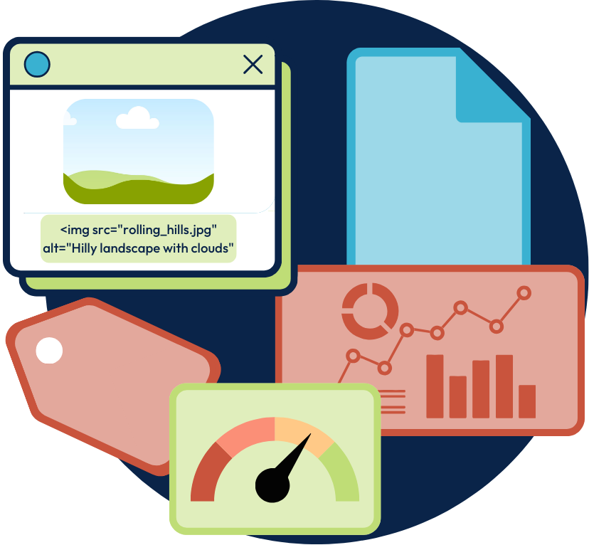
Alt text, file names, and compression
Image SEO isn’t complicated, but it does need to be intentional. And visuals carry more weight when they’re optimized to be seen and understood. Alt text gives search engines the context they need to index images correctly. Clear, descriptive file names reinforce content relevance behind the scenes. Compression ensures fast load times, which not only improves user experience but also supports better rankings.
Core Web Vitals and image performance
Google’s Core Web Vitals track load speed, visual stability, and interactivity. Heavy, unoptimized visuals can cause slowdowns or layout shifts, which hurt scores. Lightweight images, sized for display and loaded responsively, help meet these technical thresholds, keeping both users and algorithms happy.
Infographics: A Link Magnet When Done Right
Useful, well-designed infographics tend to attract links naturally. They distill complex ideas into shareable content. When others reference your infographic in their content, they link back. Those backlinks help boost authority and improve keyword rankings.
How Google’s Image Understanding Is Evolving
Google’s understanding of visuals is getting more sophisticated. With the help of AI, it now reads context, captions, nearby copy, and even the contents of the image itself. In real time, machines are learning to recognize objects, interpret visual structure, and extract meaning from what was once invisible to them.
This shift changes how we think about imagery online. Every visual you publish becomes part of how your content is read, ranked, and remembered. And in a world where machines can now "see," what we choose to show carries more weight than ever.
The Anatomy of a High-Impact Visual Content Strategy
Step 1: Define Your Goals & Audience
Every impactful visual starts with clarity. Who are you speaking to, and what do you hope they walk away with? Maybe it’s education for a first-time visitor. Maybe it’s reassurance in the middle of a decision. Maybe it’s trust, reinforced through design. Knowing your audience’s preferences, challenges, and behaviors gives you the insight to create assets that actually resonate.
For example, a SaaS company launching a new feature might use a series of micro-graphics on LinkedIn to walk users through the “why” behind the update, reinforcing clarity and trust without overwhelming them with text.
Step 2: Select the Right Formats
Infographics, illustrations, video, and carousels
Each format serves a purpose. Infographics distill data. Illustrations bring brand personality forward. Video builds an emotional connection. Carousels simplify step-by-step learning. The right choice depends on the message and the medium.
Platform-based considerations (web vs. social)
What works on a landing page might not translate on Instagram. Social content needs to grab attention fast. Website visuals should support conversion flow. Designing for the platform means visuals meet users where they are and how they scroll.
Step 3: Design with Intent
Think of design as your reader’s first cue. Before a word is read, it signals where to look, what matters, and how to move forward. The right choices in layout, color, and spacing help guide attention, reduce friction, and create a clearer path through your message.
Step 4: Optimize for Every Channel
Not every visual is meant to live everywhere. Search engines look for metadata and load speed. Social platforms reward shareability and clarity. Mobile demands a clean structure and fast delivery. Tailor file sizes, metadata, and design specs to match the channel’s expectations.
Step 5: Measure & Iterate
Once something is live, it starts speaking. Metrics like engagement, scroll depth, and shares offer insight into what’s resonating and what’s being skipped. Use analytics to understand what’s working, refine what isn’t, and build a system that improves over time.
The Difference is in the Details
The Real Cost of Amateur Visuals
Audiences may not always articulate why something doesn’t land, but they often feel it. Uneven spacing, mismatched colors, or low-resolution graphics send subtle signals that something isn’t quite aligned. These details may seem small, but they shape first impressions.
And that’s not a reflection of effort or intention; in fact, many DIY designs come from a place of deep care. But design is communication, and small details often carry bigger meaning. When visuals are thoughtfully aligned (clear, cohesive, intentional), they build a sense of credibility that invites connection. So while DIY design might save budget up front, it can cost more in missed opportunities, diminished credibility, and underperforming content.
Design Consistency = Brand Trust
Strong brands signal clarity through consistency. When fonts, colors, and layouts are chosen with care, each touchpoint reinforces a sense of identity. Over time, that visual rhythm builds familiarity, and with it, trust. Audiences begin to feel at ease, more confident in what’s being offered, and more willing to stay engaged. On the other hand, a scattered or inconsistent design introduces friction. It creates small moments of doubt that make it harder for people to connect and harder for your message to take root.
Where DIY Falls Short in SEO
DIY design efforts often skip over the technical details that help infographics rank and convert. The result might look polished on the surface, but without the right structure underneath, it can miss the mark in search and fall short of its full potential.
Tools Alone Aren’t Enough
Design software has come a long way. It’s more accessible, more intuitive, and filled with features that promise efficiency. But tools alone don’t make the strategist (or the designer). Templates can’t define content hierarchy or shape a compelling visual narrative. What matters most is the intention that guides how space is used, how information flows, and how attention is directed.
How RivalMind Crafts Visual Content That Performs
At RivalMind, every infographic we design is guided by the same purpose: help people understand faster, connect deeper, and move forward with confidence. Sometimes that means guiding a prospect through a decision. Other times, it’s helping a partner tell their story with more impact.
Take our recent work for a flight training partnership with a local flight school. Their offer was strong, a three-year path to a university degree, paid co-pilot training, and financing through a credible lender. But the content was dense. Long paragraphs, heavy structure, no clear entry point. So we reimagined it as a visual that helped the message take off and land with clarity.
We started with structure. A timeline inspired by the aviation path gave users a clear sense of progression, starting with small aircraft and leading to full-time roles in commercial aviation. These aircraft served as visual anchors, grounding the opportunity in something real.
Financial information was broken into scannable blocks and color-coded for clarity. Repayment stages were easy to follow at a glance. Layered messaging connected the program to Purdue Global and Southern Airways, adding credibility without overexplaining.
The final graphic was built as a smart pop-up. It appeared when users hovered without converting and was designed to catch the eye, spark curiosity, and move them to act.
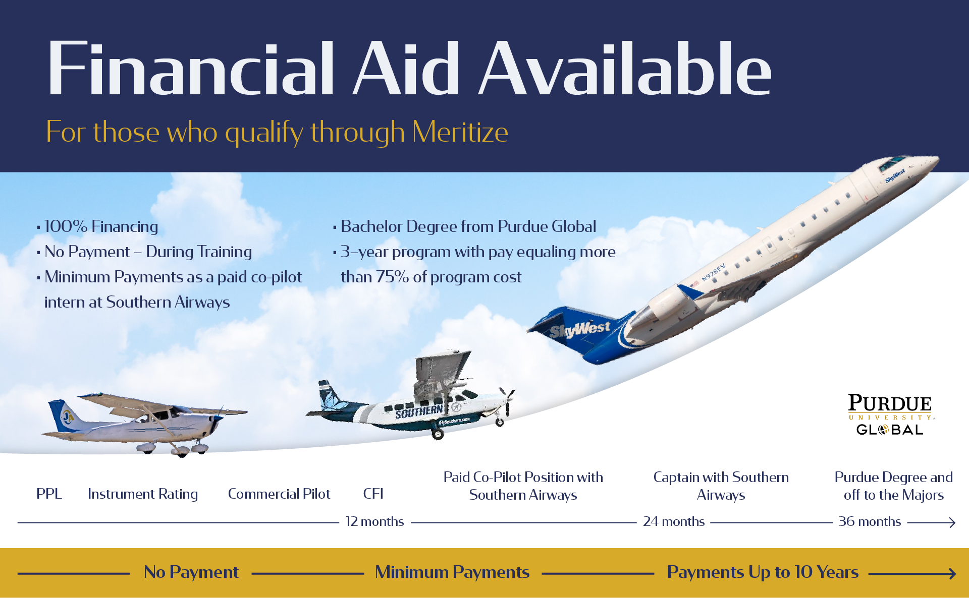
The result? A tool that worked. It cut through the noise, reduced friction, and made the value of the program easier to grasp.
The Future is Visual
Emerging Trends in Visual Content
Visual expectations are shifting fast. Motion graphics are showing up in spaces that used to be static. Interactive infographics are doing what long paragraphs used to. Visual search, once a novelty, is becoming a real and growing pathway for how people find and engage with content.
What holds the audience’s attention today isn’t always what worked yesterday. Static images still serve a purpose, especially when they’re intentional and well-executed, but now they share the stage with formats that invite interaction, spark curiosity, and respond to how we process information in motion.
AI-Assisted Visuals: Hype vs. Real Opportunity
AI-generated visuals are becoming common. With the right prompts, anyone can produce quick mockups, style variations, or concept drafts in seconds. And that speed has real benefits. It can streamline workflows, spark new ideas, and remove creative bottlenecks.
But speed alone isn't a strategy. AI doesn’t know your audience. It doesn’t sense tone, understand nuance, or align its output with your brand’s deeper goals. It generates, but it doesn’t discern.
That’s where human judgment still matters most. AI is a tool, and like any tool, its value depends on how intentionally it’s used. When guided well, it can accelerate production without sacrificing precision or purpose. It can help bring ideas to life faster, without losing sight of what makes them meaningful.
Standing Out Through Storytelling and Strategy
Storytelling is uniquely human. It’s how we make sense of complexity, how we build connection, and how we turn raw information into something that resonates. In marketing (especially content marketing), it’s not just about what we say, but how we say it, and whether the message actually sticks.
That’s where infographics shine. They combine story and structure in a format that’s easy to engage with and hard to forget. When crafted with care, infographics guide the eye, simplify dense concepts, and help the reader move through information with clarity and purpose.
But the real power lies in how infographics support the deeper story your brand is telling. They show that you not only have insight to offer, but that you respect your audience’s time and attention.
Let’s Visualize Your Growth Together
Visual content is quickly becoming the deciding factor in how people engage, decide what’s worth their time, and how they remember your brand. But visuals alone don’t create outcomes. Strategy does.
At RivalMind, every project starts with a clear goal, and every tactic ladders up to it. From SEO and content marketing to email, social, and web design, we build systems that connect, convert, and scale. Infographics and visuals are one piece of that larger picture.
Our clients don’t come to us for quick fixes. They come for traction, for momentum, for strategy that moves. We combine creativity and technical precision, not because it’s trendy, but because it works.
If you’re looking for a partner who values clarity, strategy, and human-centered growth, we’d love to explore that with you.

Meet the Author
Jessica Goodrum
Marketing Director
Jessica Goodrum is the Marketing Director at RivalMind, responsible for brand management, marketing, social media, and networking. With over a decade of experience in digital project management, Jessica has a proven track record in driving business growth through innovative marketing strategies. She oversees the direction and success of RivalMind's marketing efforts and collaborative relationships, always striving to create authentic connections and deliver exceptional results. Jessica’s management philosophy is rooted in transparency, and clearly communicating project goals and the necessary steps to achieve them is a top priority.
Specialties: Brand Management, Media Relations, Keeping It All On Task
Looking for more organic website traffic?
Welcome to RivalMind. Our purpose is to help your business thrive. We are a digital marketing agency that offers SEO, PPC, Web Design, Social Media and Video Solutions as tools to our clients for online business development and growth.
Contact us today to get started!
Blog Contact Form
Connect with Us: