
Our Approach
Ninja like design, accurate electronic prototypes
We set out to craft a site that felt as agile and inventive as the brand itself. With minimal branding to start, our focus was on forging a digital identity that matched Ninja Circuits’ pace and personality.
The design strategy leaned into dynamic elements like micro-interactions, bold typography, and strategic color to keep users engaged without overwhelming them. Playful ninja graphics added character, while a carefully structured layout made the experience intuitive.
Navigation was reworked for smoother flow, and service pages were expanded to amplify visibility and SEO. Every move was deliberate, creating a site that balances excitement with professionalism and positions Ninja Circuits for long-term growth.
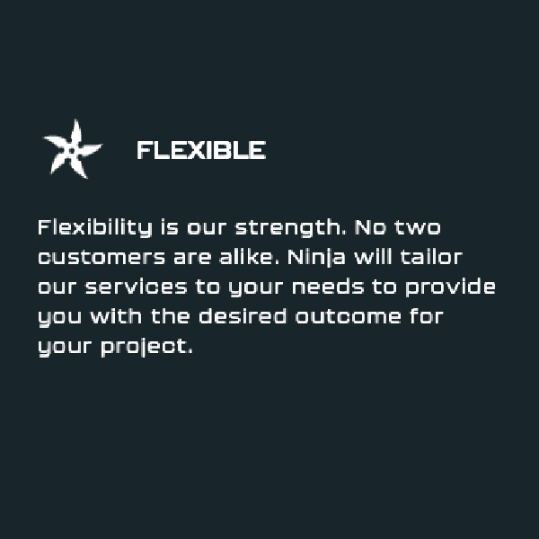


The Results
The new site gave Ninja Circuits a refined online presence and a more intentional user journey. Information is organized for faster discovery, and services are presented with greater clarity. Visitors now interact with a site that feels purposeful and easy to explore.
Behind the scenes, the platform boosts SEO performance and makes updates more efficient. Since launch, Ninja Circuits has reported an increase in qualified leads and stronger engagement from prospective clients, setting the stage for continued momentum.
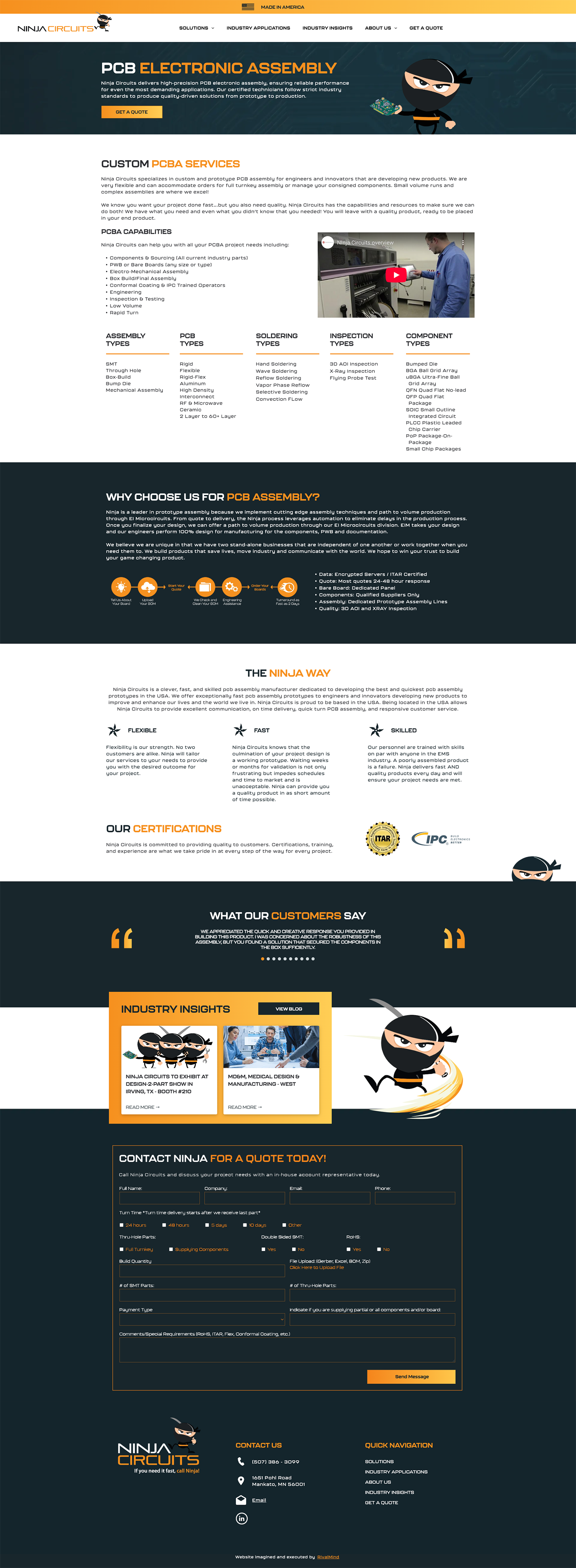
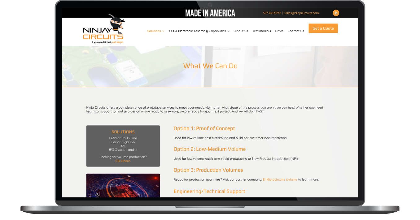
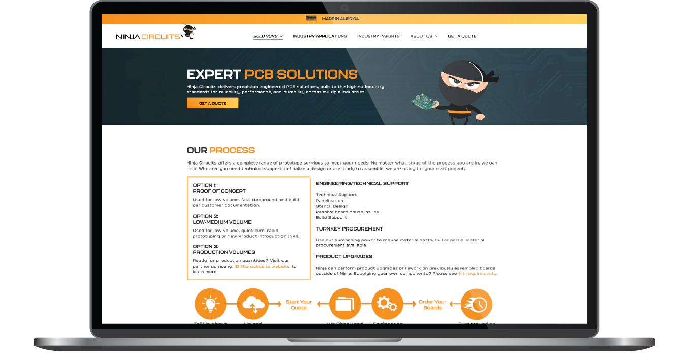
Before & After
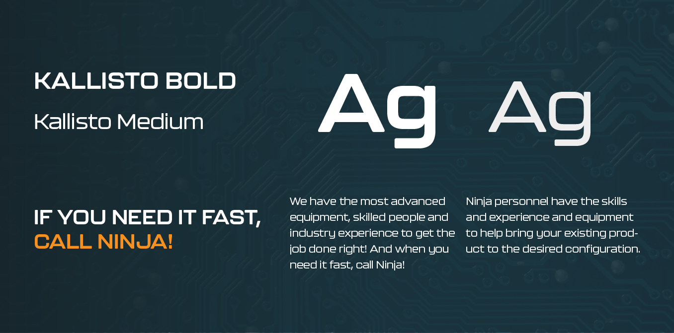
Type That Strikes with Impact
Typography on the new site reinforces clarity and energy. Following Ninja Circuits’ brand direction, Kallisto was selected for both headings and body text. Its bold, rounded letterforms bring a distinctive character to the site, balancing a playful tone with the professionalism expected in the tech industry.
Readable across devices and styled for consistency, Kallisto supports the site’s dynamic feel without sacrificing structure. The font’s form pairs seamlessly with the ninja-inspired graphics, creating a brand identity that feels disciplined, expressive, and ready to strike.
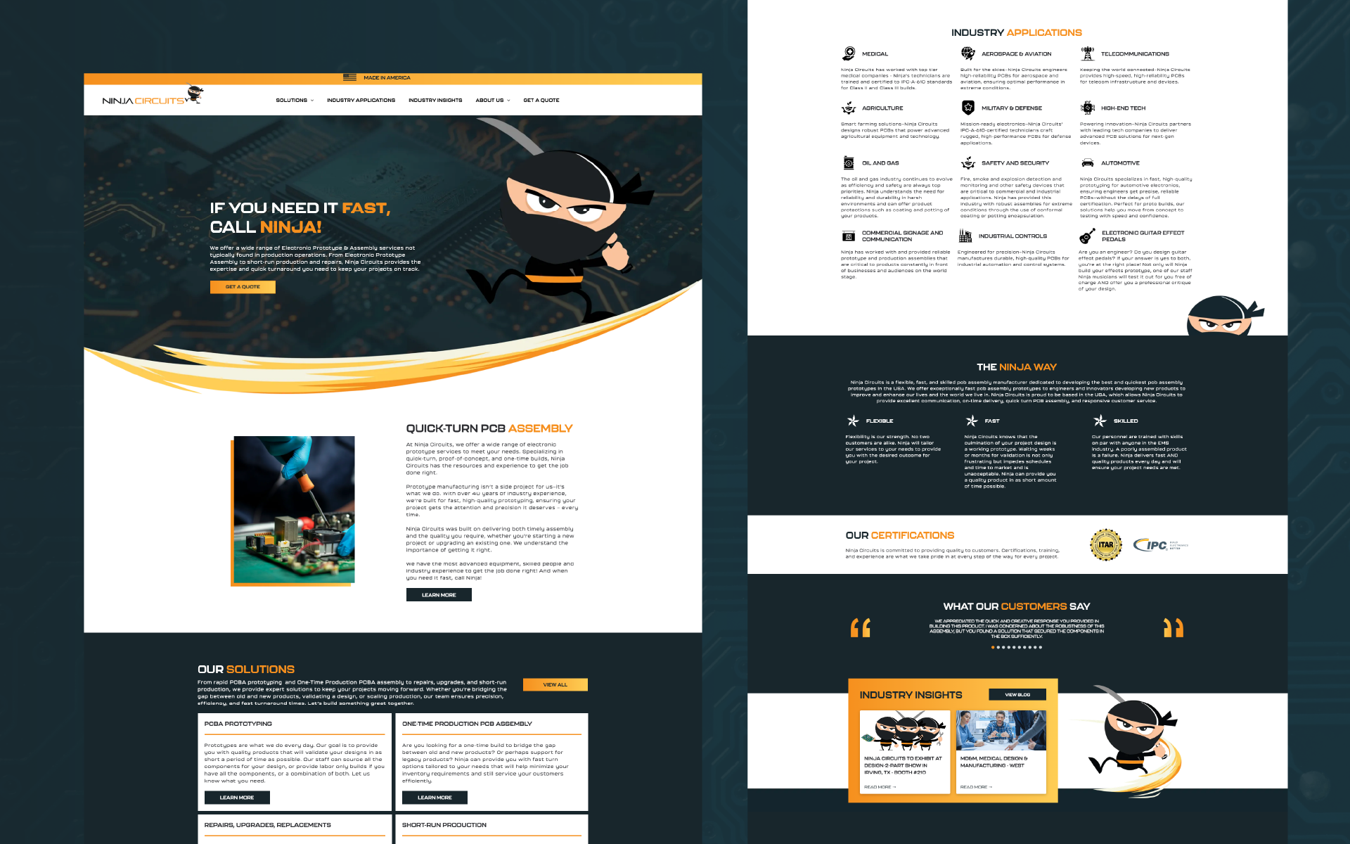
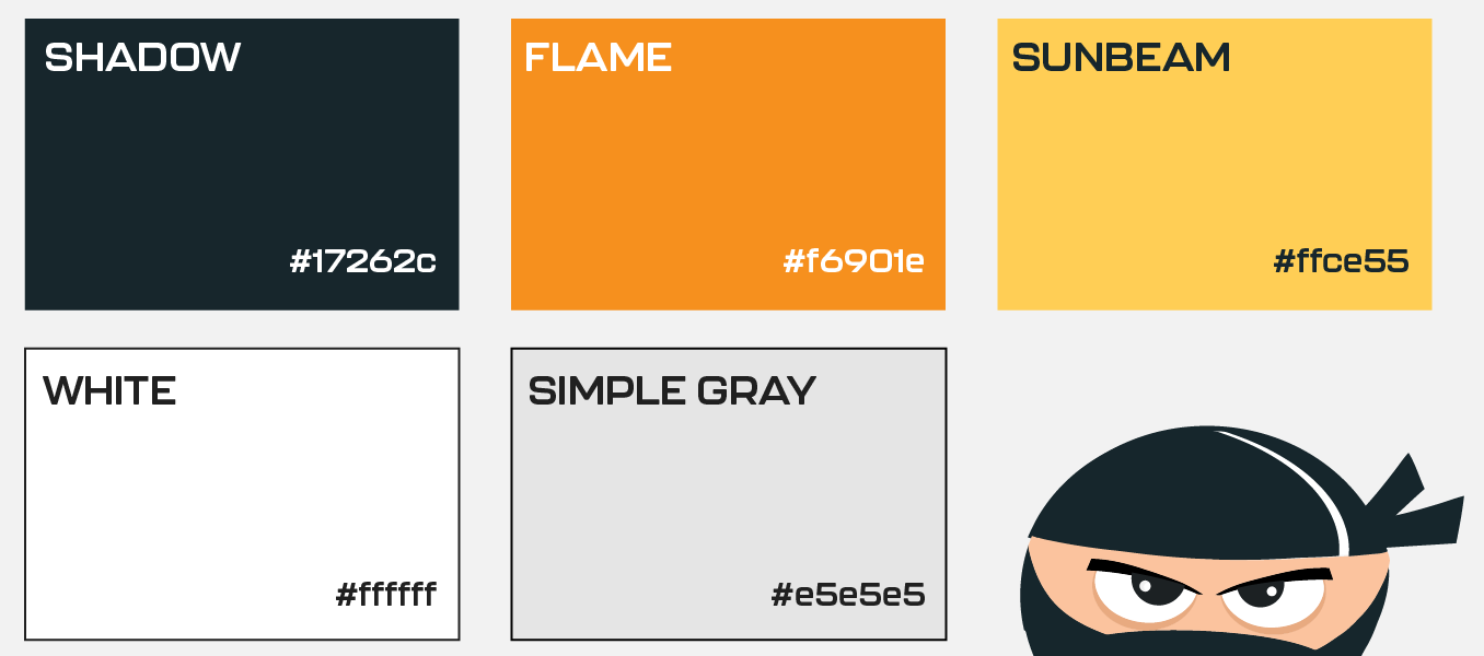
Stealth in Every Shade
Ninja Circuits’ color system moves with subtle force. Deep blacks provide a strong base, while bursts of orange and yellow inject controlled energy without overwhelming the design. Gradients and neutral tones add depth and movement, reinforcing the site’s dark, modern edge.
Every shade is deployed with intent, guiding focus while maintaining a sense of stealth and precision. The palette supports a brand presence that feels composed and engineered to leave an impression without making a sound.

Staff Spotlight
Designed by Haley Stein
Haley Stein, a seasoned web graphic design, harnessing years of invaluable agency experience to deliver exceptional design excellence. She specializes in crafting not just websites, but immersive digital experiences that transcend mere aesthetics. From captivating social media campaigns to visually stunning website interfaces, Haley's creations leave a lasting impression on our client's and their audiences.
Specialties: Duda Web Development, Branding/Identity, Packaging


More Case Studies
We work across an expanse of projects at RivalMind, and we love to share our clients’ successes. For each case study, our goal is the same: bridging the gap between marketing and growth through innovative and custom design. This is why companies come to us. Dive into more of our favorite web design projects below!