Cleaning Services
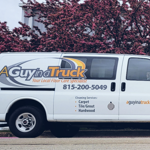
A Guy in a Truck
When your company website goes down, it’s not always an easy fix—and time is money. Facing this crisis, the owner of this top-notch cleaning service found RivalMind through a Google search. They also discovered a team who could deliver exactly what they needed: a rapidly executed short-term solution and a new site that would exceed expectations.
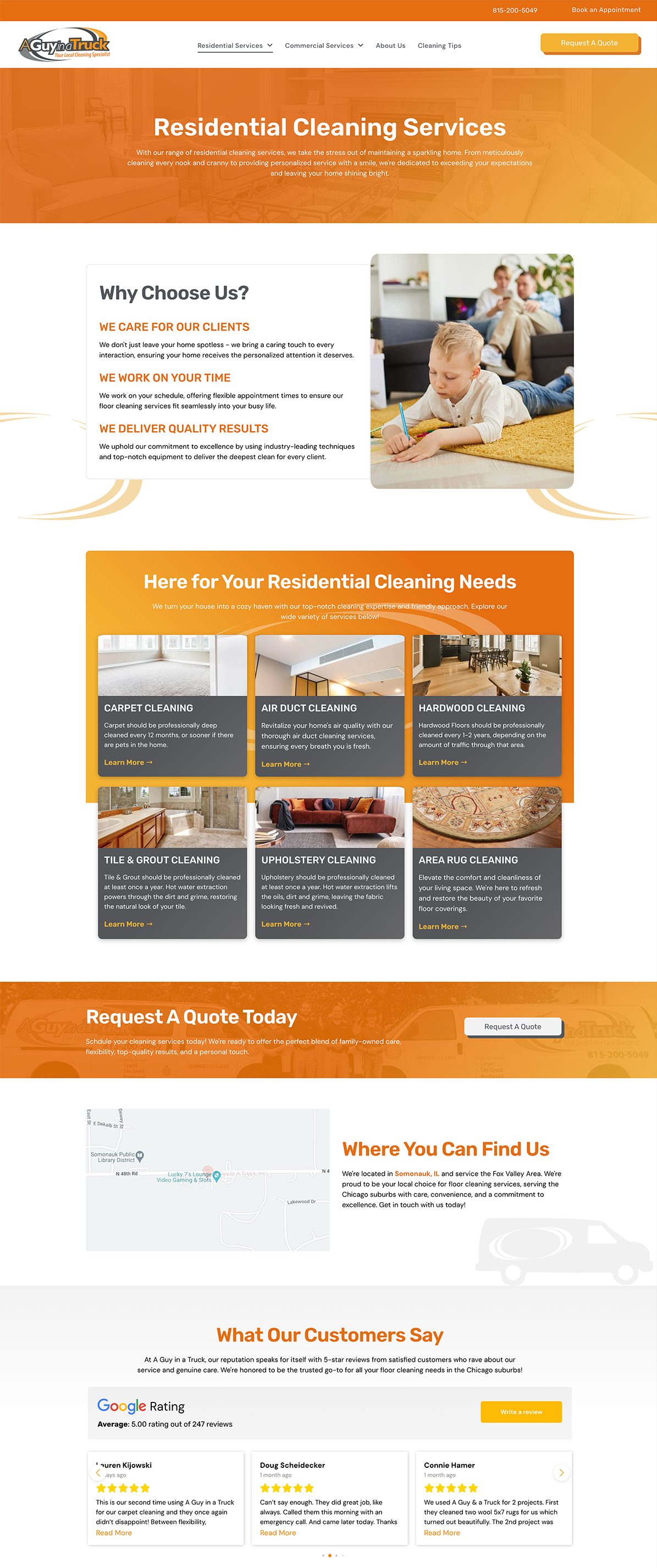
First order of business: creating a landing page and launching it to their domain to put something in place while a new website was built. Additionally, we educated the client on how this new site would set up their pages for SEO success now and into the future.
Built & Hosted using
Organized, Branded, Pristine
Website Design

Our Approach
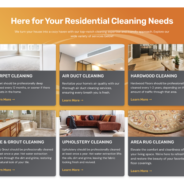
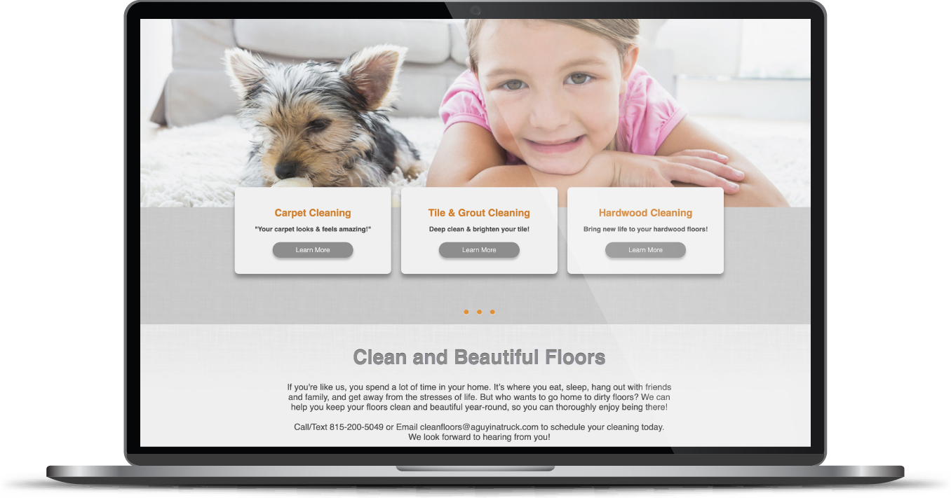
Express cleanliness through structure and design
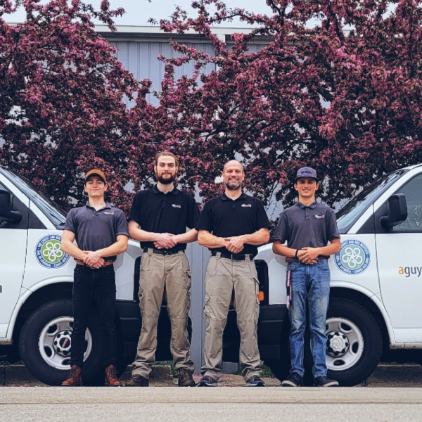
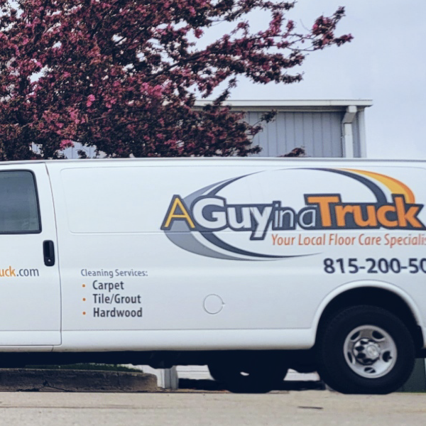
The client had a well-established brand, so we decided to play off the foundation set by their logo and color scheme, using these elements to expand and refresh their identity.
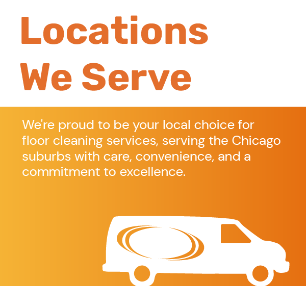
A silhouetted outline of the logo was developed into a background graphic and incorporated throughout, subtly reinforcing the consistency of the brand message on the website.
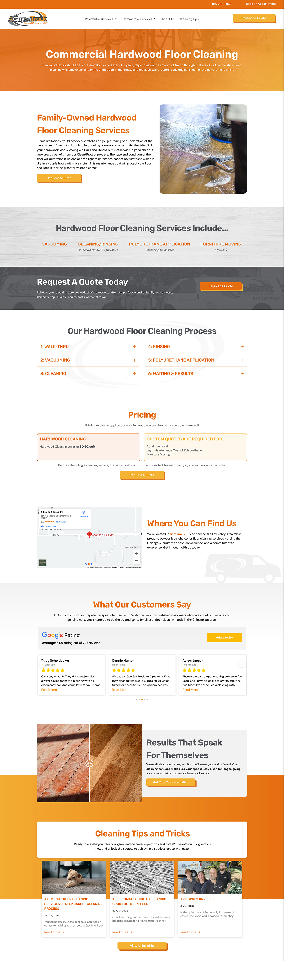
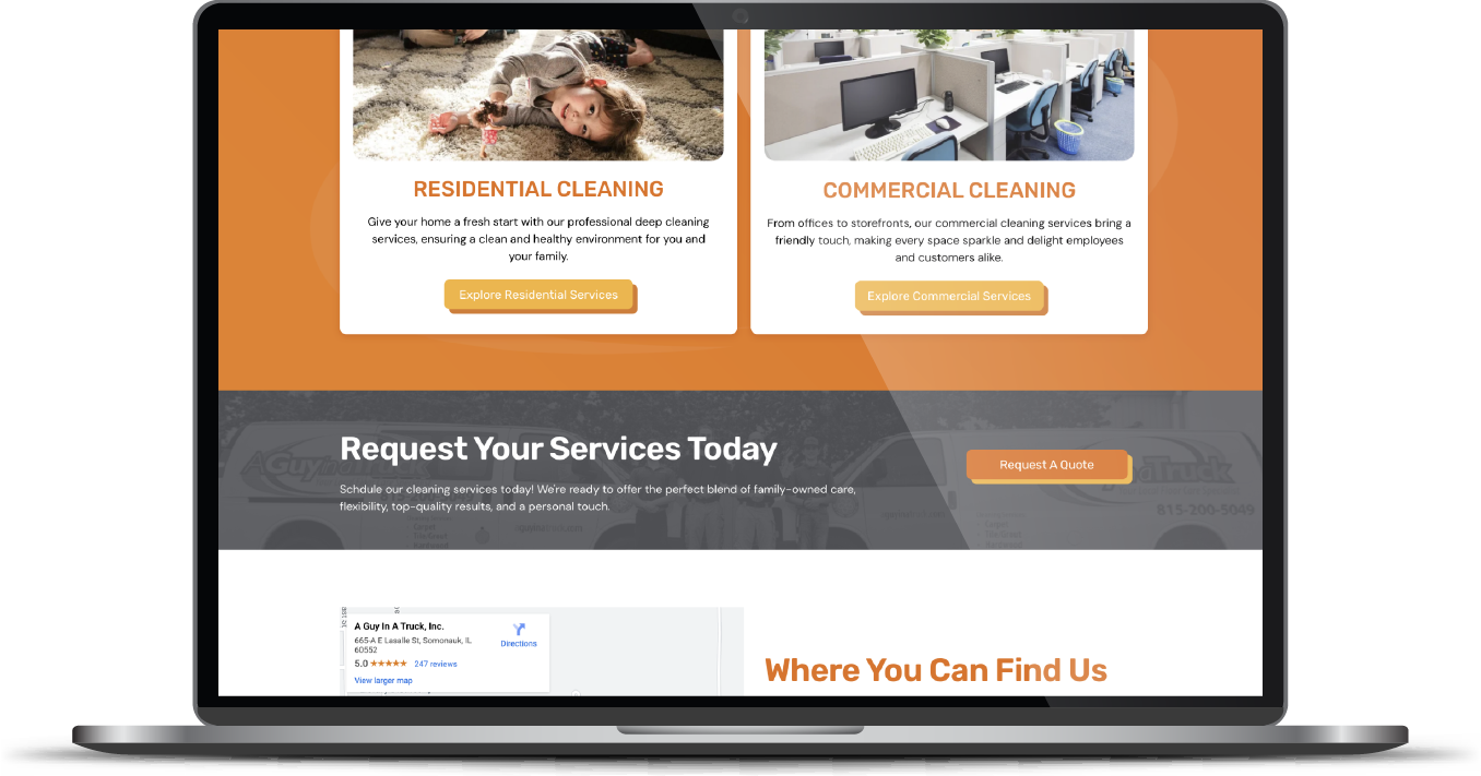
With our careful selection, every image showcases the stunning results achieved by A Guy With a Truck, and by displaying a variety of spaces and floor types, the site now effectively appeals to the client’s wide range of customer types. From the office manager who needs weekly rug services to the stay-at-home parent who needs a monthly boost, each customer can encounter an example that represents their space.
The Results
Crisis averted! And now this family-owned business will reap the rewards of a strongly branded and highly strategized site. Return clients will appreciate the visual update and new users will be impressed with the professionalism conveyed and the ease of navigation.
Before & After
Rounded, structured fonts.
Rubik was selected for its rounded, approachable appearance and its sans serif structure. This font reflects the client’s logo type and strengthens brand consistency. Rubik also has a structured, geometric element, which pairs nicely with the predominantly masculine color palette.
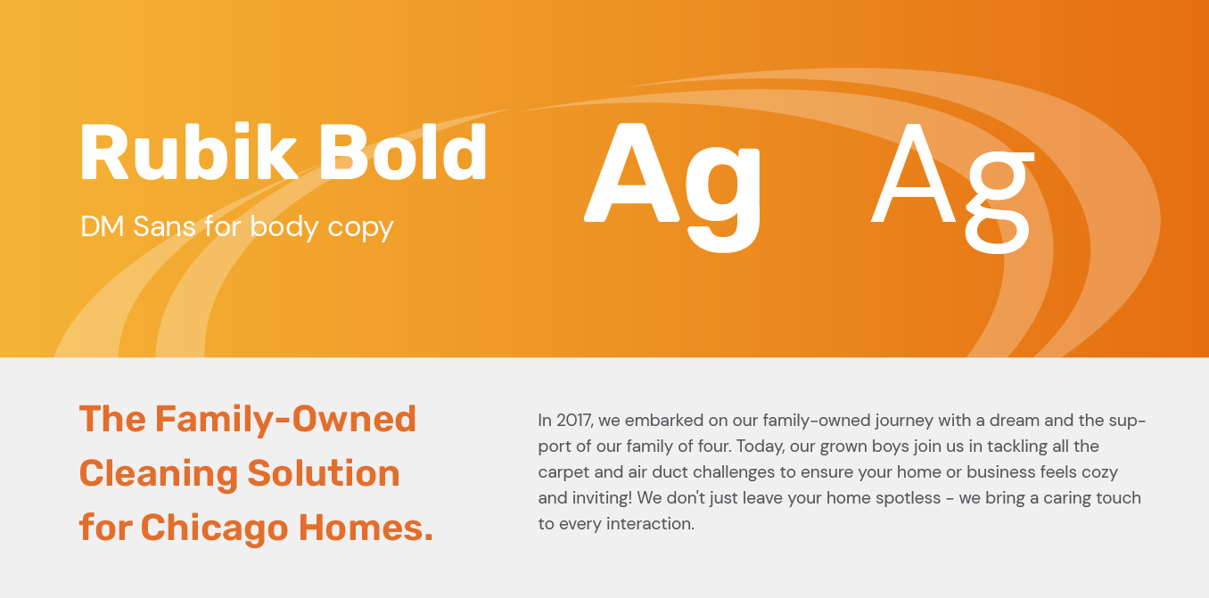
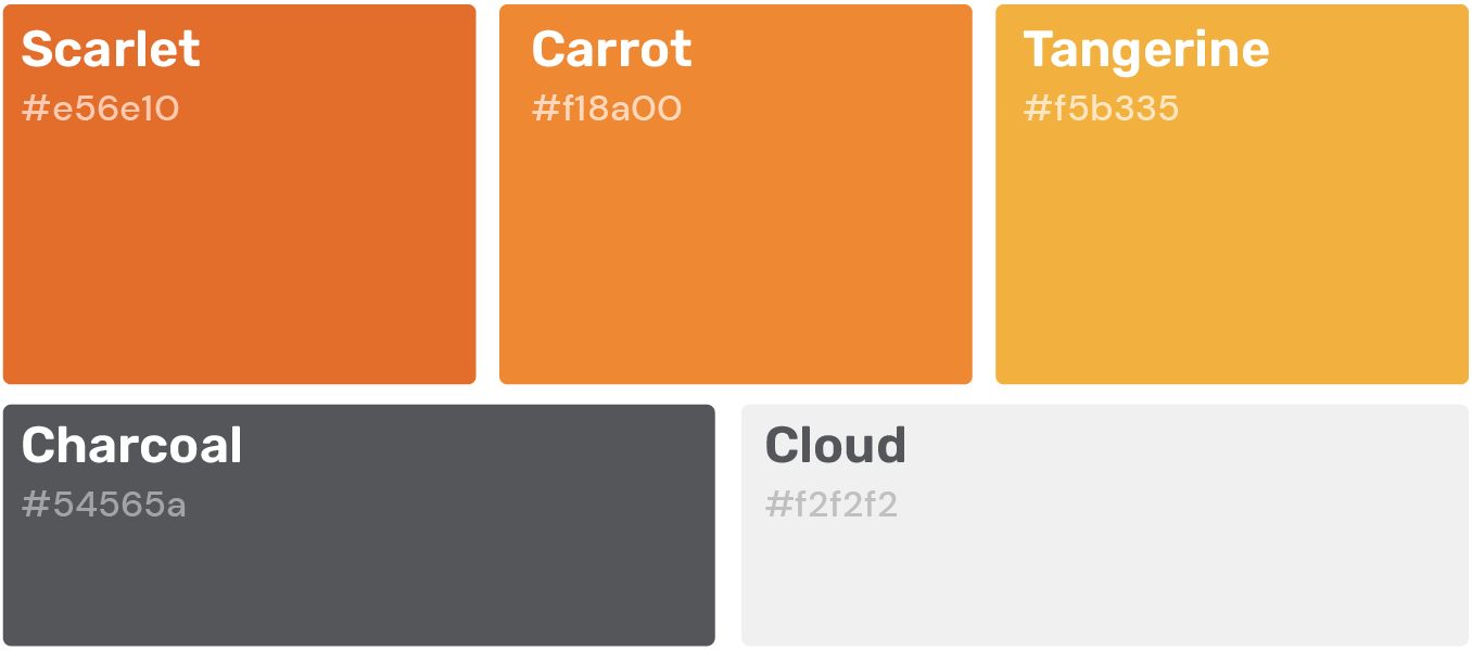
Branded oranges and complementary grays
Using the client’s logo as our starting point, our team built a color palette of oranges and grays. To avoid a flat, non-dimensional website, we incorporated an orange and yellow gradient in various spaces across the site. The effect is a unified, well-branded website.
More Case Studies
We work across an expanse of projects at RivalMind, and we love to share our clients’ successes. For each case study, our goal is the same: bridging the gap between marketing and growth through innovative and custom design. This is why companies come to us. Dive into more of our favorite web design projects below!